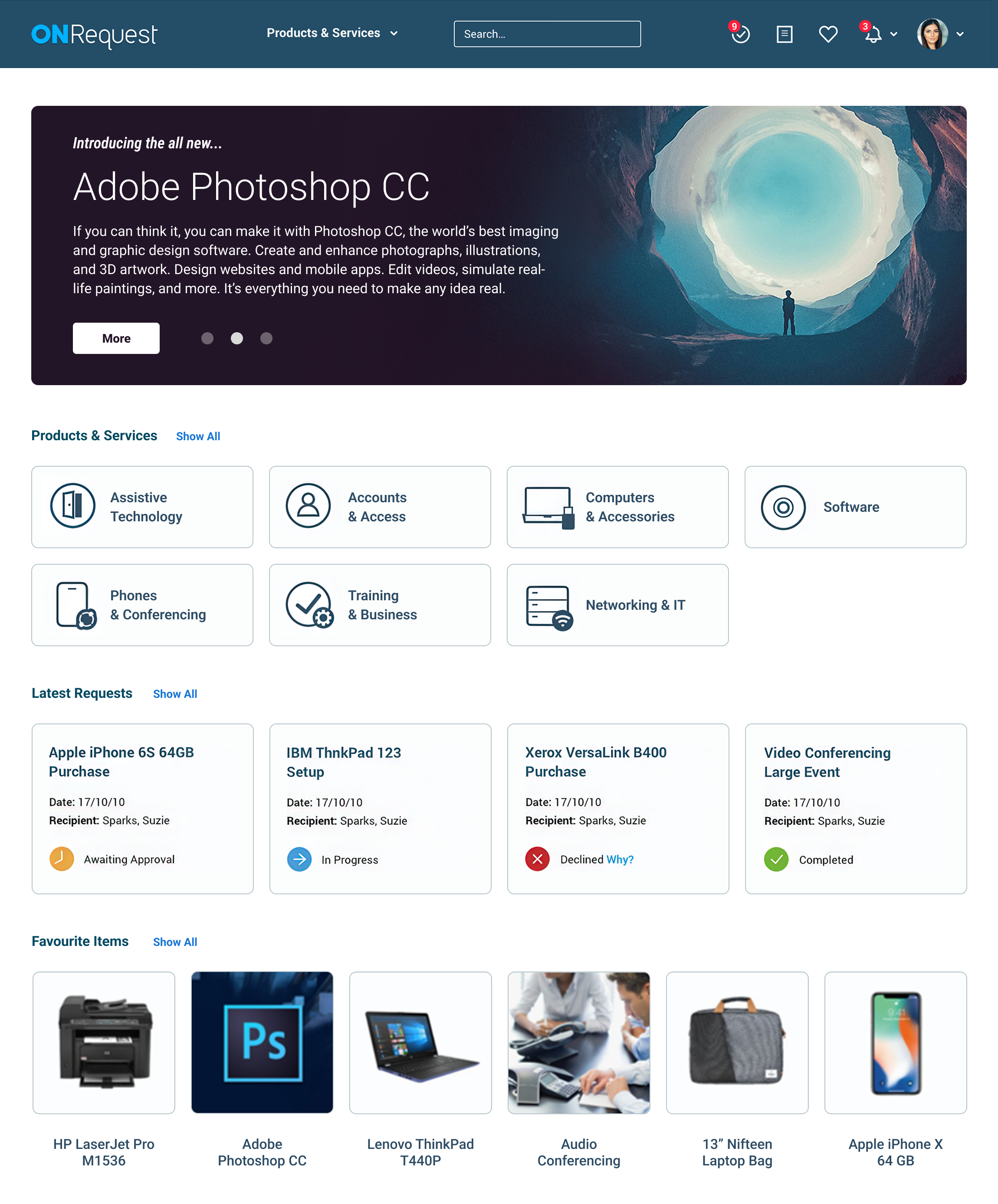


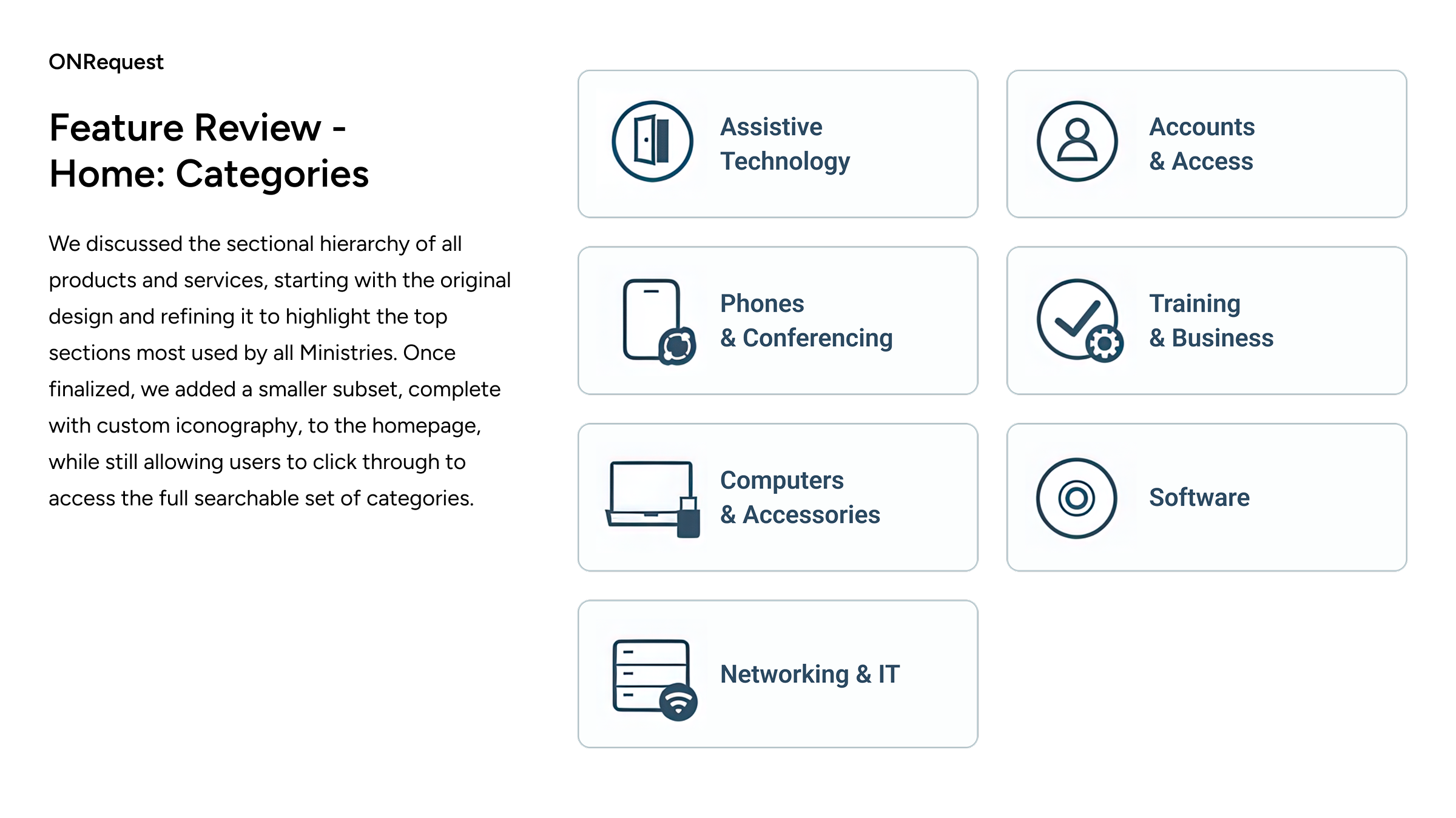
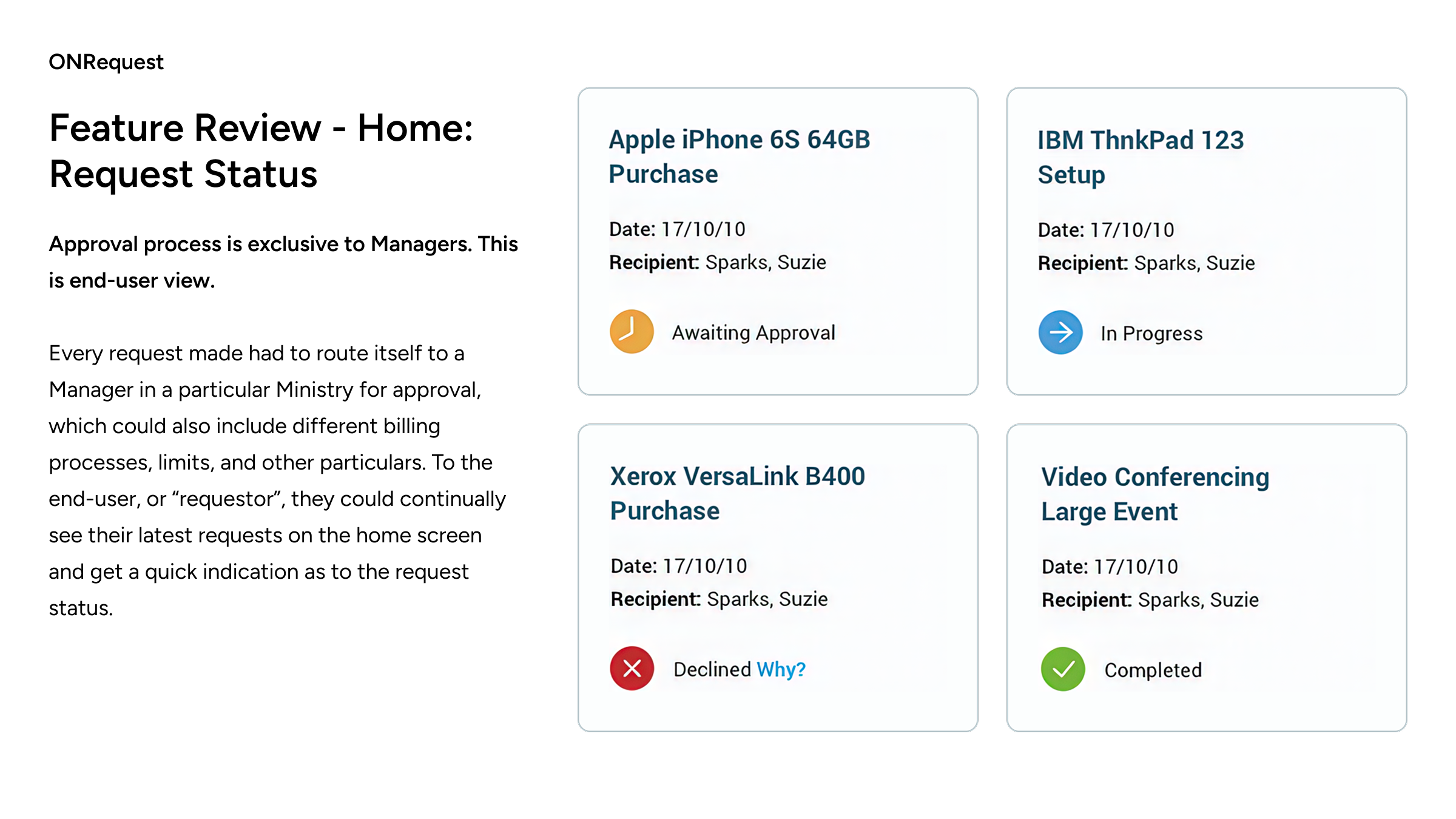
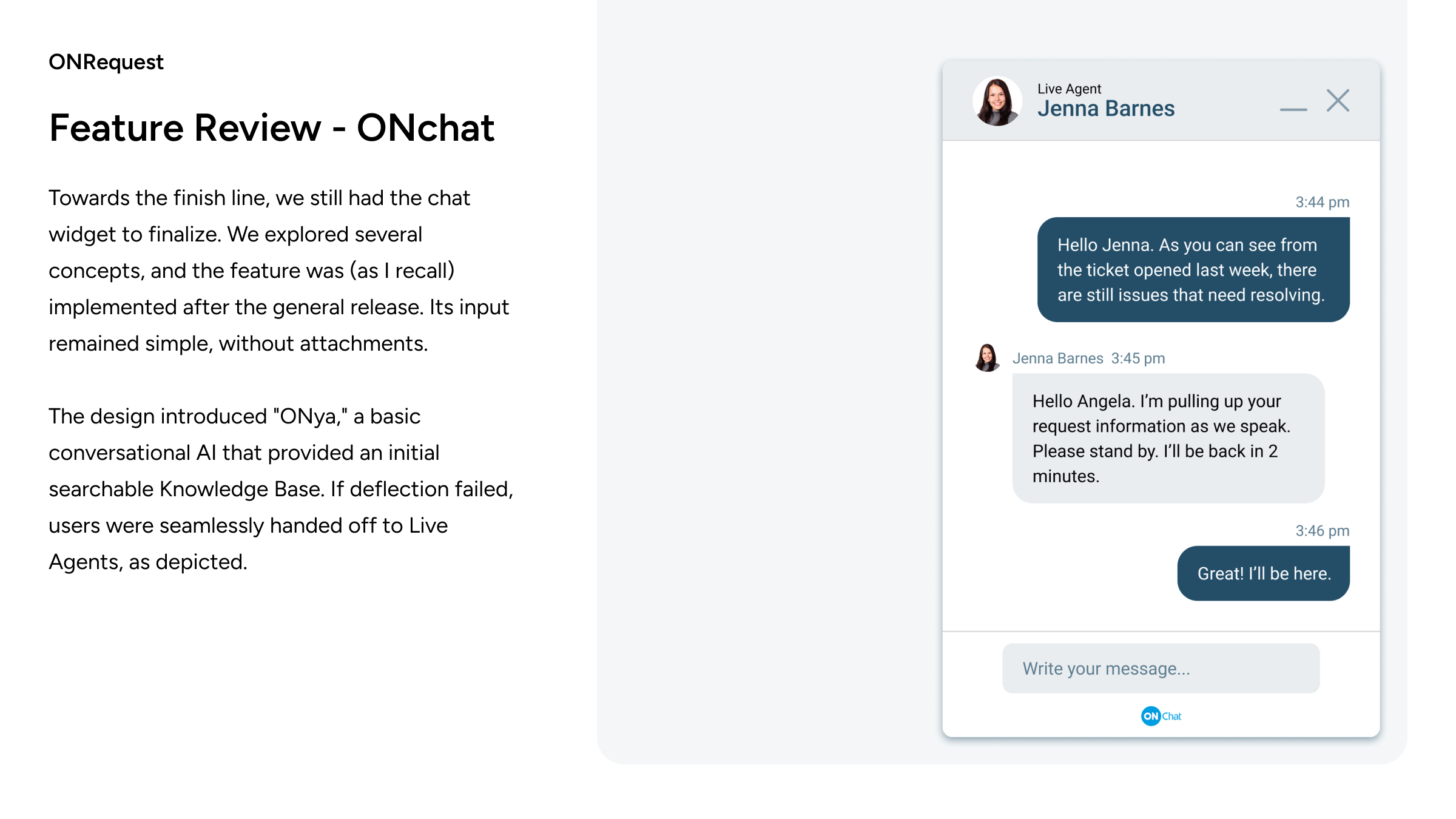
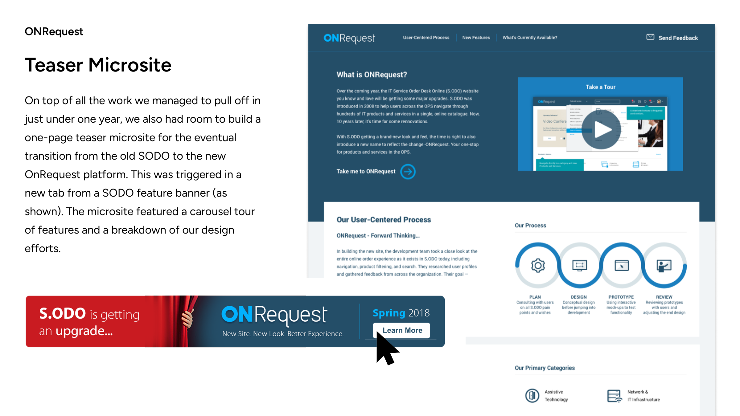
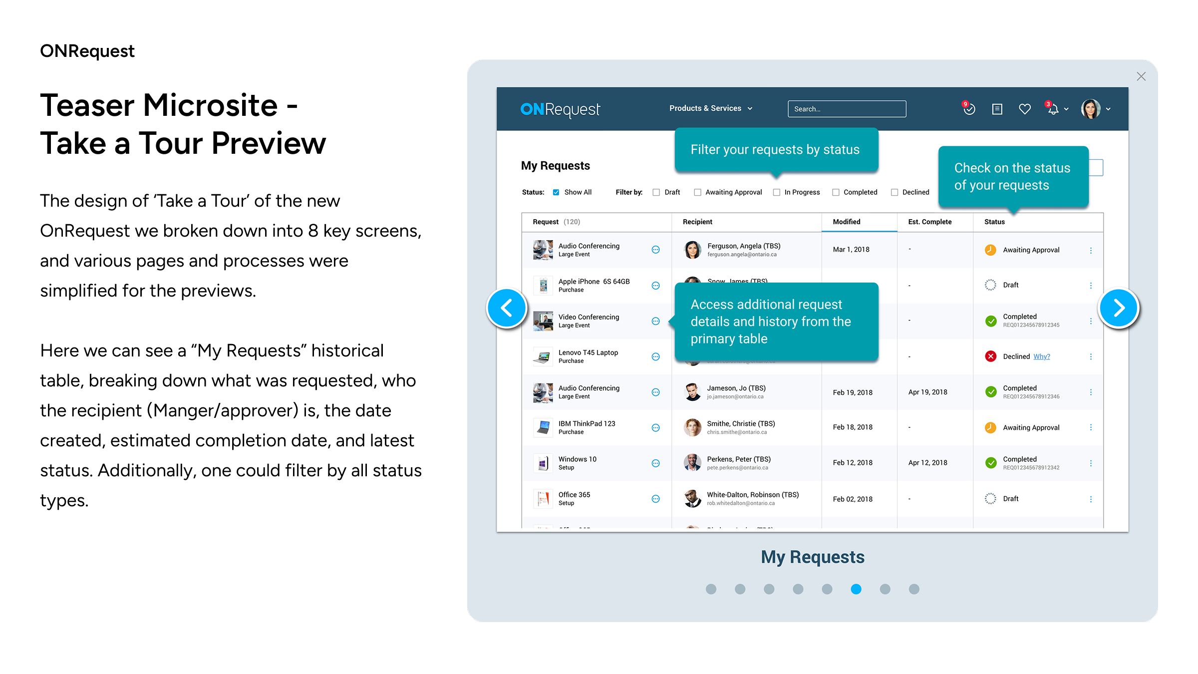


ONRequest - Portal

16:9 case study format based on source Figma deck
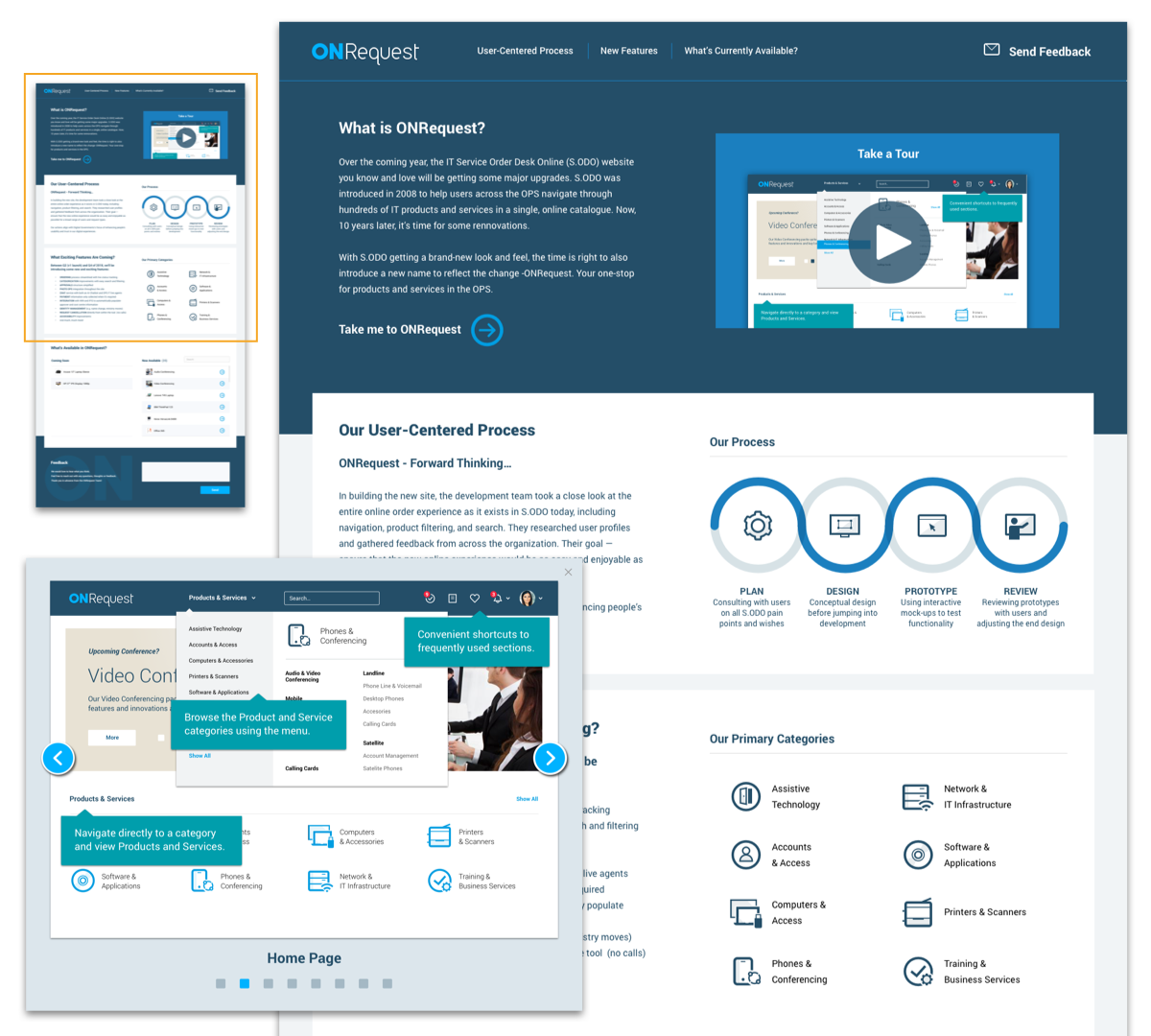
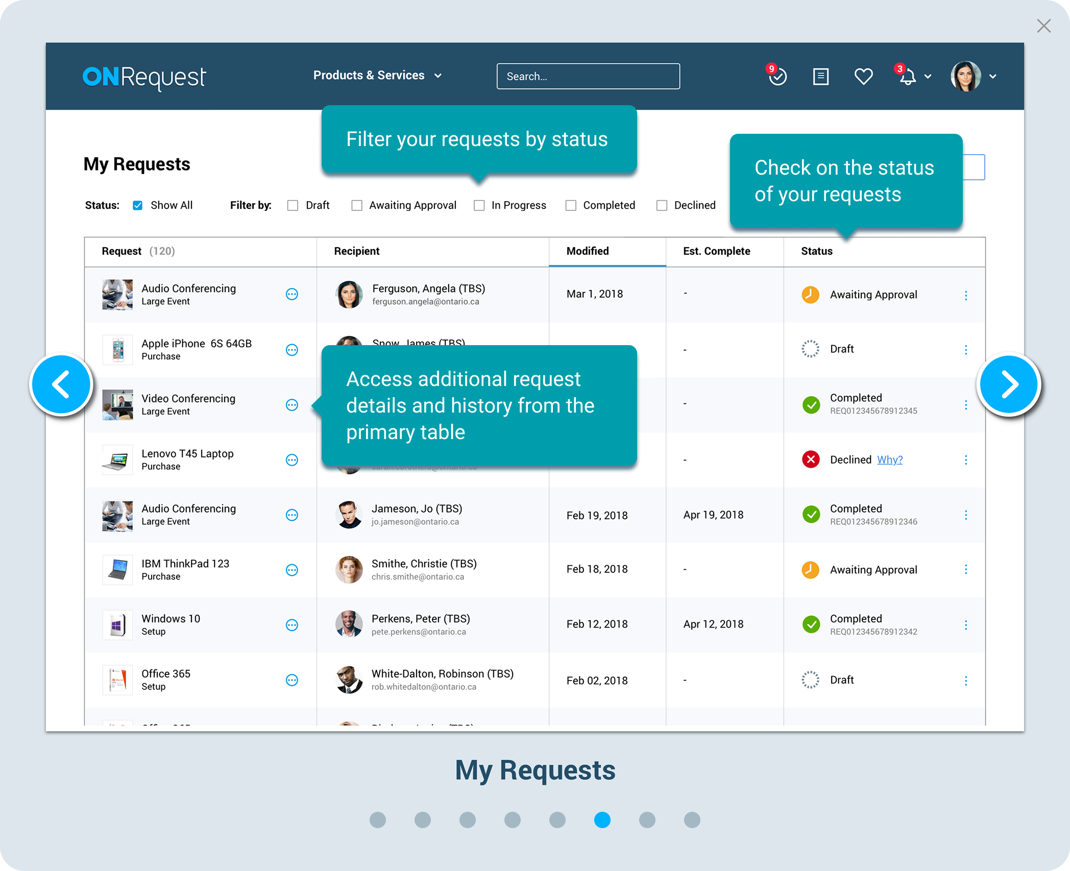
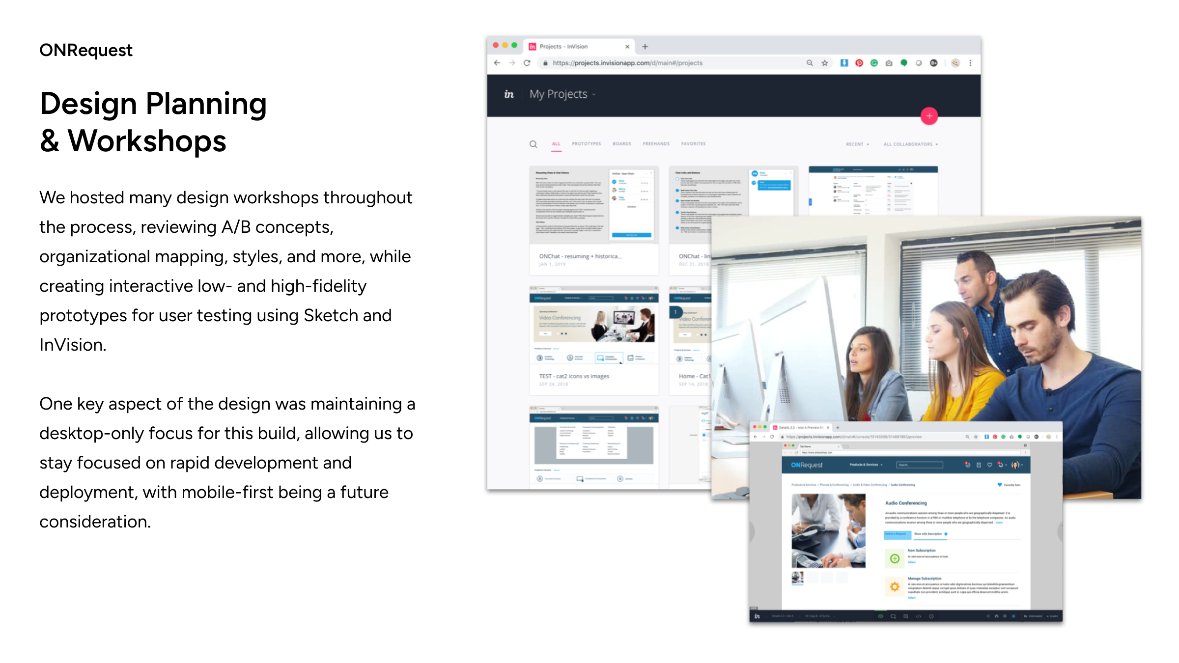
Phase 1 - Desktop MVP
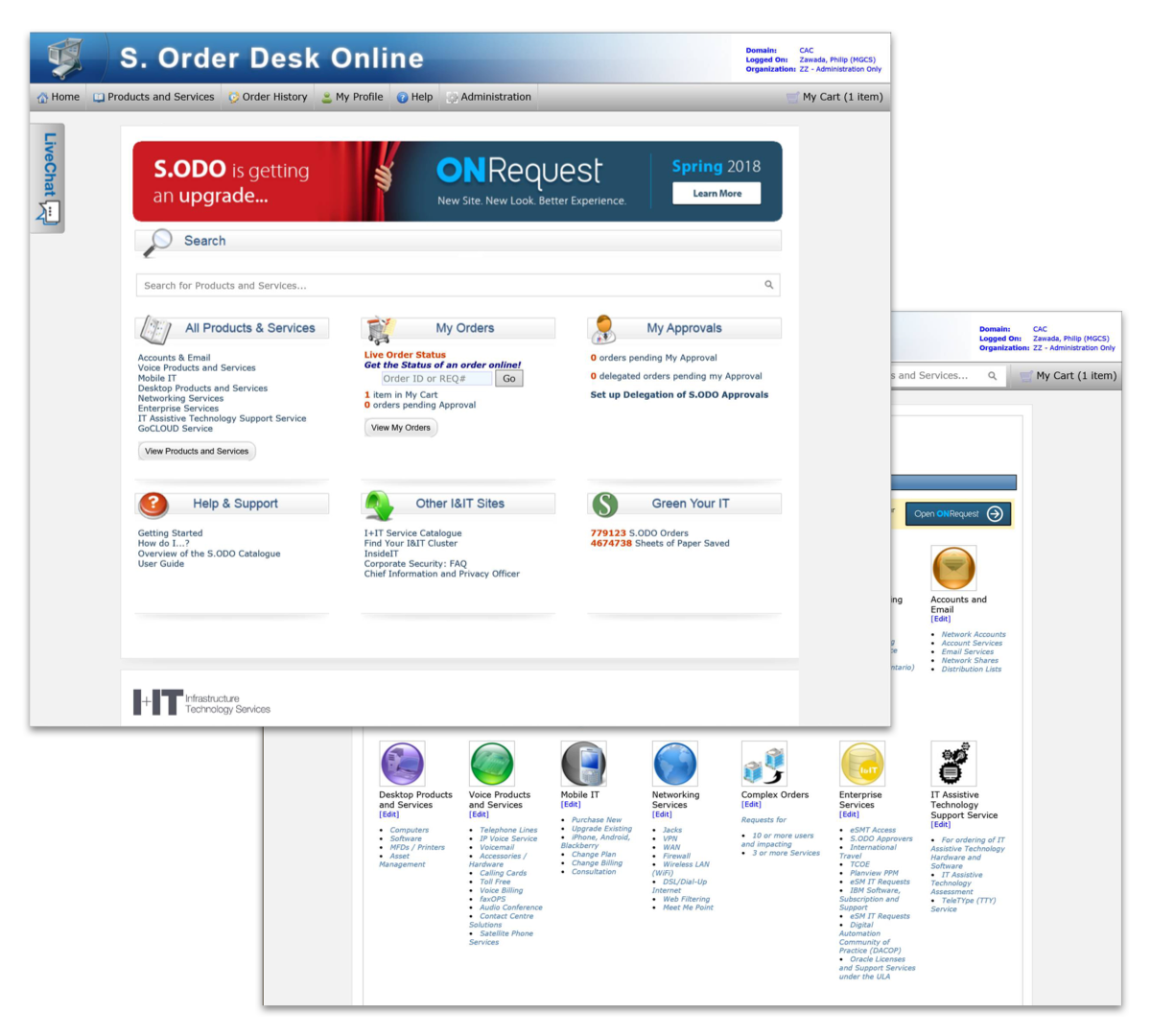
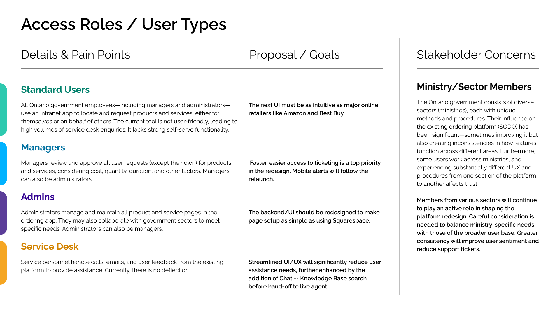
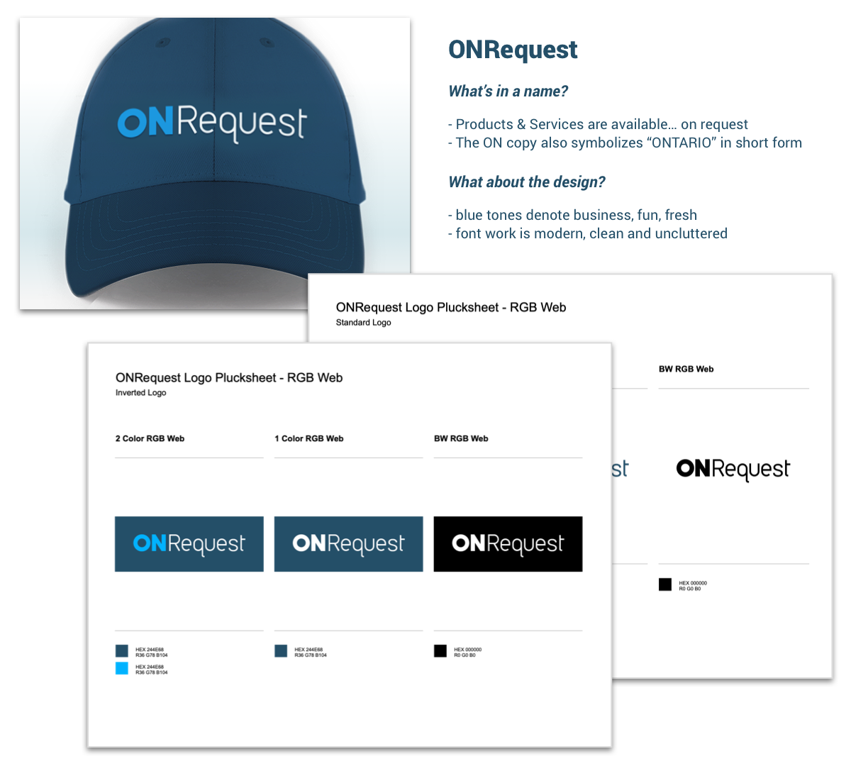
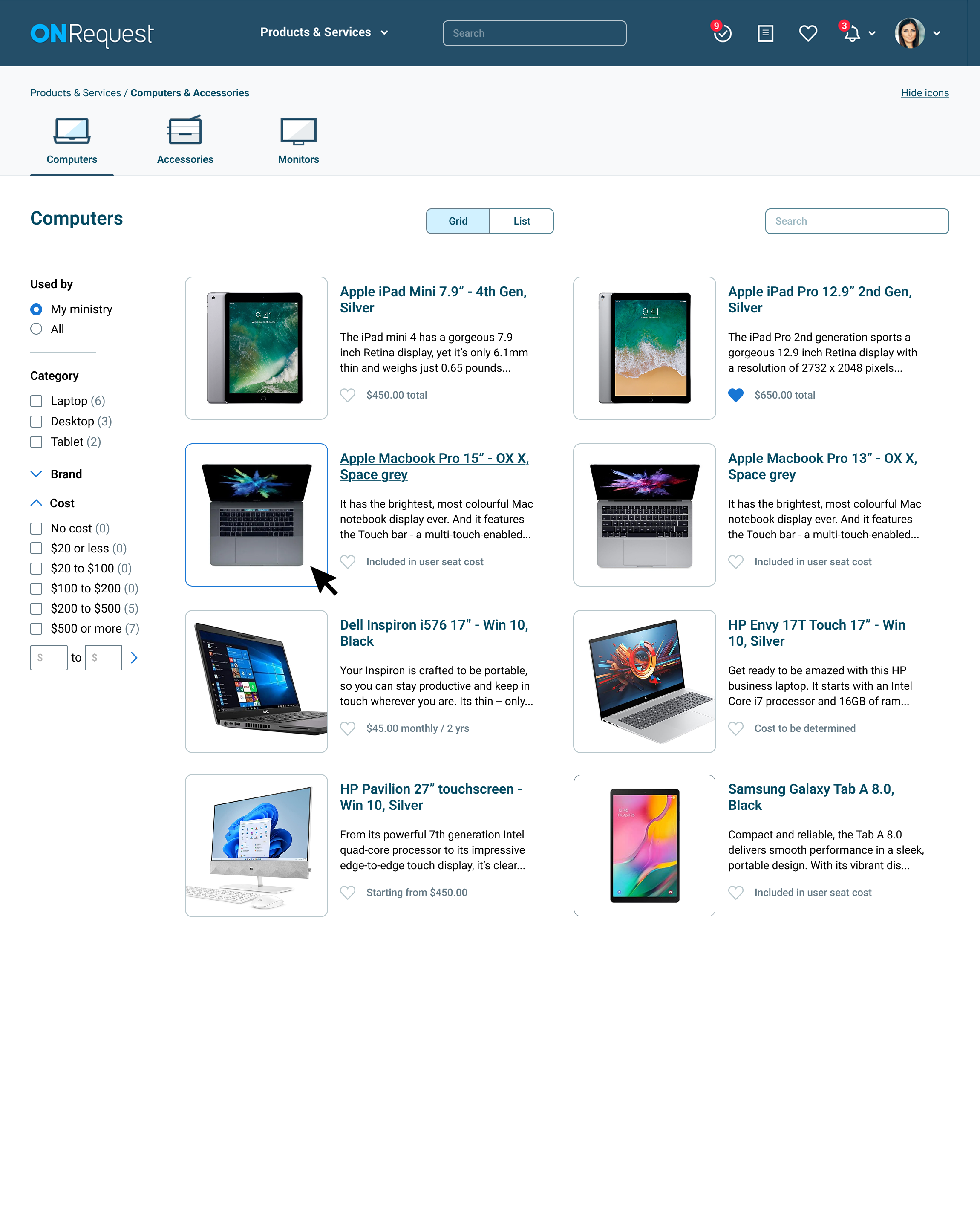
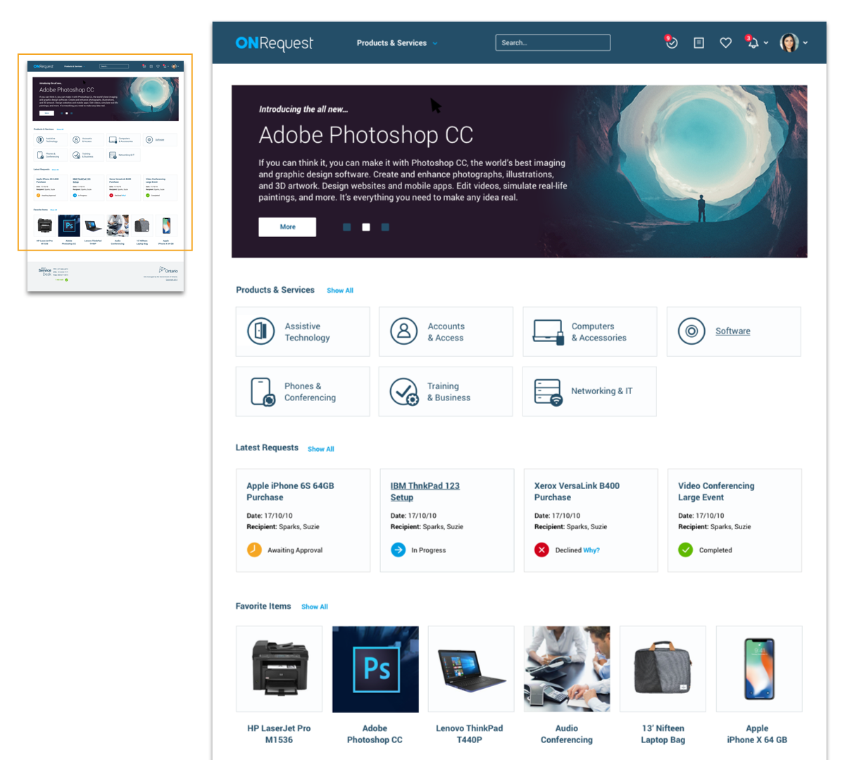
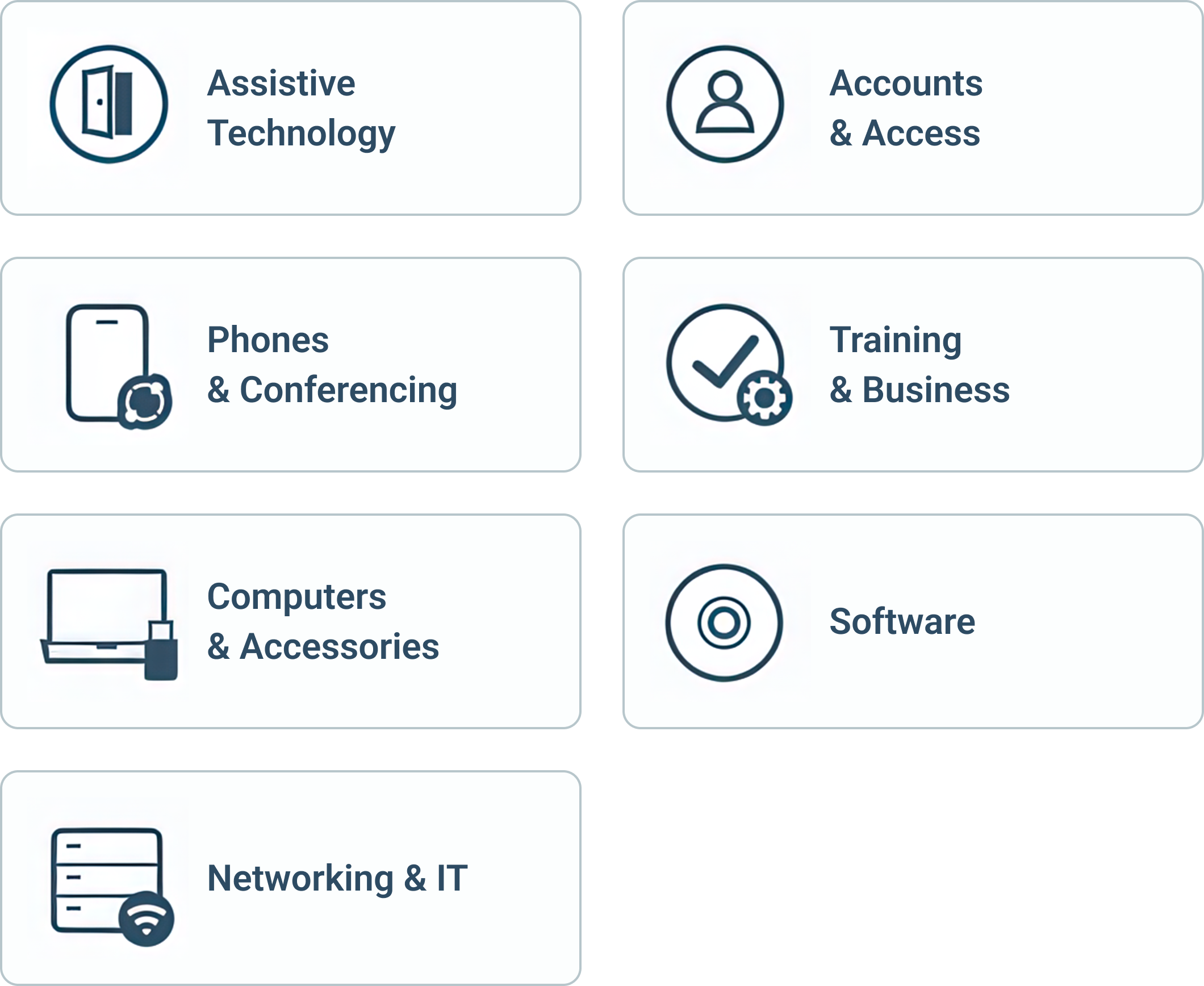
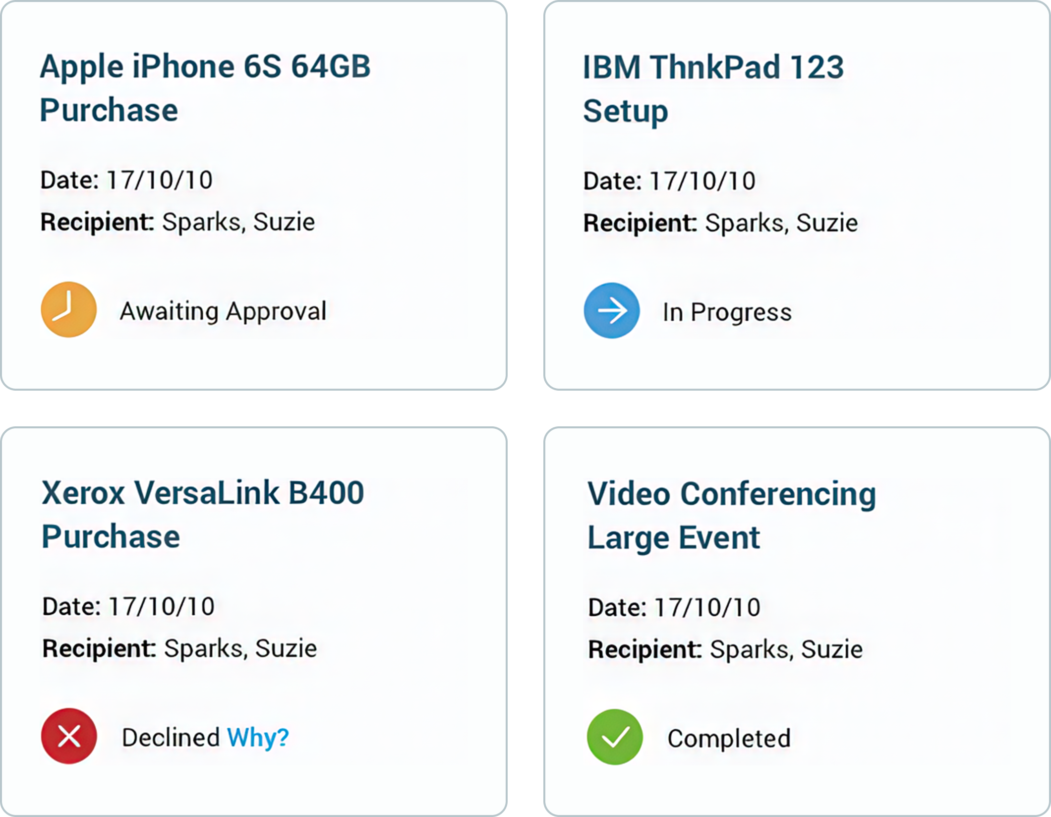
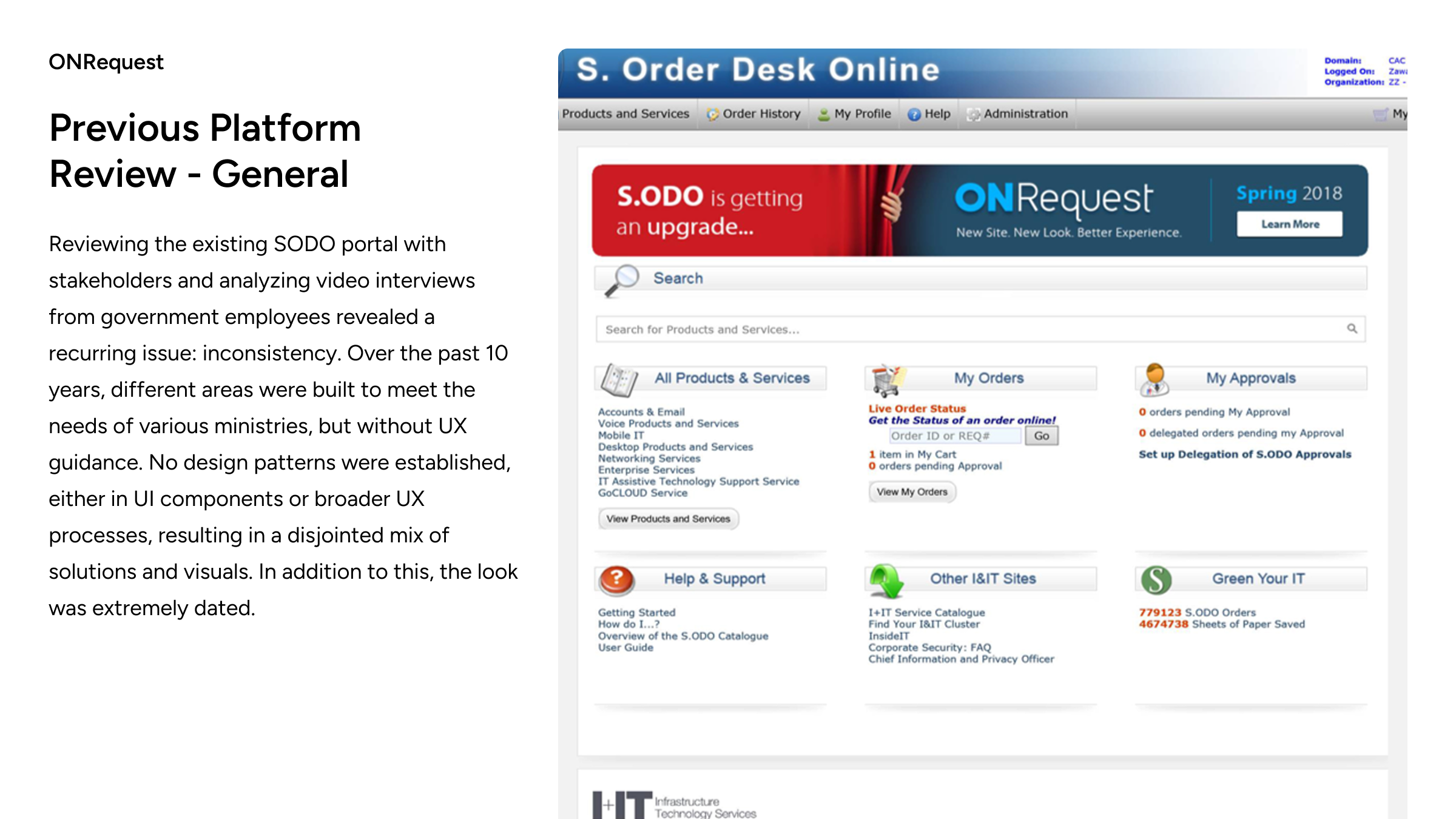
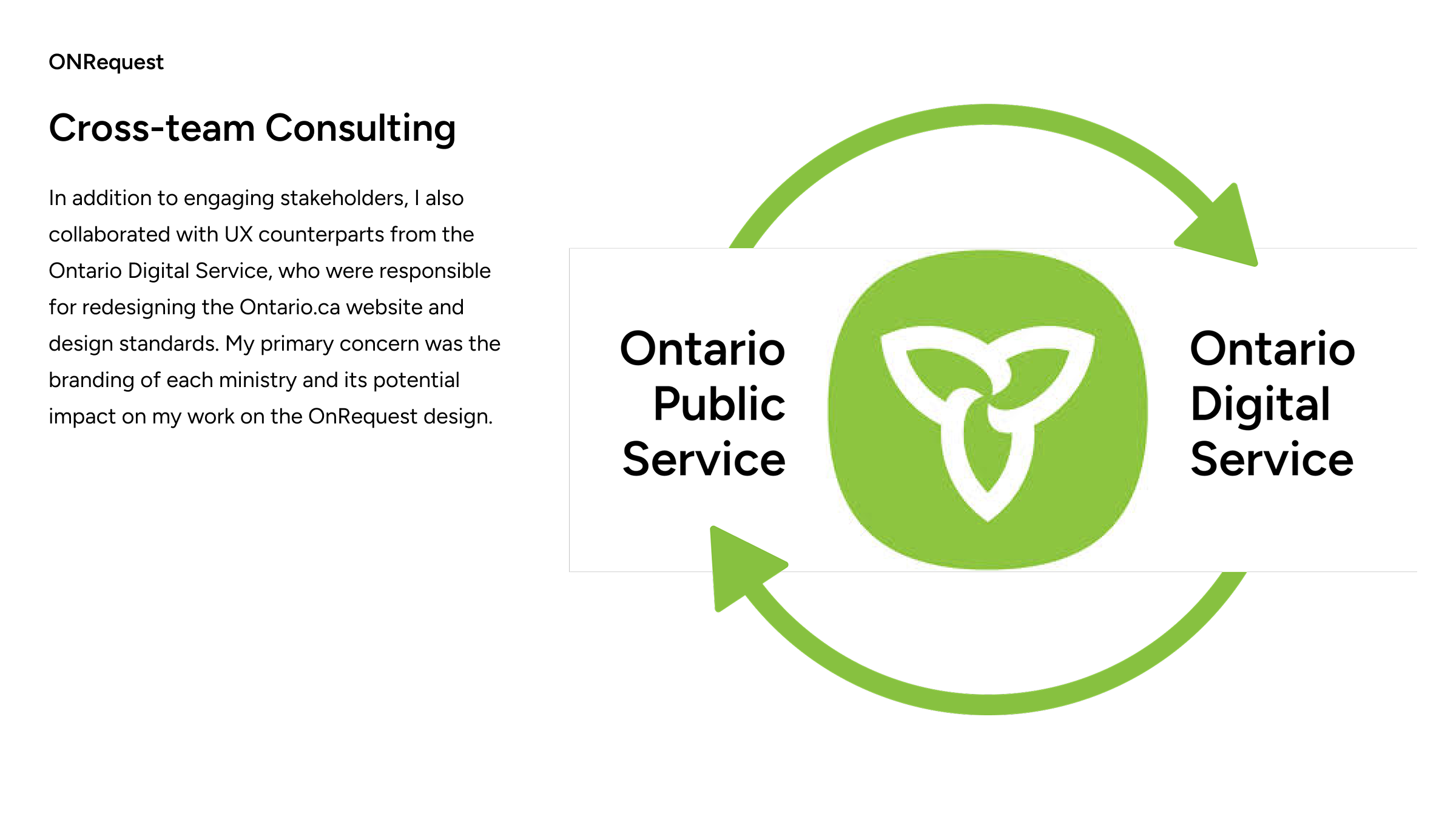
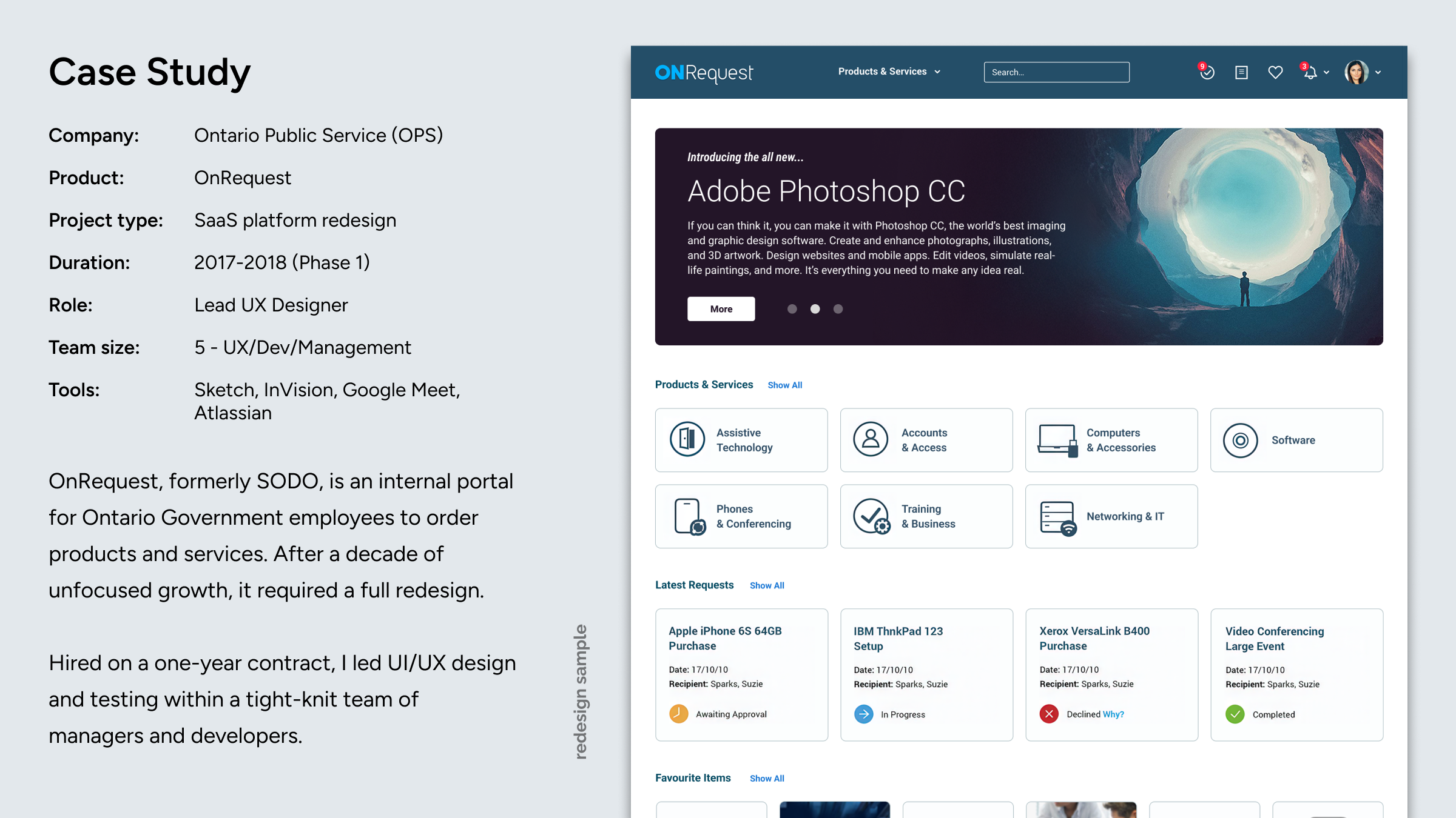
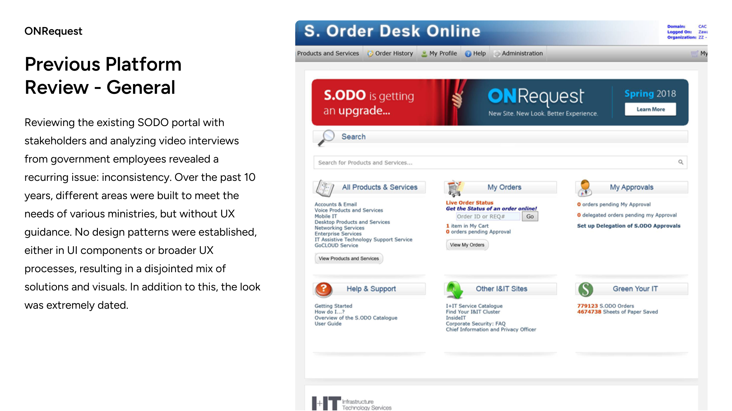
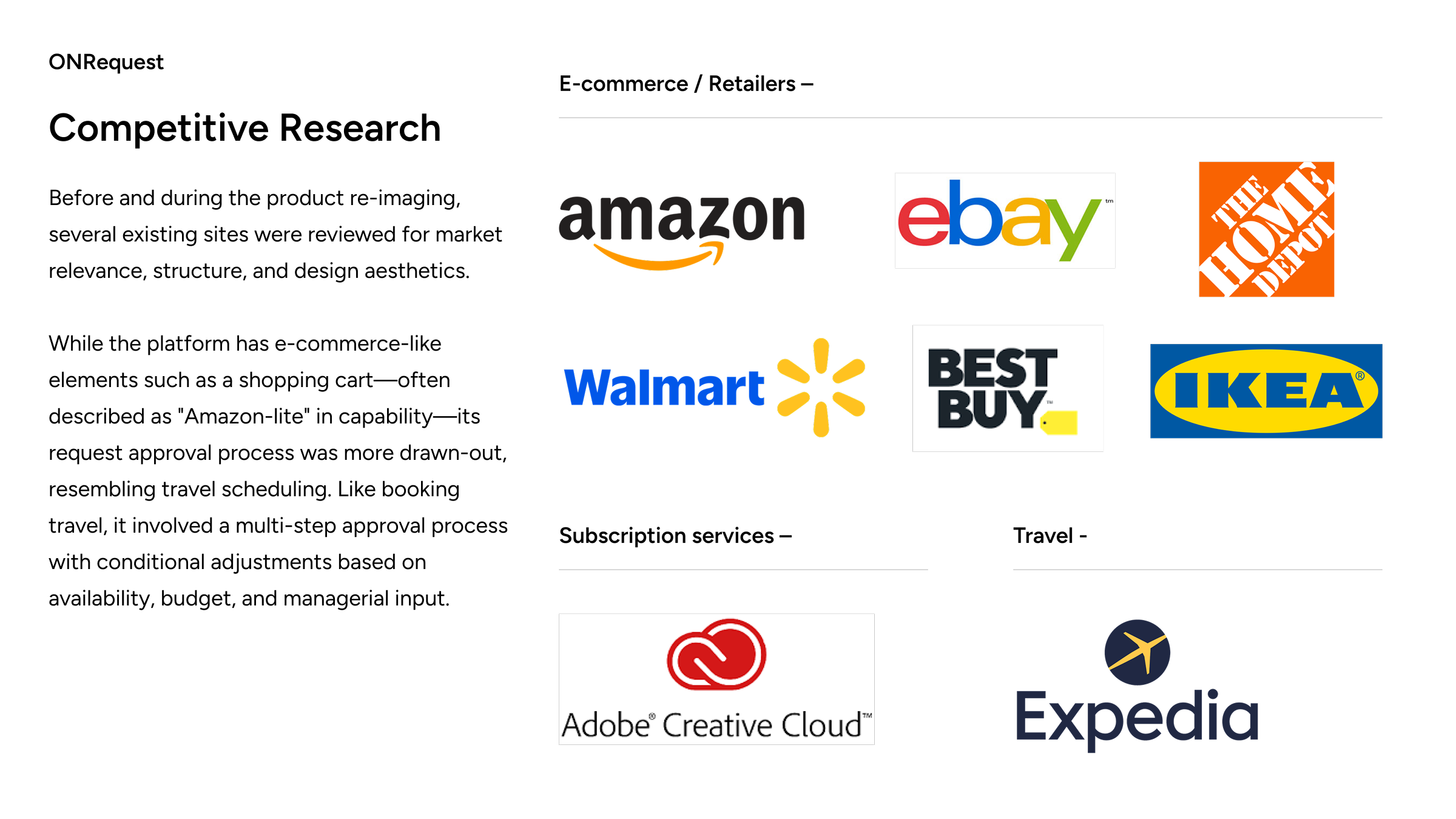
The Ontario Public Service (OPS) is a division of the Ontario provincial government that provides services directly to citizens. To fulfill this role, employees rely on an internal web portal for ordering products and services—essentially an internalized "Amazon" previously known as SODO (Service Order Desk Online).
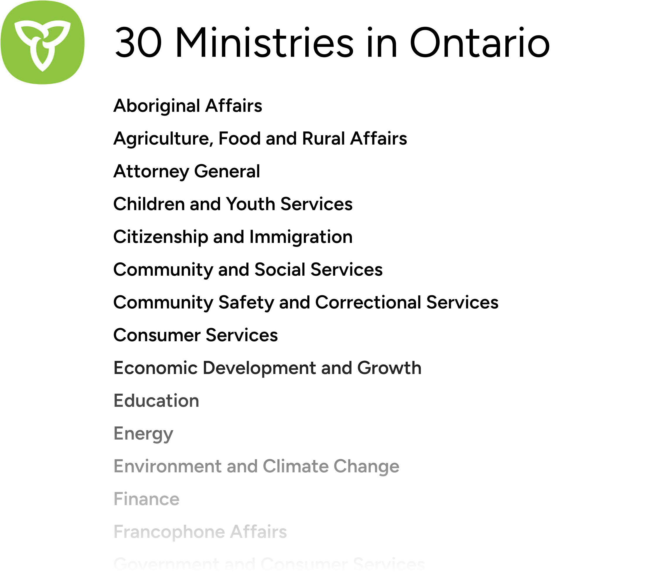
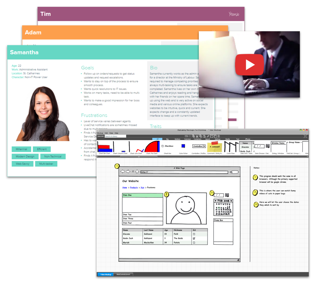
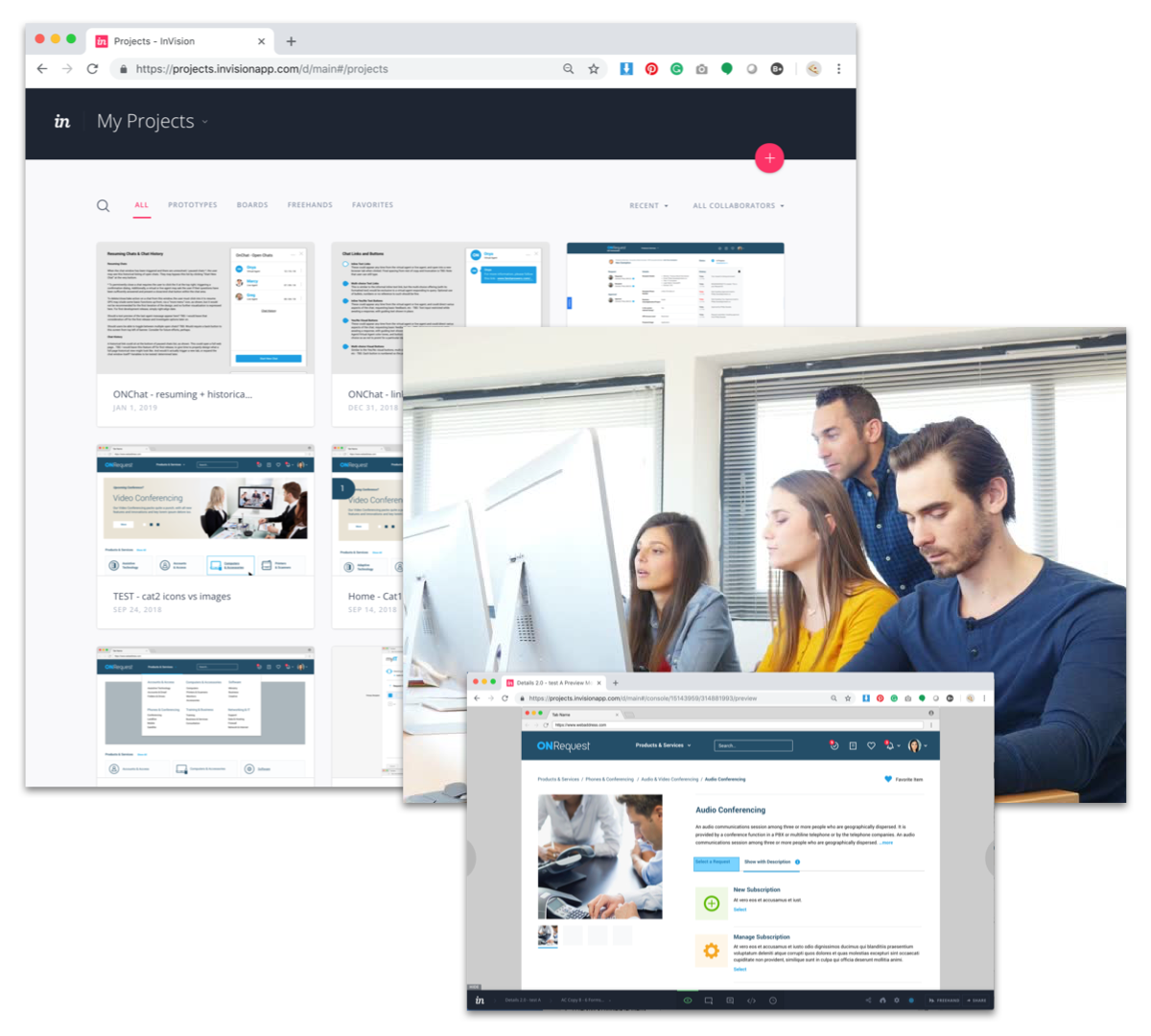
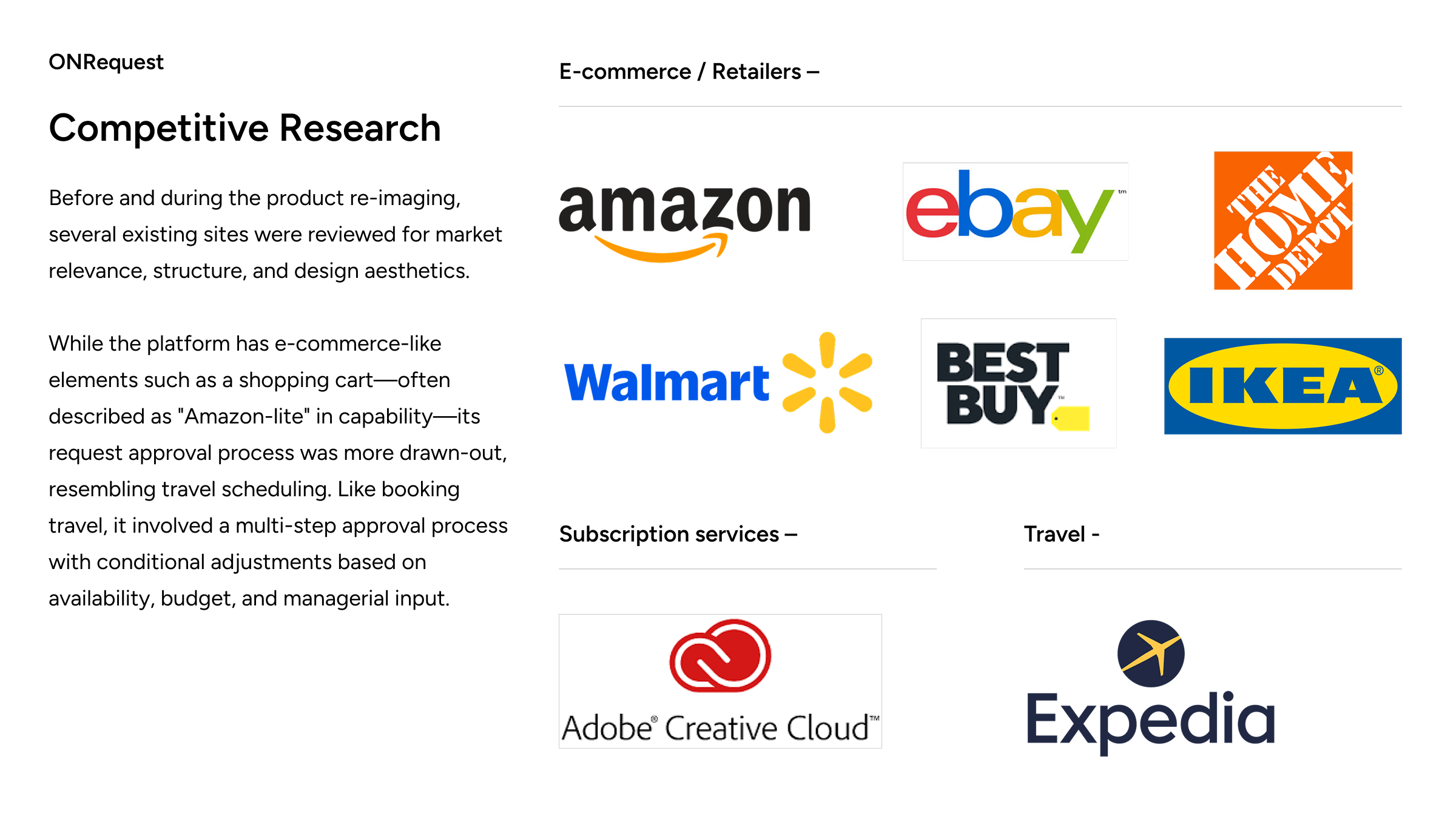
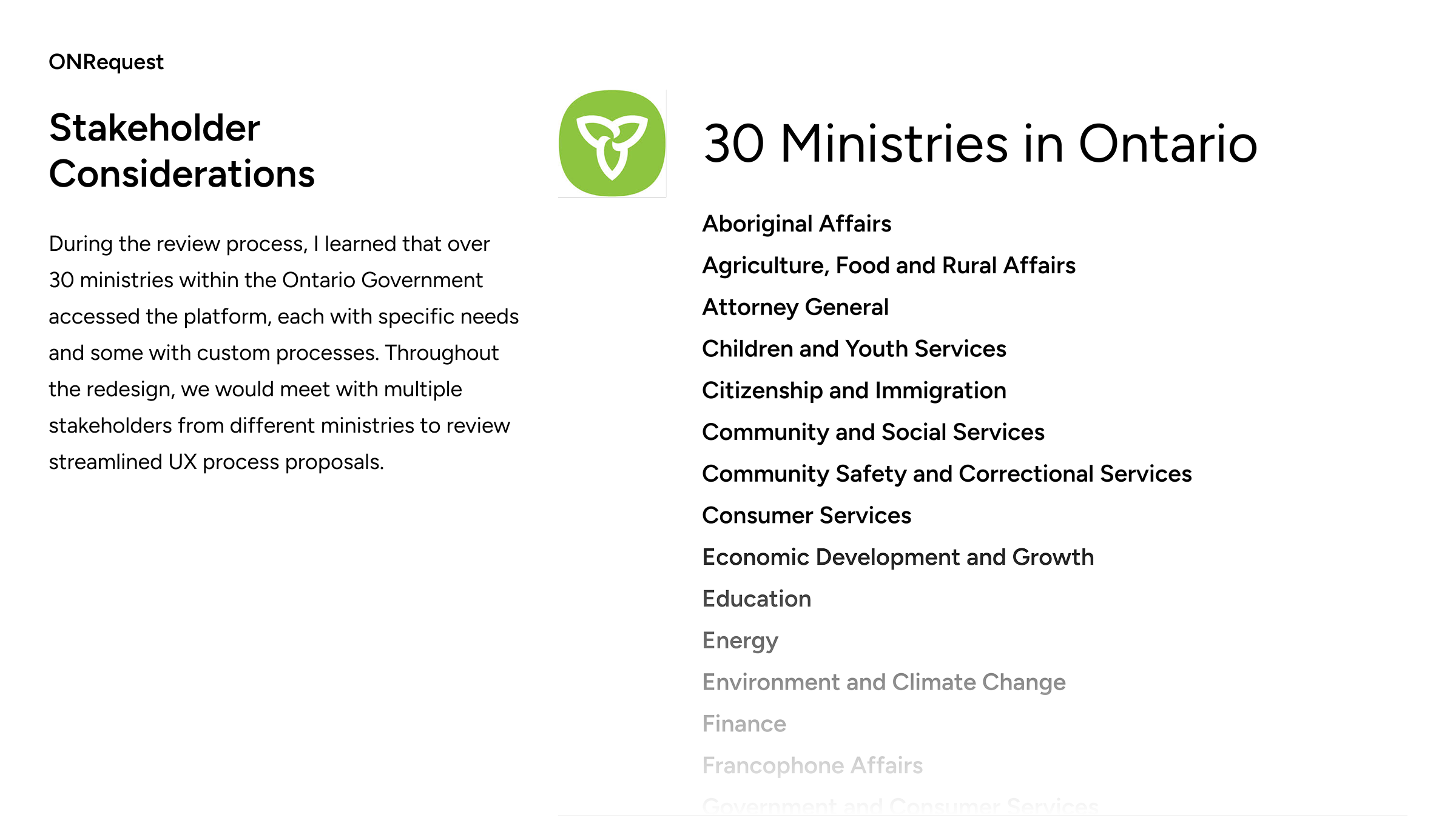
In 2017, I was contacted directly by my soon-to-be manager to join a small, dedicated team of developers and researchers to rebuild the service portal from the ground up. This involved working and consulting with multiple ministries and researching several popular marketplaces for inspiration.
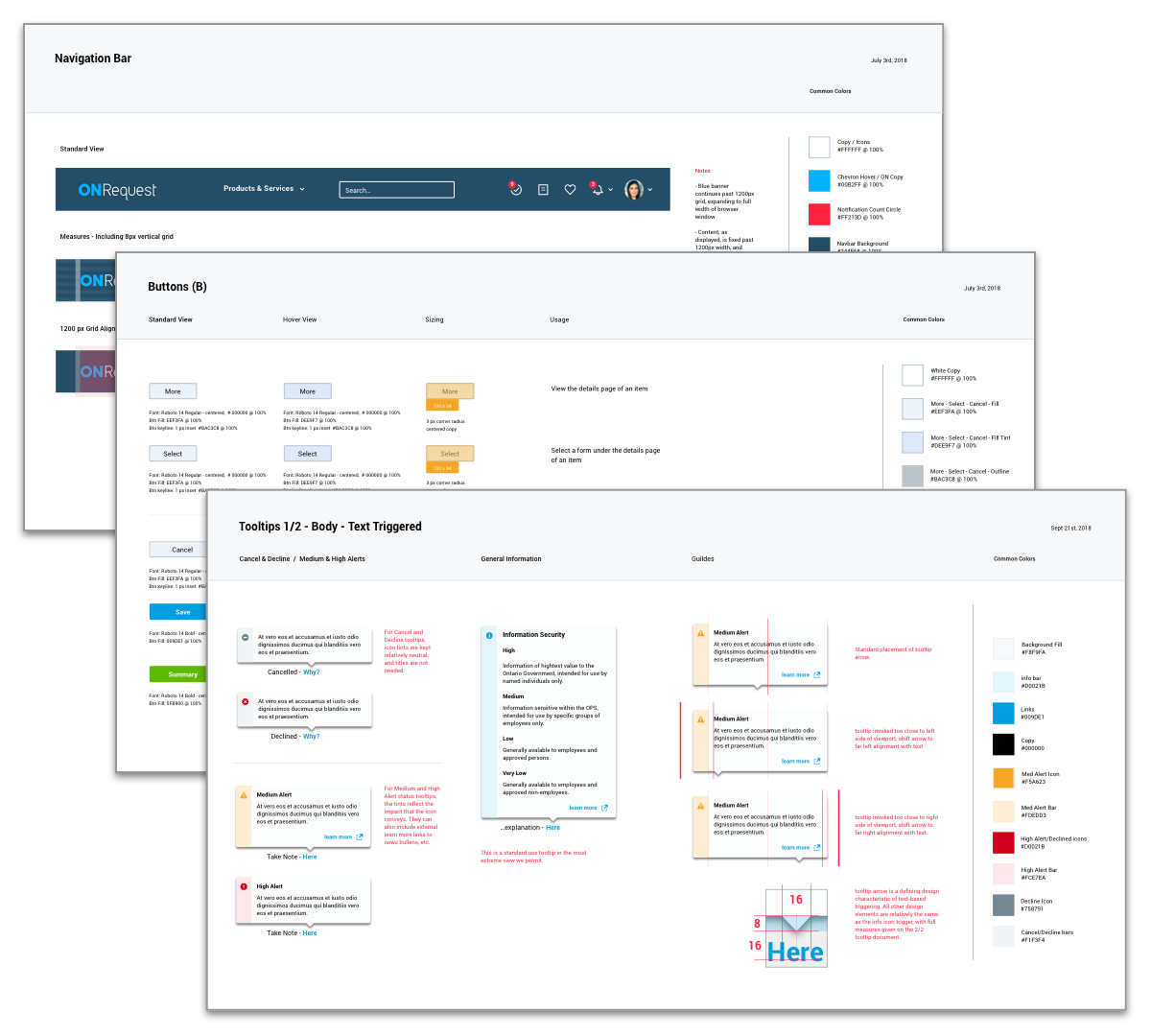
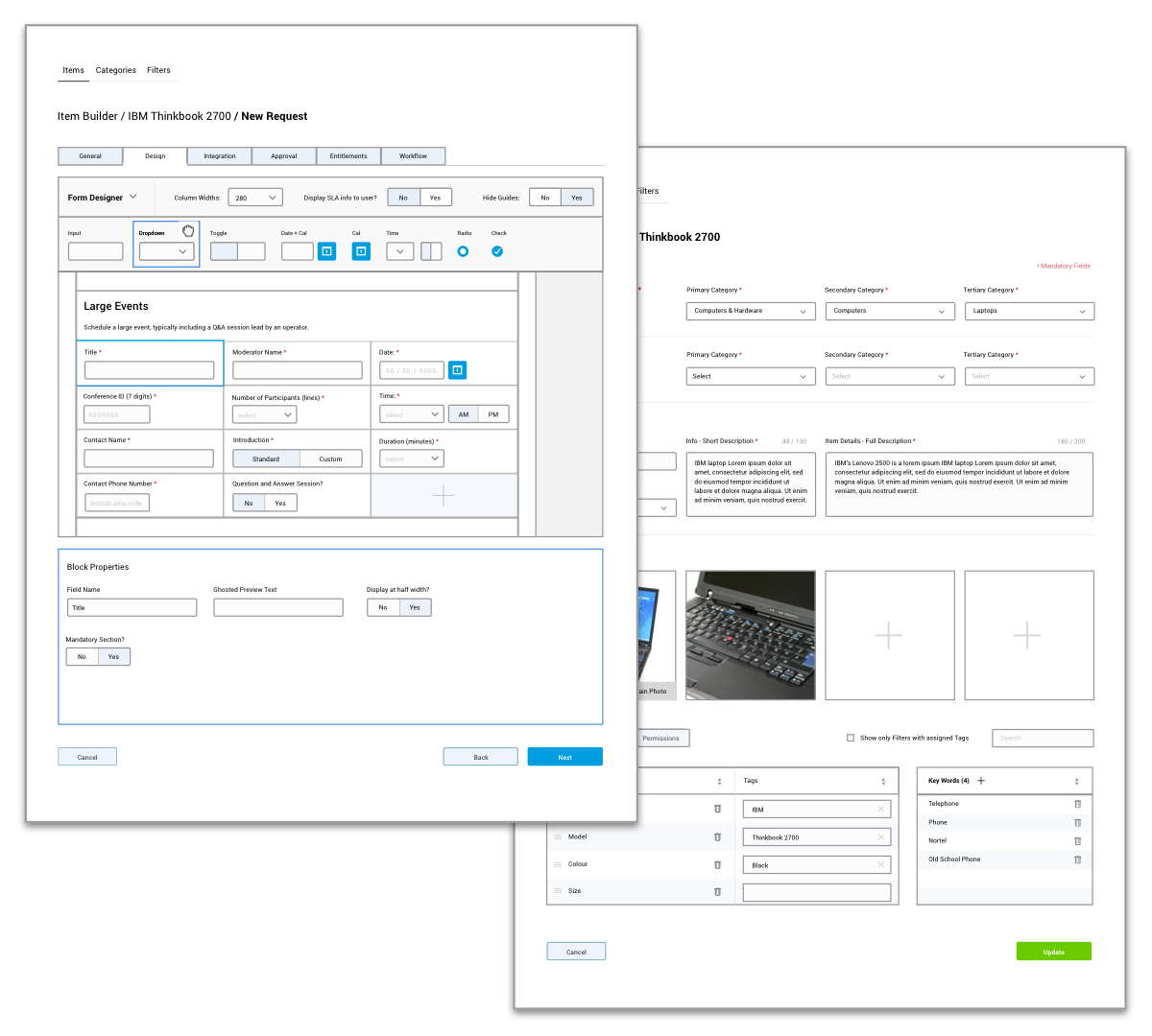
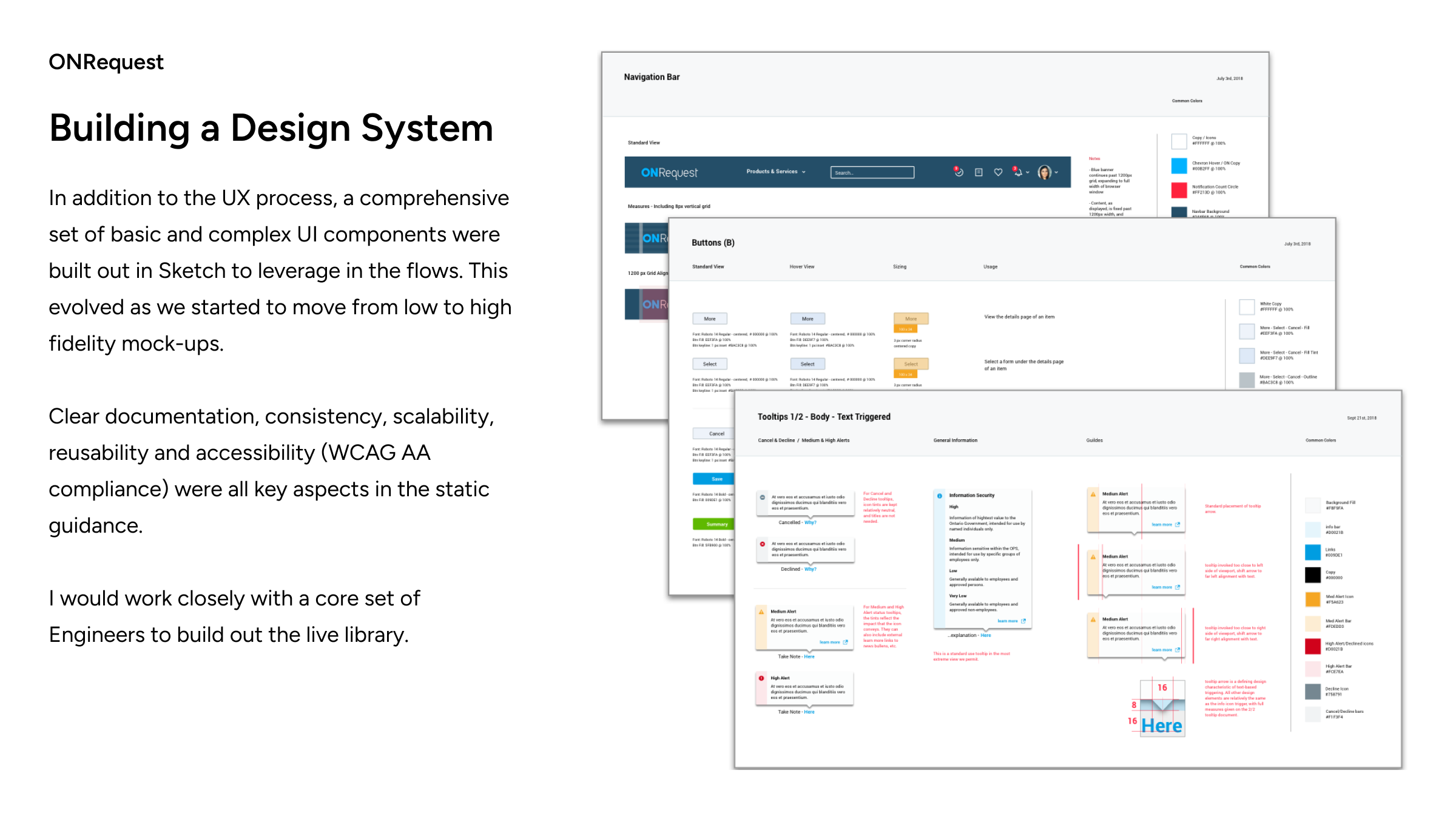
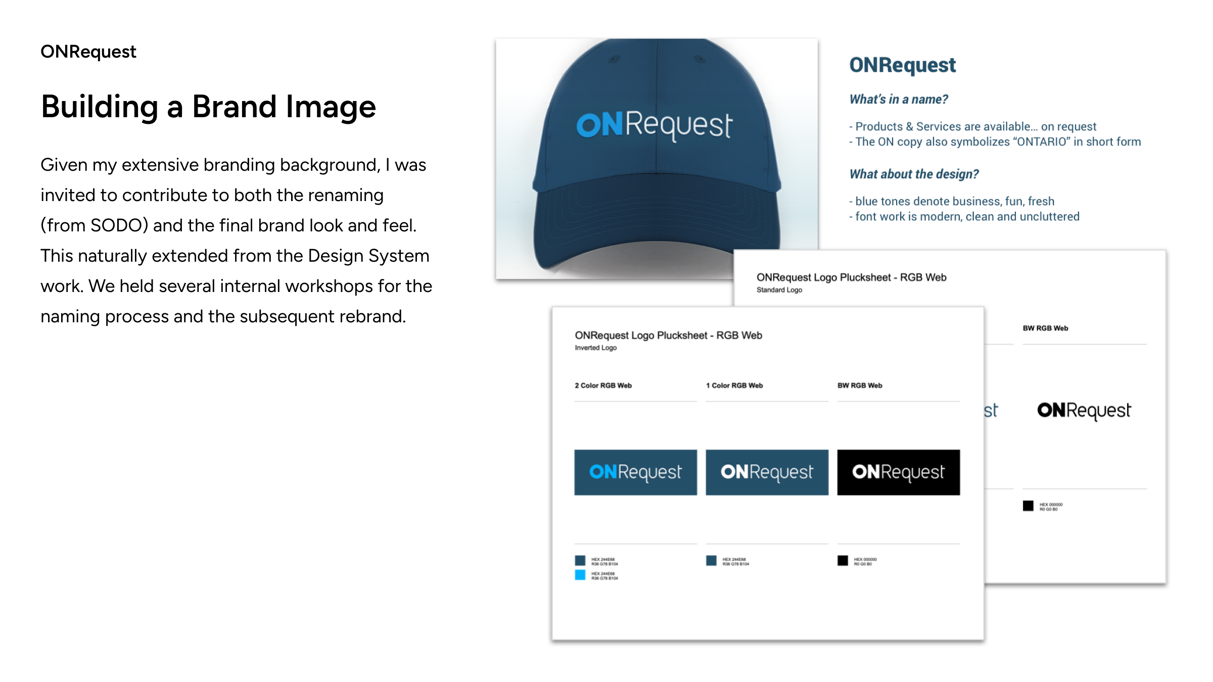
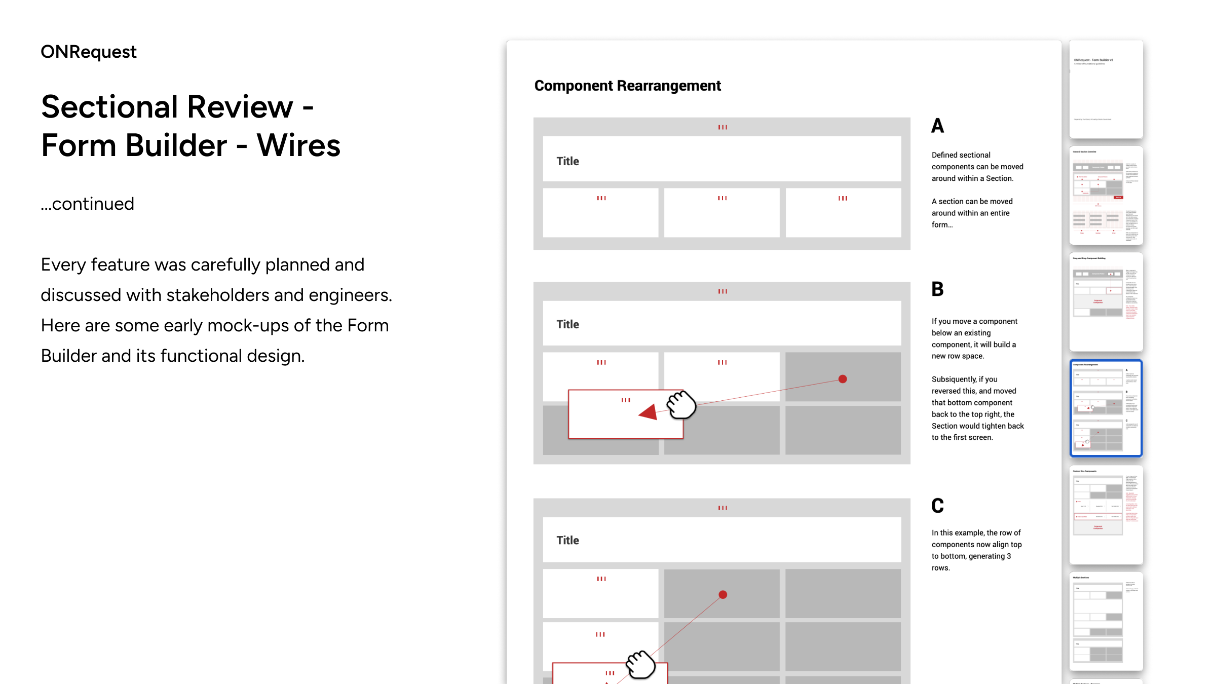
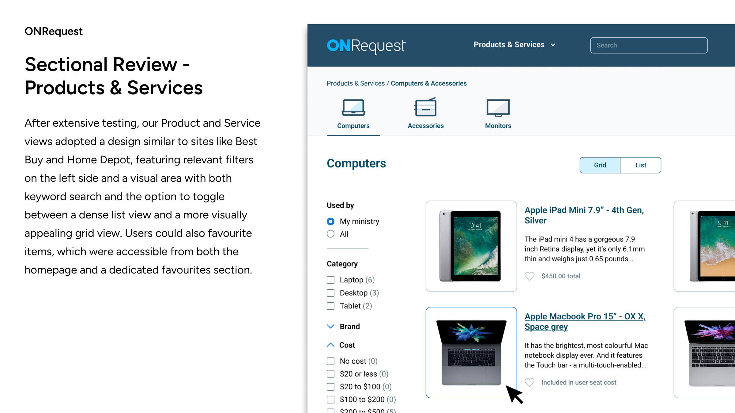
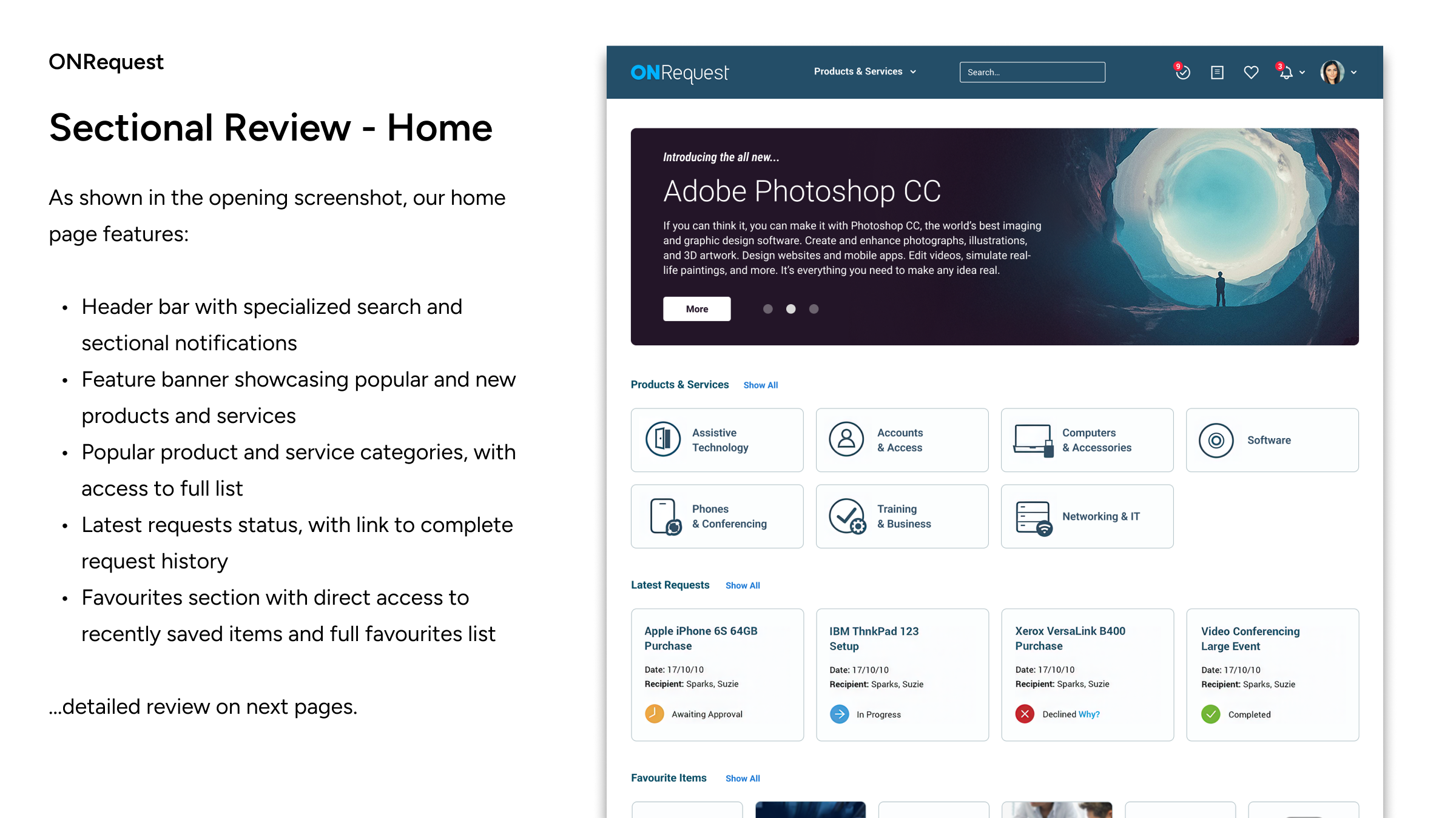
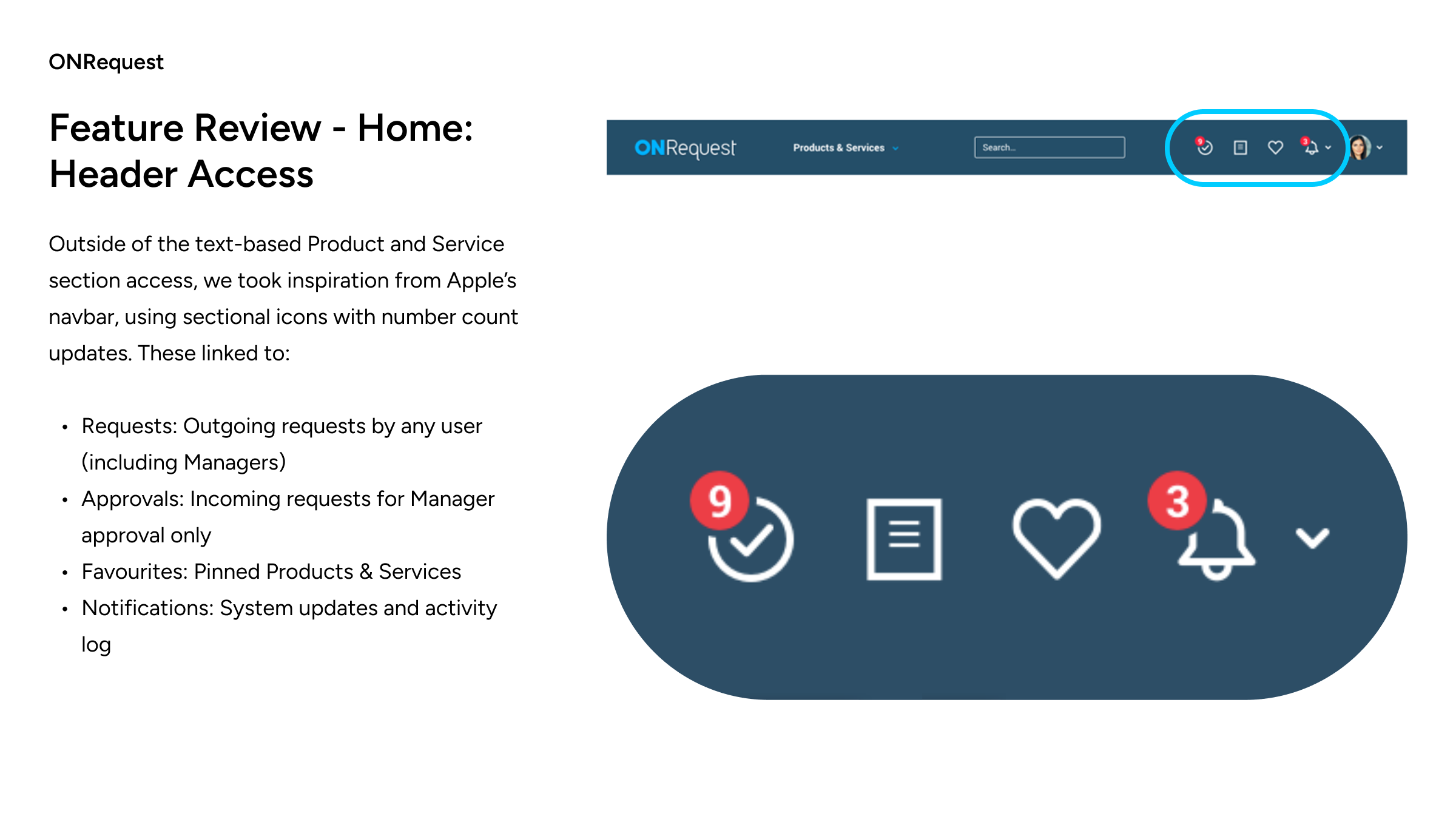
This Phase 1 work, successfully launched within one year, represents a near 0-1 redesign of the legacy desktop portal. A case study is provided below, rebuilt from Sketch into a Figma slide deck.