
Sojourn Tarot - iOS App

info icon

Larger context on desktop

A Personal Project

Duration:

2026 (Active)

Tarot has been practiced for centuries, evolving from a card game into a widely used tool for reflection and self-guidance. A standard deck contains 78 cards, 22 Major Arcana representing life's significant themes and 56 Minor Arcana covering everyday influences, and today it enjoys broad mainstream appeal with millions of practitioners worldwide.

I've long been drawn to hidden knowledge, deeper meanings, and patterns, and after trying Tarot, I Ching, and similar apps, I saw an opportunity in 2020 to combine that interest with my UX background to build a better alternative: free to download, premium in execution, supported by inline ads, and anchored by over 70 custom illustrations, striking a middle ground between free apps that lacked polish and paid ones that cost too much. I mapped core features, a freemium monetization strategy, and a UX framework with high-fidelity mockups, but shelved the project because complex multi-card AI summarization didn't exist yet. Now that it does, I'm reinvesting in the app throughout 2026 to transform static card draws into dynamic, personalized readings.

Latest App Flows

Onboard:

Key Sections & Policy Agreement

On first run, the app walks new users through 4 core sections: Daily Guidance, Yes/No, Tarot Library, all free, and then Multi-Card Spreads closing the sequence out as the subscriber teaser. Then, once the user has agreed to the policy statement at the end, they land cleanly on Home.

Note: For subtleties beyond the happy path, a full demo can be provided during a review call.

Daily Guidance:

Single Card Auto-Draw

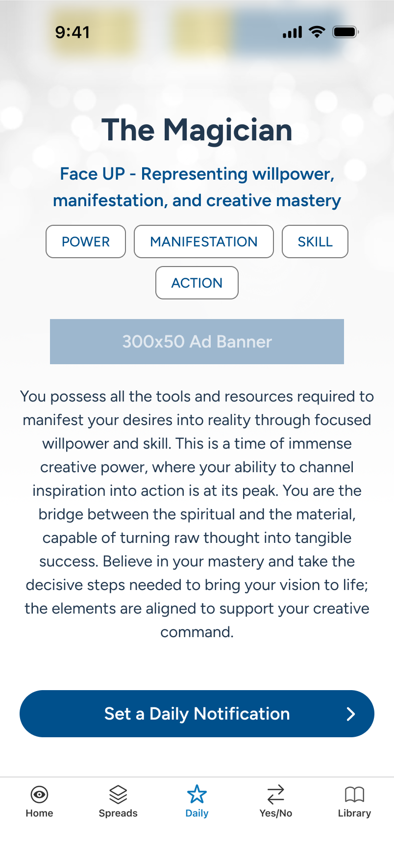
Each day, users can visit Daily Guidance for a quick, personal vibe check. As they scroll, the drawn card reveals its position, keywords, and full details. By default, negative cards and card reversals are disabled, to promote an always-positive take, but can be changed in settings, along with notification scheduling.

Note: When a notification is set, it will reflect back at the bottom of Daily Guidance, with an edit feature, in place of the current CTA (not shown here).

Yes/No:

Single Card Draw

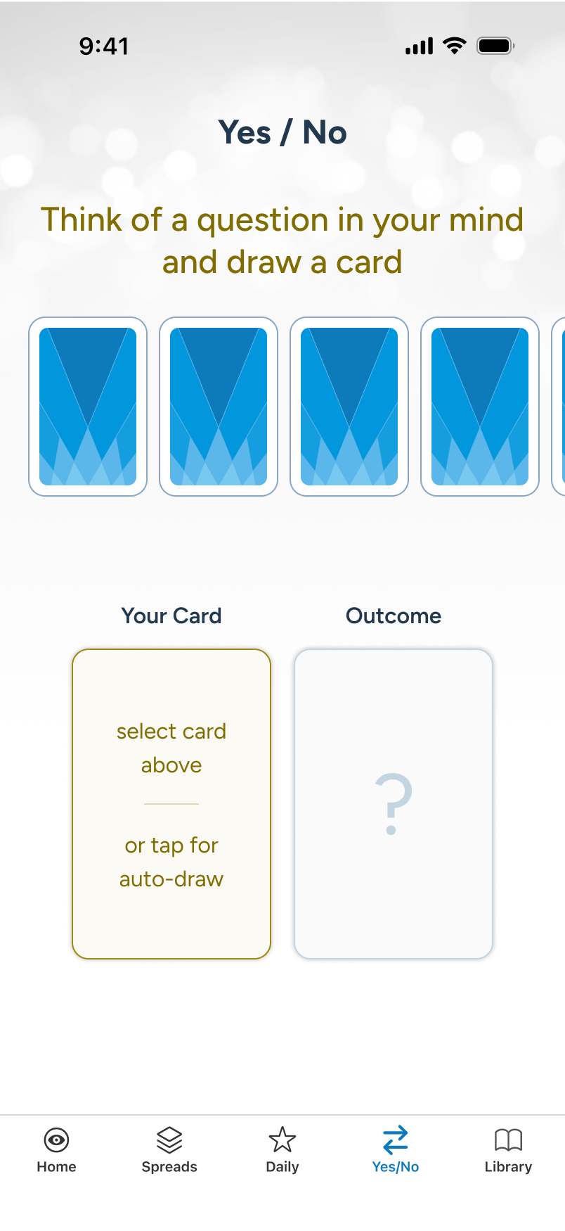
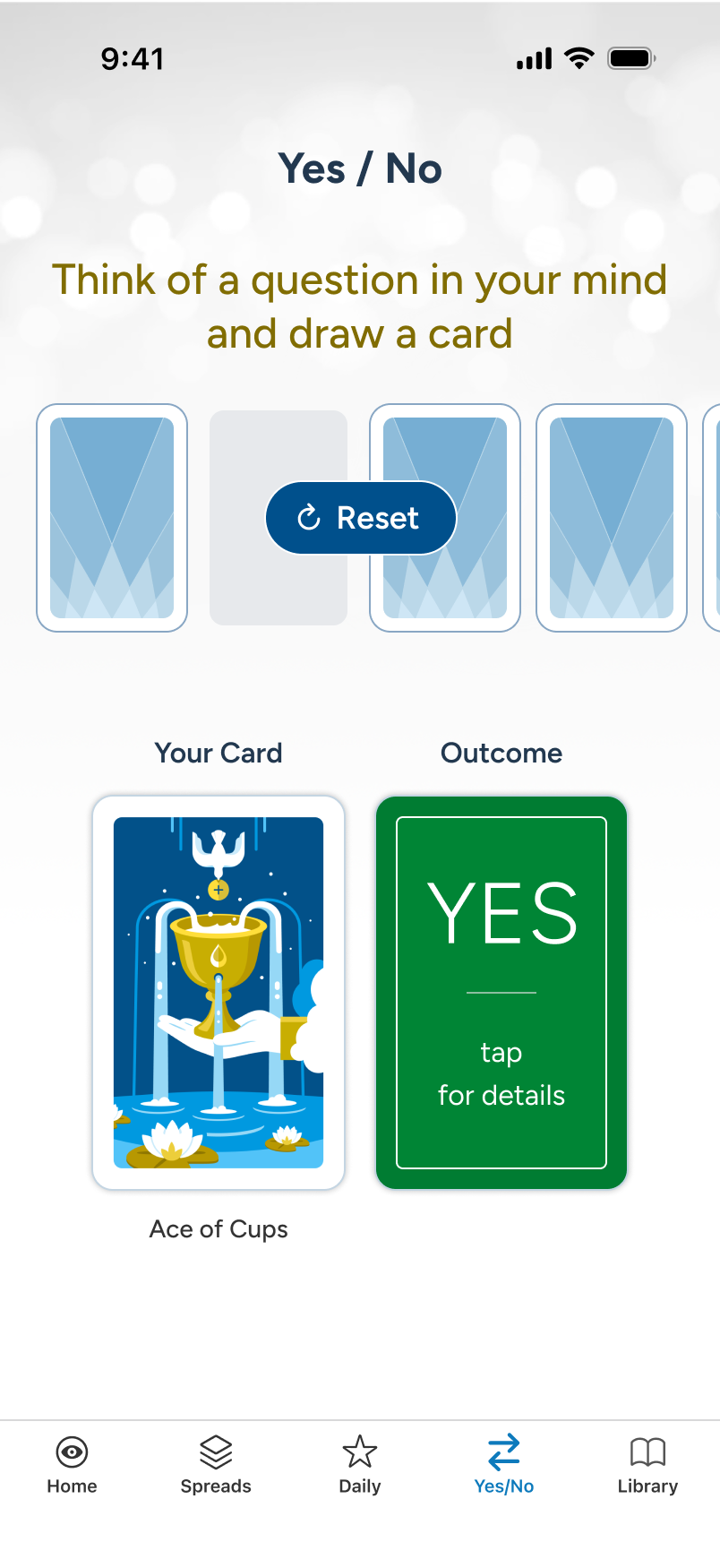
For a quick answer to a pressing question, users can turn to Yes/No for an instant card draw yielding a Yes, No, or Maybe. Spin and draw from the carousel, or tap the Your Card area for an auto-draw. The outcome is immediate, with details accessible via a quick tap. The reset is easy to access when done.

Note: Like Daily, Yes/No details view makes use of the foundational details built into the Library section. The card draw mechanics are reused from Spreads.

Library:

Search & Review

The Library, like Daily Guidance and Yes/No, is always free to use, and leverages similar details view patterns, which greatly simplifies implementation. It's also another avenue of interest for those just learning about tarot. And at 78 cards, each view is an opportunity to generate inline ad revenue.

Note: The details view can not only invert the card and copy (not shown), but it also includes side-swipe capability for last-next card switching.

The Multi-Card Spreads Upsell:

Conversion Funnel

A new user on Home encounters an ad card promoting Multi-Card Spreads. Tapping it launches an overlay touting what a subscription unlocks. The overlay offers two paths: to review and upgrade via "Explore Plans" (shown), or to try Spreads, in demo mode, which will eventually lead back to Plan.

We will forgo a review of Spreads in demo mode, and instead review from a fully subscribed, full-feature perspective, shortly.

Multi-Card Spreads Subscription:

Sojourn Plus Onboard

We now skip forward to the user having subscribed to Sojourn Plus, which unlocks Spreads for multi-card AI-assisted readings but maintains inline ads throughout. Once back on Home, the user sees that their account designation has been updated, and proceeds to see the updated Plan card.

Note: Once the user is subscribed (bottom right), we show monthly cost and upgrade/downgrade options in the Change Plan overlay sheet (not shown).

Account:

Sectional Tabs

Our newly subscribed user explores the Account section, which houses 3 tabs after Plan: Policies duplicates the initial onboarding agreement; Feedback captures sentiment and future upgrade suggestions; and Settings unlocks a subscriber-only activity area for tracking usage.

Note: Granular changes in these sections, between free and subscribed users, can best be reviewed in a live demo.

Multi-Card Spreads:

Pin to Home

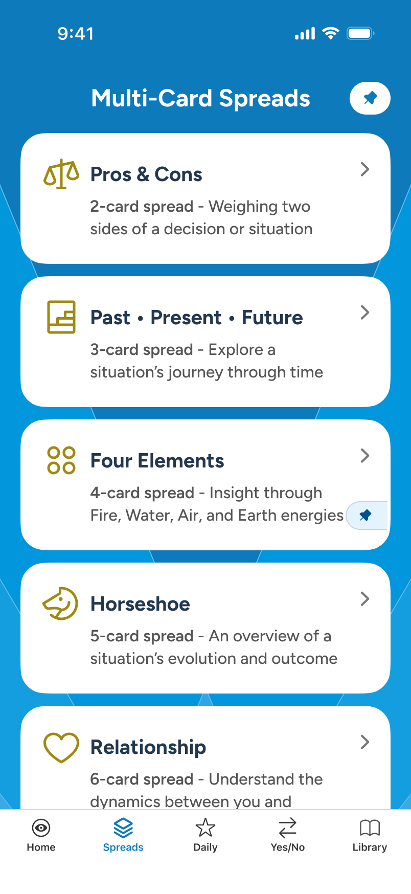
Subscribers often want their favorite spread available immediately at launch. We pre-pin the popular "Past • Present • Future" 3-card spread to the Home screen by default. As users explore new multi-card options, they can easily swap their pinned selection directly within the Spreads area.

Note: Unsubscribed users see a PREVIEW banner at the bottom of Spreads, allowing partial access, with no Spread pinning to Home (not shown here).

1 of 3 - Picking a Spread:

Query, Focus, & Card Draw

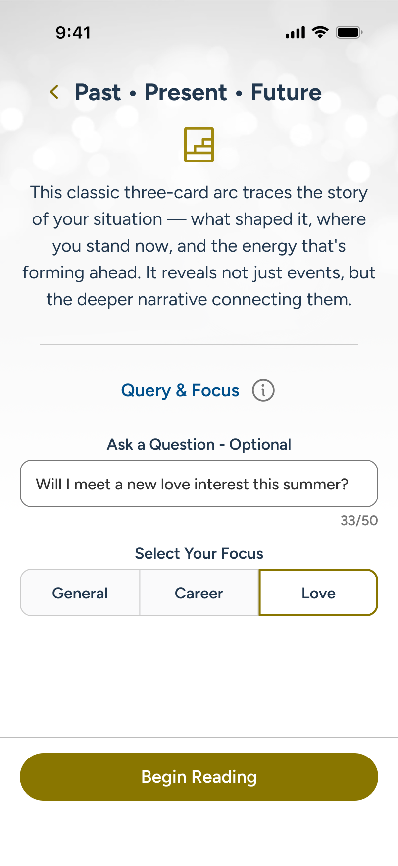
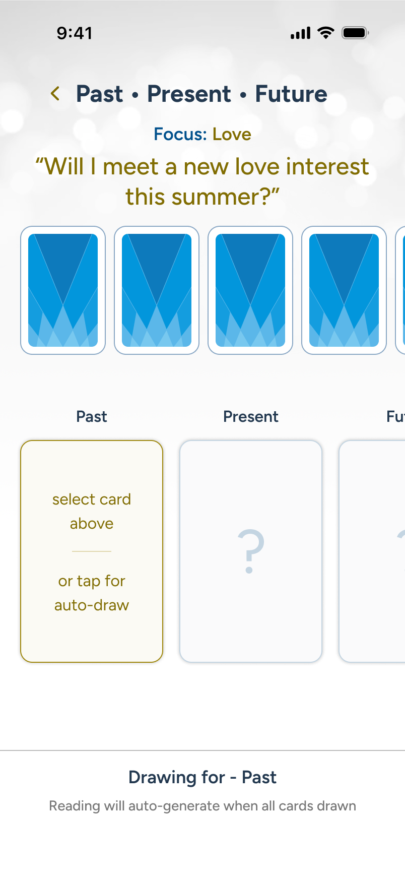
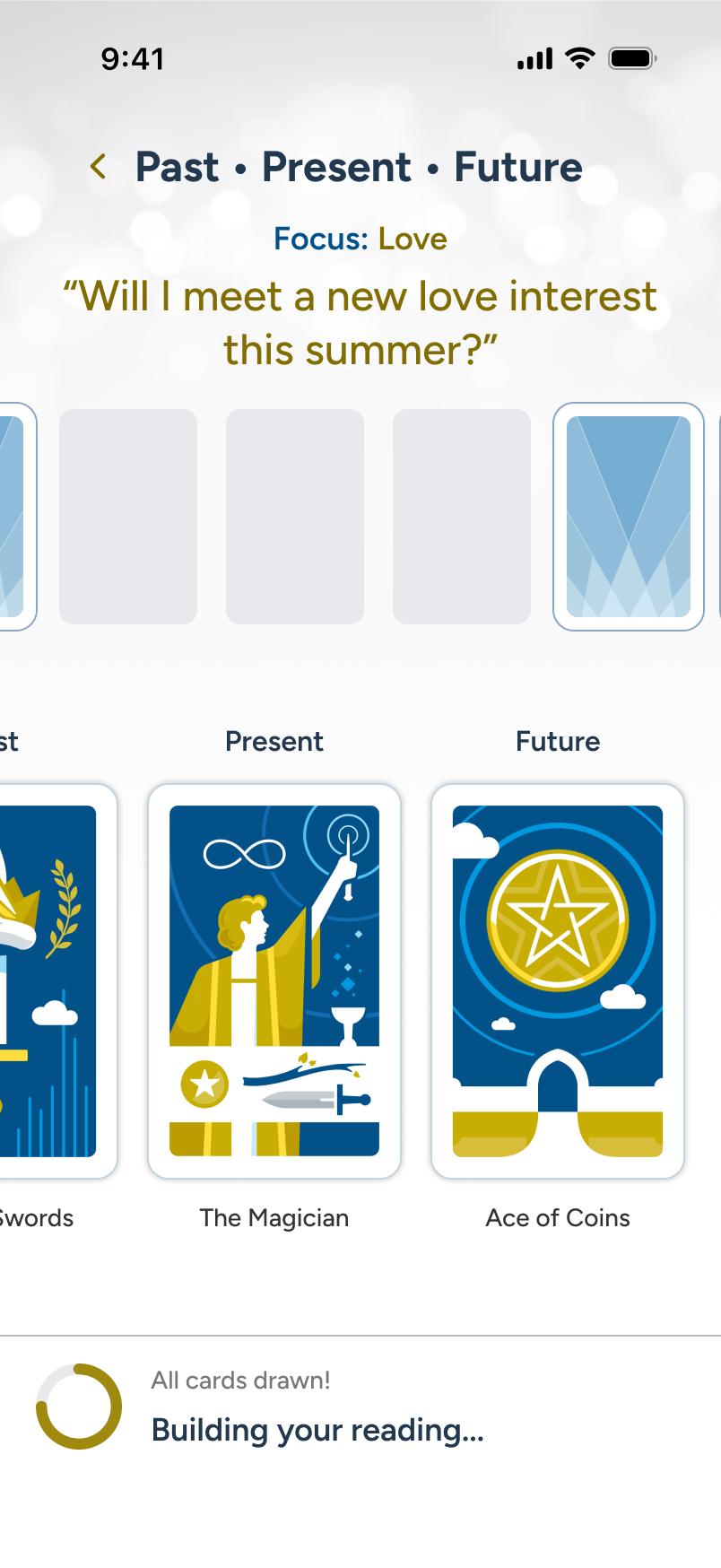
From the Spreads section, our user selects "Past • Present • Future" for a reading. At the opening stage, the user can supply an optional query and toggle focus to shape the final output. When they move to "Begin Reading," we see the user's intent carried over as they draw their cards.

Note: Weekly/Monthly reading gating, AI processing errors, poorly formatted queries, and other granular aspects can be discussed and reviewed in a call.

2 of 3 - The Reading:

AI-Personalization

The reading is presented to the user in a left-to-right manner as the cards draw, mimicking a progressive journey. Regardless of card count, the structure is always the same: Overview > Each card/position with a flippable, AI-customized card detail > Closing Thoughts. When done, the user taps "Exit."

Note: Painstaking care was put into this design so that it can work from the largest iPhones down to an SE 2/3, which is still receiving iOS updates in 2026.

3 of 3 - The Reading:

Send Transcript & Exit

Subscribers often want their readings saved for review later. Rather than maintaining a complex database, it is far easier to offer a transcript service on exit, and promote it as a bonus feature. In this example, we make the option as frictionless as possible at the point of reading exit.

Fail states and edge cases, for here and elsewhere, can be reviewed via Figma deck and/or live demo during a call.

paul photo

Throughout my UX career...

...I've built foundations and design systems across enterprise platforms, with storytelling at the center of my approach. I've designed for government portals and large data-driven cloud tools, and led a UX team at Netomi from the ground up.

To learn more, including my work timeline and continual learning initiatives:

Contact

416.817.4429 | Email Me

Artwork is client-owned and shown solely for creative demonstration.

Website built and published via:

figma sites logo

Sojourn Tarot - iOS App

info icon

Larger context on desktop

A Personal Project

Tarot has been practiced for centuries, evolving from a card game into a widely used tool for reflection and self-guidance. A standard deck contains 78 cards, 22 Major Arcana representing life's significant themes and 56 Minor Arcana covering everyday influences, and today it enjoys broad mainstream appeal with millions of practitioners worldwide.

I've long been drawn to hidden knowledge, deeper meanings, and patterns, and after trying Tarot, I Ching, and similar apps, I saw an opportunity in 2020 to combine that interest with my UX background to build a better alternative: free to download, premium in execution, supported by inline ads, and anchored by over 70 custom illustrations, striking a middle ground between free apps that lacked polish and paid ones that cost too much. I mapped core features, a freemium monetization strategy, and a UX framework with high-fidelity mockups, but shelved the project because complex multi-card AI summarization didn't exist yet. Now that it does, I'm reinvesting in the app throughout 2026 to transform static card draws into dynamic, personalized readings.

Duration:

2026 (Active)

Latest App Flows

Onboard:

Key Sections & Policy Agreement

On first run, the app walks new users through 4 core sections: Daily Guidance, Yes/No, Tarot Library, all free, and then Multi-Card Spreads closing the sequence out as the subscriber teaser. Then, once the user has agreed to the policy statement at the end, they land cleanly on Home.

Note: For subtleties beyond the happy path, a full demo can be provided during a review call.

Daily Guidance:

Single Card Auto-Draw

Each day, users can visit Daily Guidance for a quick, personal vibe check. As they scroll, the drawn card reveals its position, keywords, and full details. By default, negative cards and card reversals are disabled, to promote an always-positive take, but can be changed in settings, along with notification scheduling.

Note: When a notification is set, it will reflect back at the bottom of Daily Guidance, with an edit feature, in place of the current CTA (not shown here).

Yes/No:

Single Card Draw

For a quick answer to a pressing question, users can turn to Yes/No for an instant card draw yielding a Yes, No, or Maybe. Spin and draw from the carousel, or tap the Your Card area for an auto-draw. The outcome is immediate, with details accessible via a quick tap. The reset is easy to access when done.

Note: Like Daily, Yes/No details view makes use of the foundational details built into the Library section. The card draw mechanics are reused from Spreads.

Library:

Search & Review

The Library, like Daily Guidance and Yes/No, is always free to use, and leverages similar details view patterns, which greatly simplifies implementation. It's also another avenue of interest for those just learning about tarot. And at 78 cards, each view is an opportunity to generate inline ad revenue.

Note: The details view can not only invert the card and copy (not shown), but it also includes side-swipe capability for last-next card switching.

Multi-Card Upsell:

Conversion Funnel

A new user on Home encounters an ad card promoting Multi-Card Spreads. Tapping it launches an overlay touting what a subscription unlocks. The overlay offers two paths: to review and upgrade via "Explore Plans" (shown), or to try Spreads, in demo mode, which will eventually lead back to Plan.

We will forgo a review of Spreads in demo mode, and instead review from a fully subscribed, full-feature perspective, shortly.

Multi-Card Subscription:

Sojourn Plus Onboard

We now skip forward to the user having subscribed to Sojourn Plus, which unlocks Spreads for multi-card AI-assisted readings but maintains inline ads throughout. Once back on Home, the user sees that their account designation has been updated, and proceeds to see the updated Plan card.

Note: Once the user is subscribed (bottom right), we show monthly cost and upgrade/downgrade options in the Change Plan overlay sheet (not shown).

Account:

Sectional Tabs

Our newly subscribed user explores the Account section, which houses 3 tabs after Plan: Policies duplicates the initial onboarding agreement; Feedback captures sentiment and future upgrade suggestions; and Settings unlocks a subscriber-only activity area for tracking usage.

Note: Granular changes in these sections, between free and subscribed users, can best be reviewed in a live demo.

Multi-Card Spreads:

Pin to Home

Subscribers often want their favorite spread available immediately at launch. We pre-pin the popular "Past • Present • Future" 3-card spread to the Home screen by default. As users explore new multi-card options, they can easily swap their pinned selection directly within the Spreads area.

Note: Unsubscribed users see a PREVIEW banner at the bottom of Spreads, allowing partial access, with no Spread pinning to Home (not shown here).

1 of 3 - Picking a Spread:

Query, Focus, & Draw

From the Spreads section, our user selects "Past • Present • Future" for a reading. At the opening stage, the user can supply an optional query and toggle focus to shape the final output. When they move to "Begin Reading," we see the user's intent carried over as they draw their cards.

Note: Weekly/Monthly reading gating, AI processing errors, poorly formatted queries, and other granular aspects can be discussed and reviewed in a call.

2 of 3 - The Reading:

AI-Personalization

The reading is presented to the user in a left-to-right manner as the cards draw, mimicking a progressive journey. Regardless of card count, the structure is always the same: Overview > Each card/position with a flippable, AI-customized card detail > Closing Thoughts. When done, the user taps "Exit."

Note: Painstaking care was put into this design so that it can work from the largest iPhones down to an SE 2/3, which is still receiving iOS updates in 2026.

3 of 3 - The Reading:

Send Transcript & Exit

Subscribers often want their readings saved for review later. Rather than maintaining a complex database, it is far easier to offer a transcript service on exit, and promote it as a bonus feature. In this example, we make the option as frictionless as possible at the point of reading exit.

Fail states and edge cases, for here and elsewhere, can be reviewed via Figma deck and/or live demo during a call.

paul photo

Contact

416.817.4429 | Email Me

Artwork is client-owned and shown solely for creative demonstration.

Throughout my UX career...

...I've built foundations and design systems across enterprise platforms, with storytelling at the center of my approach. I've designed for government portals and large data-driven cloud tools, and led a UX team at Netomi from the ground up.

To learn more, including my work timeline and continual learning initiatives:

Website built and published using Figma Sites

figma sites logo

Sojourn Tarot - iOS App

A Personal Project

Tarot has been practiced for centuries, evolving from a card game into a widely used tool for reflection and self-guidance. A standard deck contains 78 cards, 22 Major Arcana representing life's significant themes and 56 Minor Arcana covering everyday influences, and today it enjoys broad mainstream appeal with millions of practitioners worldwide.

I've long been drawn to hidden knowledge, deeper meanings, and patterns, and after trying Tarot, I Ching, and similar apps, I saw an opportunity in 2020 to combine that interest with my UX background to build a better alternative: free to download, premium in execution, supported by inline ads, and anchored by over 70 custom illustrations, striking a middle ground between free apps that lacked polish and paid ones that cost too much. I mapped core features, a freemium monetization strategy, and a UX framework with high-fidelity mockups, but shelved the project because complex multi-card AI summarization didn't exist yet. Now that it does, I'm reinvesting in the app throughout 2026 to transform static card draws into dynamic, personalized readings.

Review Structure

  • Evolution, Development, & Strategy – From 2020 pause to 2026 reboot, three build stages that carried the app from early LLM prompt concepts through interactive prototypes to native Xcode execution, backed by market analysis, monetization planning, user tiers, and more.
  • MVP Flows: Onboarding, sectional review, freemium-to-subscriber conversion funnel, subscriber-only features, and more.

Duration:

2026 (Active)

  • Consumer

  • AI Personalization

  • Mobile

  • 0 to 1

2020

Insight Tarot: Initial Project + Pause

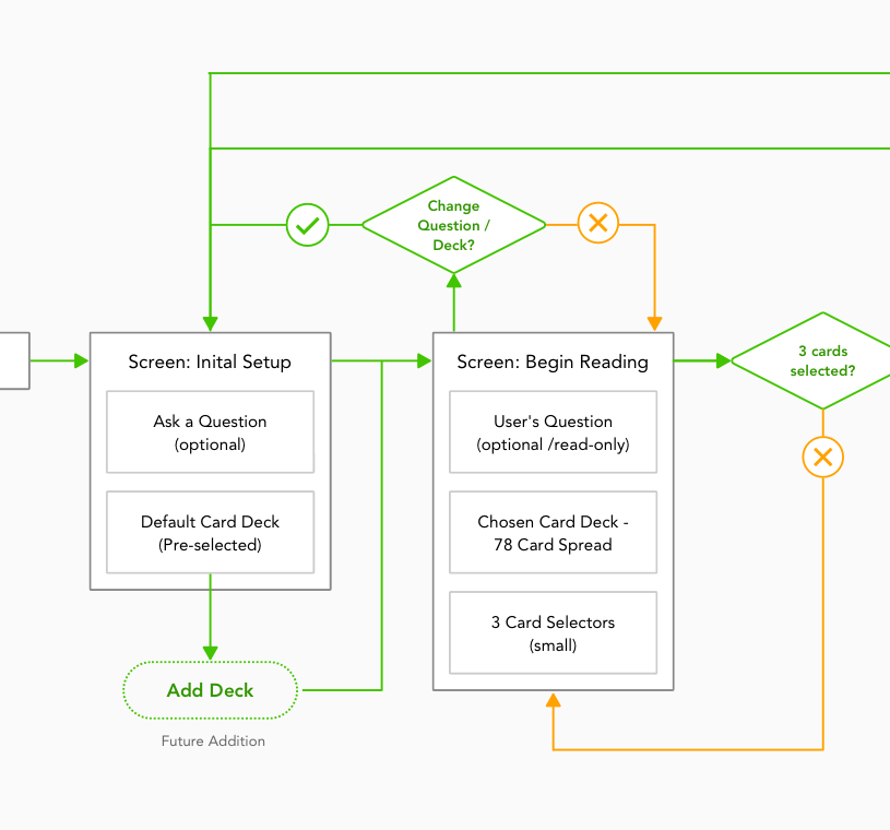
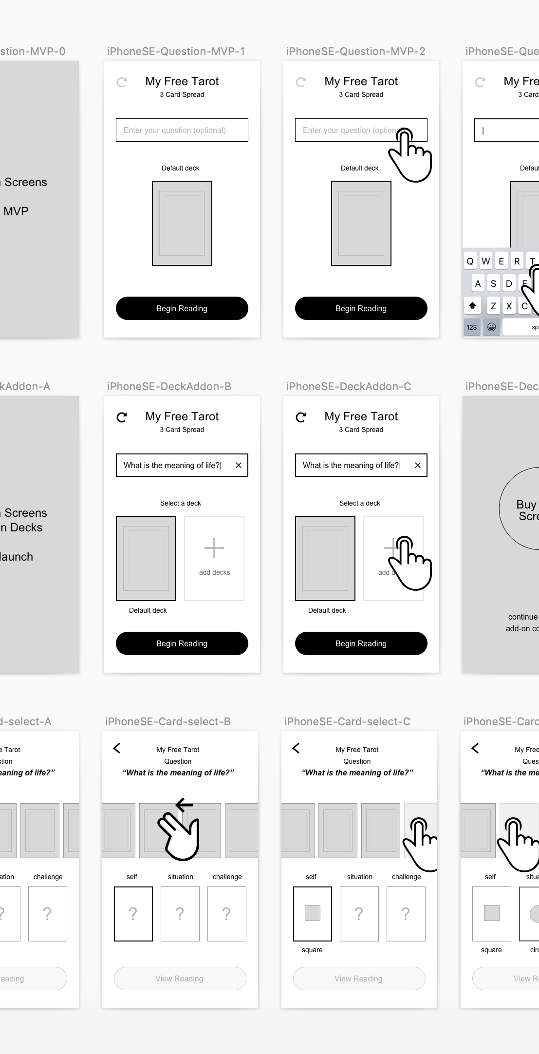
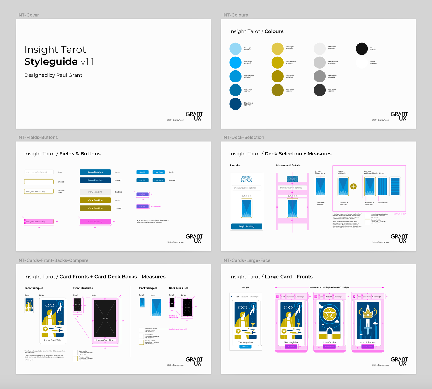
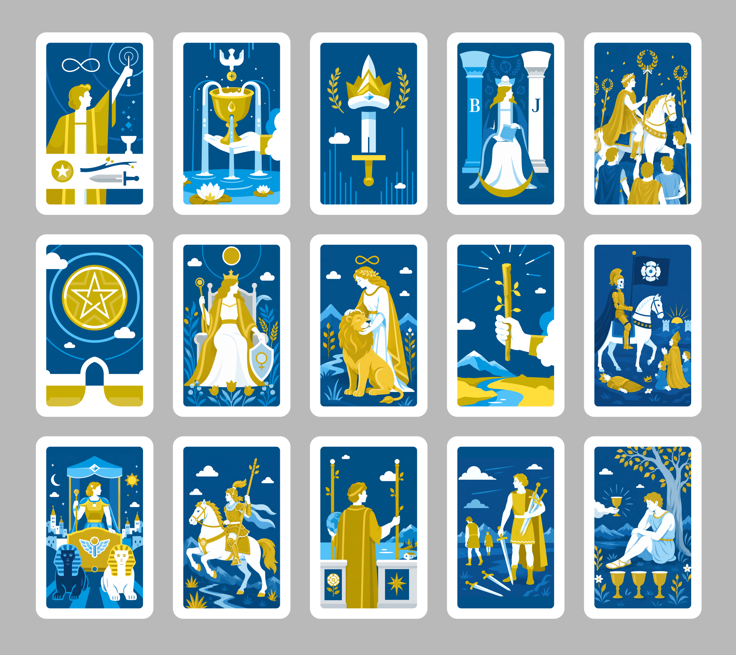
  • Early Discovery: Researched the competitive landscape, defined the app USP, created a Sketch design system, wireframed core interactions, and began crafting over 70 original card illustrations.

​

  • Technical Blockers: Standard tarot apps rely on static, isolated card definitions. Without LLM text synthesis, multi-card spreads could not deliver dynamic, personalized readings.

​

  • Strategic Pause: The project was shelved due to high development costs and pre-LLM constraints, waiting for natural language generation to mature.
step mapping
wireframes
app styleguide

2026

Reboot

as Sojourn Tarot

  • The AI Pivot: Re-imagined the product vision following 3 years leading UX at Netomi, utilizing agentic AI summarization and vibe-coding capabilities to unlock rich multi-card readings.
  • Monetization Architecture: Daily Guidance, Yes/No, and Library features serve as the free ad-supported entry point, driving subscription upsells for personalized AI-assisted multi-card spread readings.

Stage 1: Gemini Gems

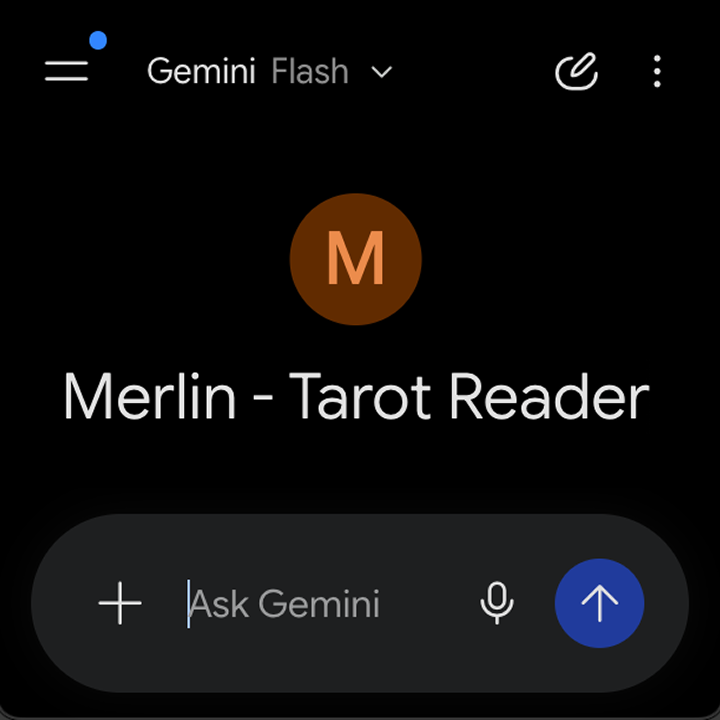
In late 2025, leveraging Gemini Gems and past experience with AI agents, I built a text-based multi-card reading simulator known as Merlin. While bare-bones, it solved the core challenge of multi-card interpretation that was not possible in 2020. I also audited competitor implementations to benchmark AI integration across the space.

Stage 2: Figma + Figma Make

In early spring of 2026, after vibe coding several smaller tools with Figma Make, I built an interactive prototype of the app, under the original name of Insight Tarot, to test expanded features beyond the original 2020 scope. Validating functional viability in this prototype established the desire to plan and push forward with a fully featured, professional build for App Store release.

Stage 2: Video Demo

Stage 3: Claude Code + Figma MCP + Xcode

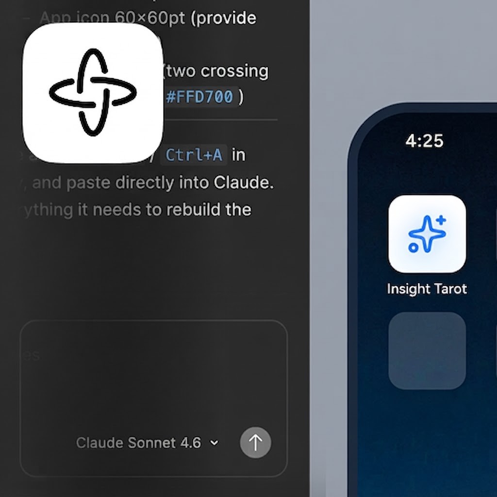
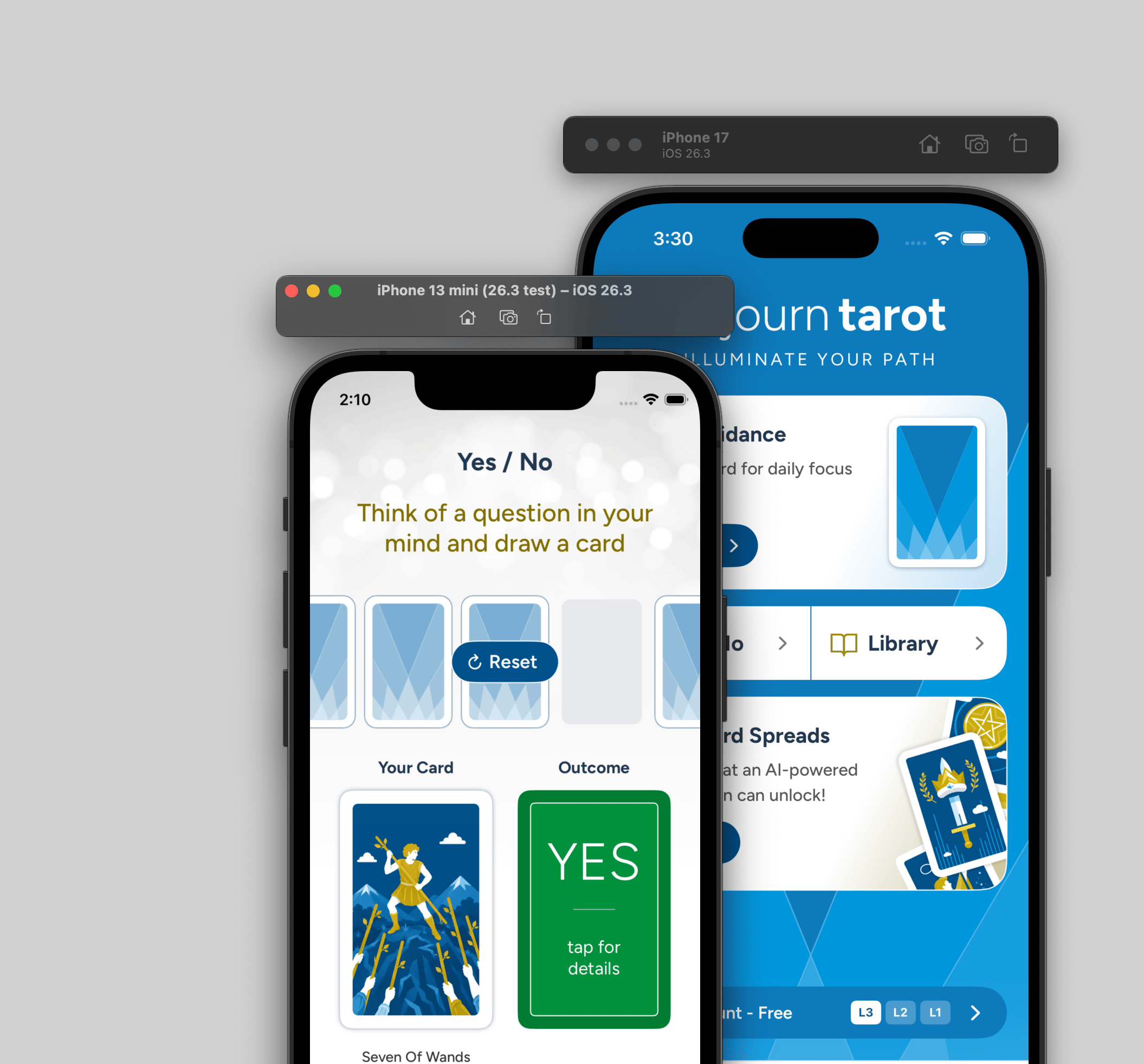
In summer of 2026, I transitioned to native iOS development using Claude Code and Xcode under the new brand name Sojourn Tarot. I have leveraged screen designs and components planned in Figma via MCP, alongside structured guidance documents, to build out the production app. Currently, I’m testing via multiple iOS simulators and physical devices before final App Store release.

Stage 3: Video Demo

Stage 2>3 Planning

Strategy & Monetization

  • Market Position: Combining custom deck sales with AI readings.
  • Tiered Value: Solving for pricing, feature gating, and ad frequency.
  • Profit Margins: Controlling API usage caps to safeguard revenue.

User Experience & Flows

  • Target Personas: Tailoring features to user budgets and ad tolerance.
  • Guided Readings: Solving multi-step reading interactions and retry logic.
  • Smart Input: Auto-detecting query context and managing load perception.

Design & Architecture

  • App Structure: Handling core navigation, local storage, and access control.
  • Assets & Content: Integrating custom vector artwork with tarot references.
  • Screen Constraints: Adapting layouts for small displays (12/13 mini and SE 2/3)

Testing & Workflow

  • Developer Tooling: Using quick toggles for rapid state testing.

‘26 Market Review:

Astrology & Divination Apps

Market Size & Growth

$9B by 2030

from $3B in 2024

20%

CAGR

User Base

120M+

Monthly Active

25-35%

Subscription Adoption

60%

Gen Z/Millennials

ARPU - Average Revenue Per UserCAGR - Comp. Annual Growth RateAll dollar figures in USD. Data sourced from 2024-2025 market reports; citations verified through Claude AI extended research.

AI Adoption Surge

2025

47%

AI-Enabled Personalization

58-62%

Users prefer hyper-personalized insights that AI can provide

10-18%

Improved Retention

Revenue Mix

Freemium/Ads

50%

Subscriptions

30%

Live Consult

20%

Subscriptions

$8-22/mo

Per User

Market Distribution

N. America

40M+

Users

Highest ARPU

Asia-Pacific

40-50%

Downloads

Growing

India

+49%

CAGR

Fastest

EU

25-35%

Subscribe

Steady Growth

MVP Persona Work:

Tiers / Freemium to Sub

Kara

22

Plan: Free

($0/mo)

The free, default tier of Sojourn Tarot allows users, registered or not, use of common features: Daily Guidance, Yes/No, and Library - all ad-supported throughout.

A digital native student/entry-level worker living with roommates. Budget-conscious with tight income, but highly ad-tolerant as an everyday trade-off for free software. Uses tarot casually for quick vibe checks and daily guidance. She expects core features like Daily Guidance and Yes/No to be fast, reliable, and completely accessible without paywalls.

Jonny

35

Plan: Plus

($7/mo)

The Plus tier builds upon app-wide ad-supported content and free features, unlocking access to advanced, multi-card spread readings, processed and personalized via AI.

A mid-career professional and homeowner/renter with steady disposable income. Highly tech-savvy, he dabbled in physical tarot and now wants deeper, AI-personalized multi-card spreads for self-reflection. Value-driven, he feels comfortable saving $3 a month by accepting inline ads as long as the AI insights and spread tools deliver solid depth.

Suzanne

52

Plan: Premium

($10/mo)

The Premium tier builds upon Plus, by offering all the same free and advanced AI multi-card reading capabilities, with an app-wide removal of all inline ads.

An established homeowner with strong disposable income and low patience for UX friction. She enjoys structured daily rituals and wants the full multi-card AI reading experience without the annoyance or clutter of inline adverts. Paying $10/month for a completely ad-free, seamless experience is an easy micro-investment for her peace of mind.

Basic/Freemium

Core features:

  • Daily Guidance - single card, with optional lock screen delivery
  • Yes/No - single card, for fast answers
  • Library - search and review the full custom 78-card deck

$0

Supported by Ads

Premium look, with access to the custom card deck and common, expected features, without the subscription price.

Sojourn Plus

Budget-friendly upgrade

  • All the features of Freemium
  • Access to 6 popular multi-card spreads featuring AI-generated readings combining aspects of question, focus, and card type/position, including emailed reading transcripts

$7

Supported by Ads

Premium AI-personalized features at below-market pricing to drive conversion.

​

Sojourn Premium

No-compromise upgrade

  • All the features of Freemium
  • All the features of Plus
  • Ad-free experience app-wide

$10

100% Ad-Free

Competitive pricing on lower end of market ($8-22/mo). Accessible upgrade, driving conversion over competitors at 2-3x cost.

Management:

UX/UI Card Alignments

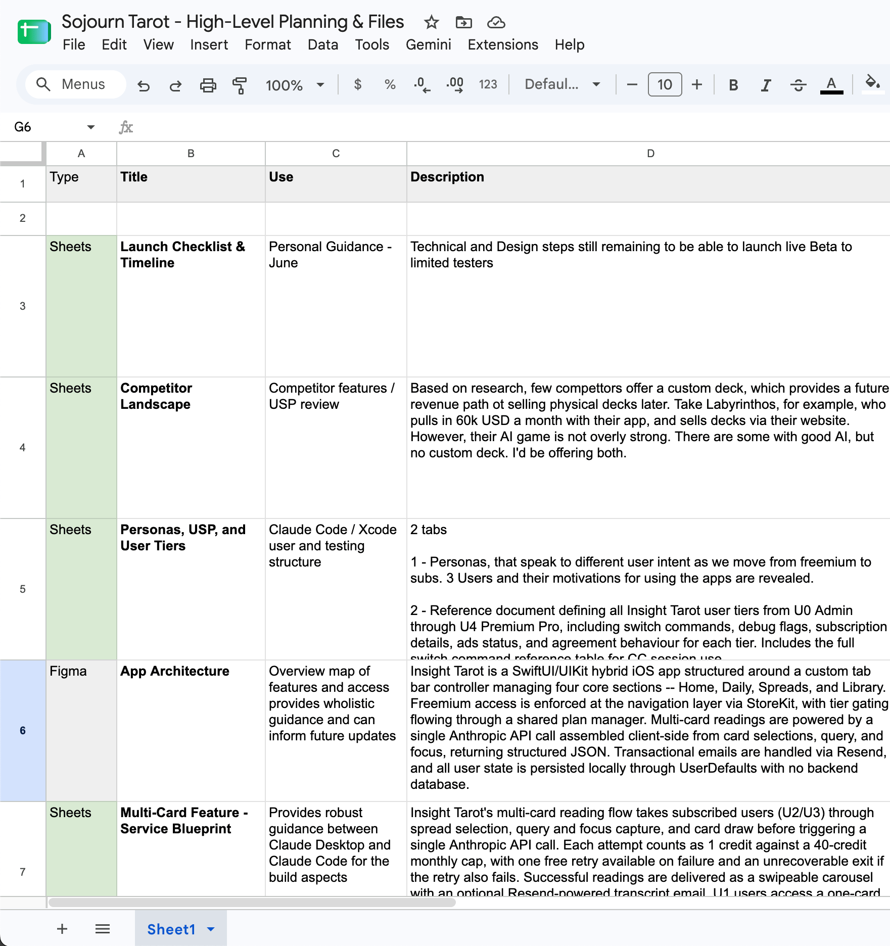
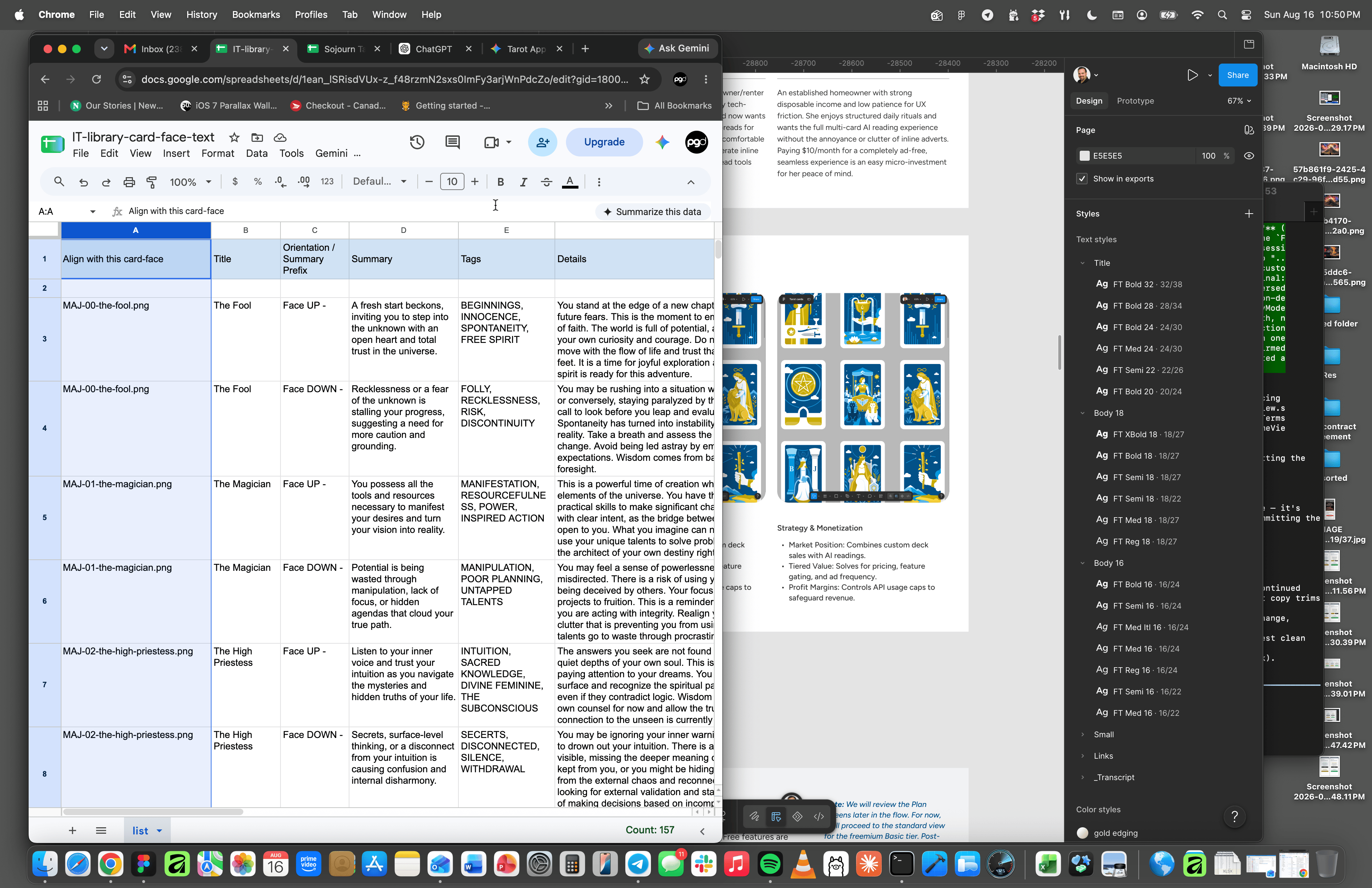
Card Details / Knowledge Base Doc

Structured a complete 78-card knowledge base in Google Sheets, mapping titles, summaries, and detailed interpretations for seamless integration into Xcode via Claude Code.

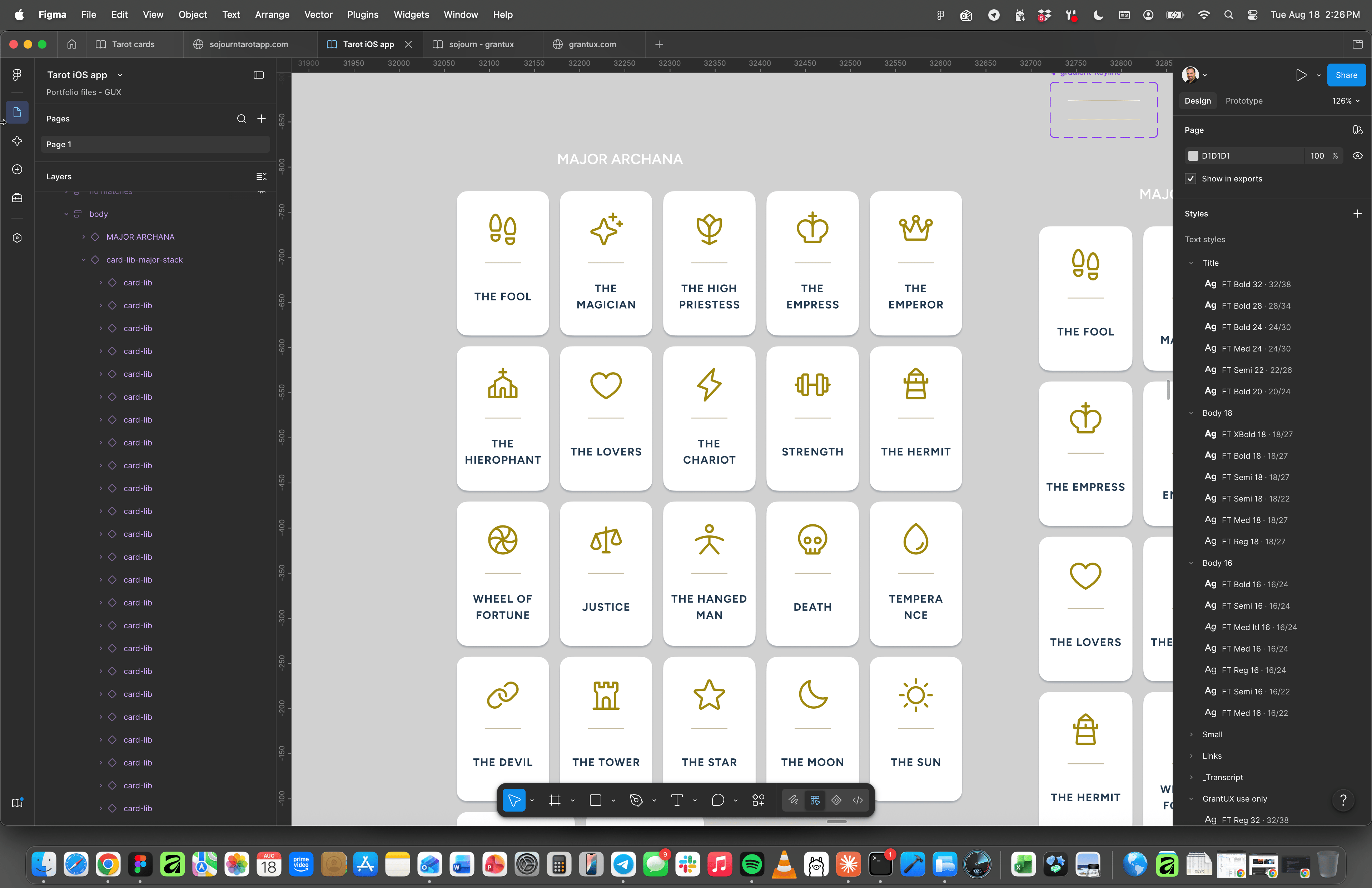
Sojourn’s Card Library

Researched and implemented Phosphor icons to represent the full tarot deck, integrating them into scrollable trigger cards that allow users to launch and explore detailed interpretation overlays in the Library.

Custom Digital Illustrations

Crafted a semantically named vector deck in Figma after competitive analysis. Styled in Sojourn's signature blue and gold palette, these visuals accompany card descriptions across the app experience.

Sojourn’s Card Details Sheet

Designed to adapt for different contexts, the Card Details component powers views in the Library (shown), Daily Guidance, and Yes/No experiences, making it a foundational piece of the UI design system.

UI Design:

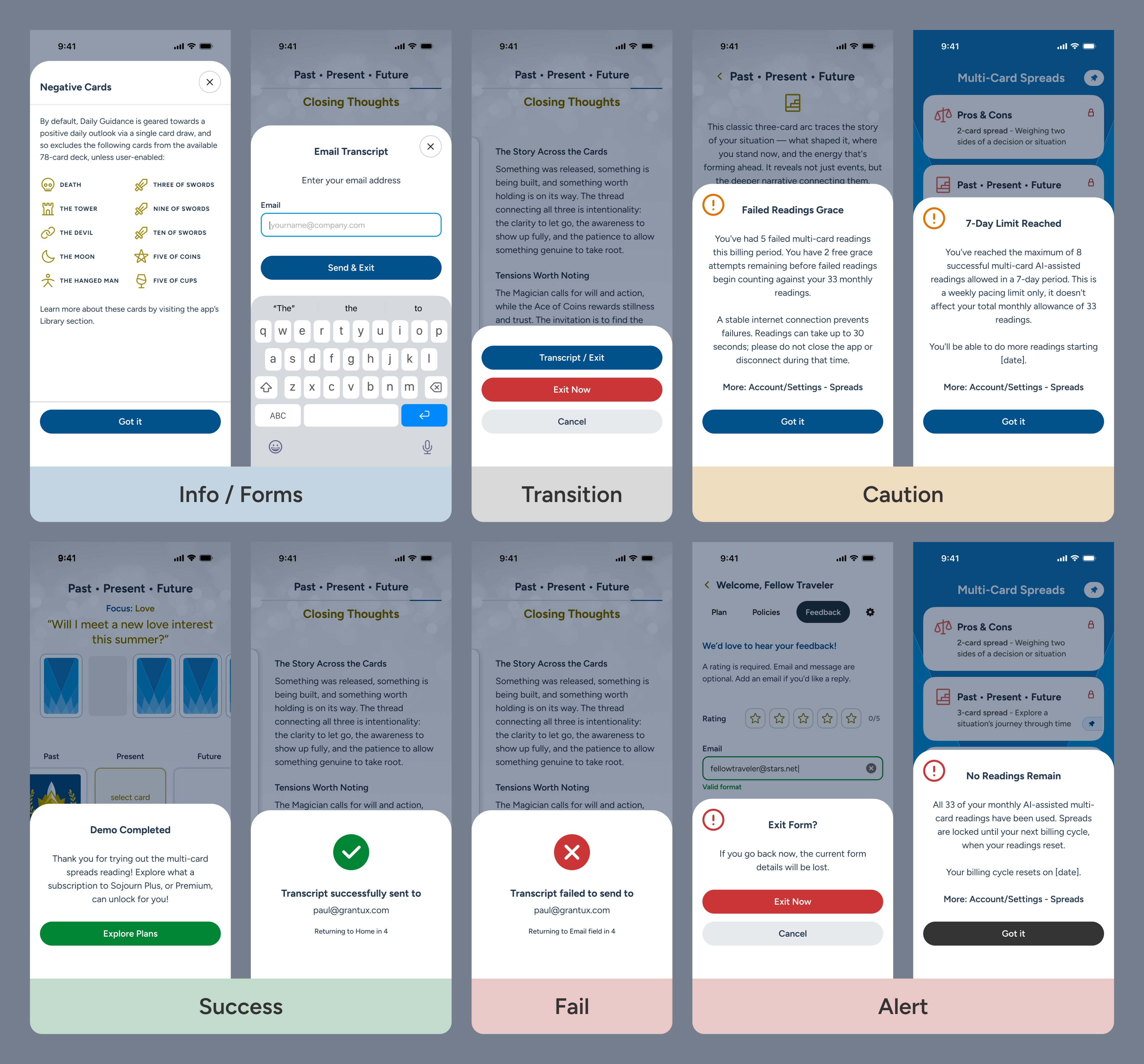
Bottom Sheet States / Patterns

Components are grouped by user intent and stakes:Info / Forms: Low-stakes, user-triggered views featuring an easily reachable top-right dismissal.

Transition: User-directed exit paths and routing options.

Caution: Non-blocking informational states handling data thresholds and warning limits.

Success: Positive completion states confirming a finalized user action.

Fail: Clear, informative error states when actions cannot be processed.

Alert: High-friction modal takeovers for data-loss risks or paywalls.

Similar patterns have been built for banners and notifications (not shown).

MVP Promo Site:

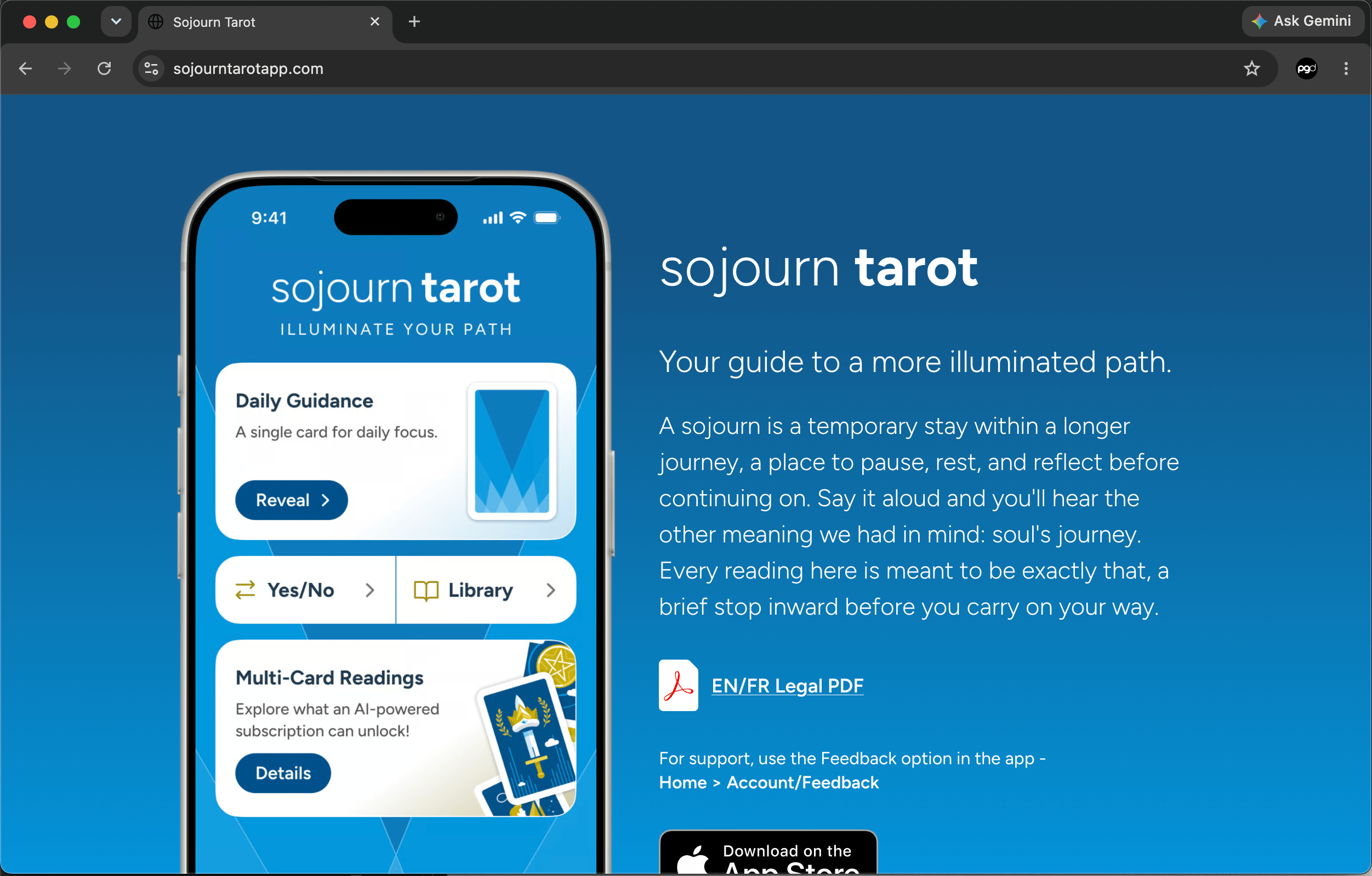
Sojourntarotapp.com

After investigating available names to ensure no competition with existing apps (as "Insight" was registered by a third party two years ago), I settled on "Sojourn Tarot" for the reasons detailed in the image.The app is currently registered with Apple for sandbox testing, and I have launched this simple, one-page promotional site to link directly back to the App Store.

Note: This simple page will later evolve to promote aspects of USP / feature-set.

Transition to App Flows

Onboard:

Key Sections & Policy Agreement

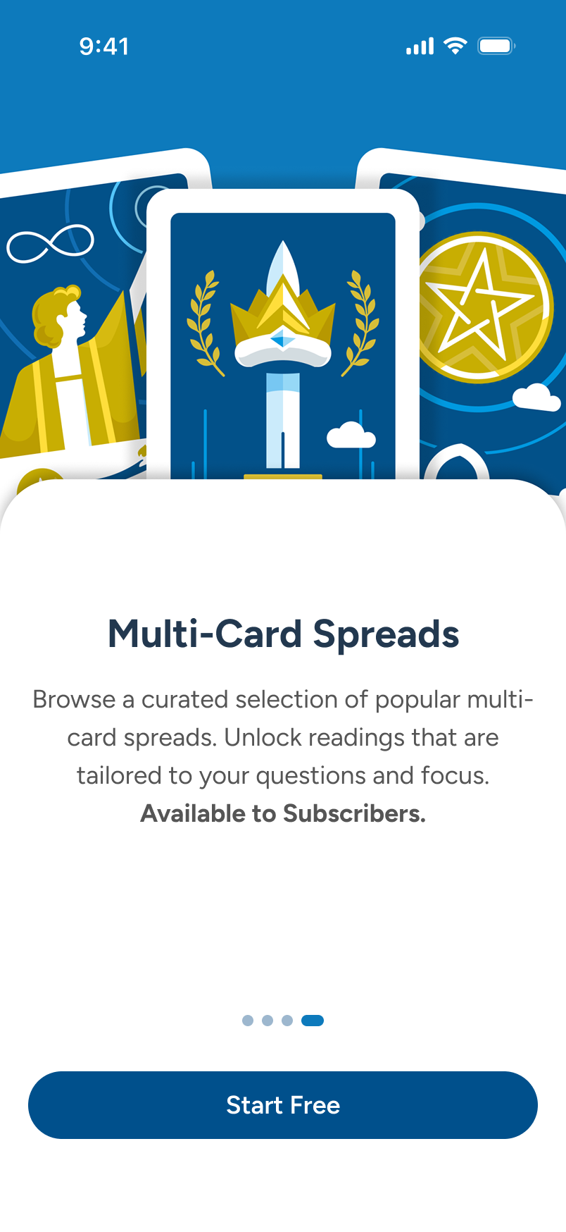
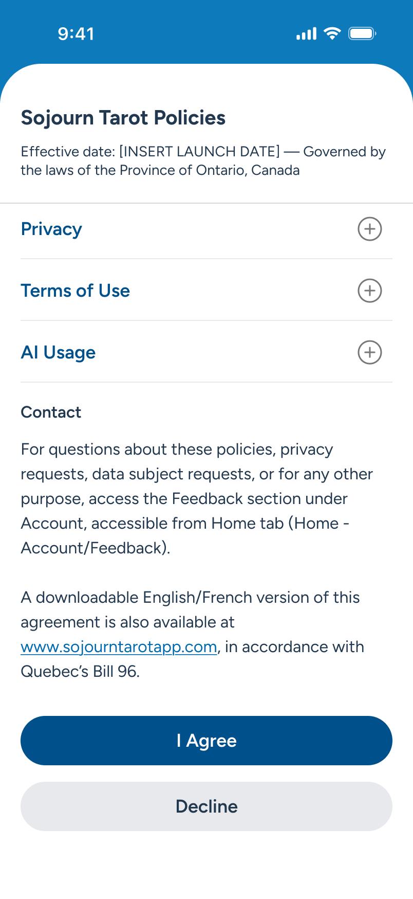
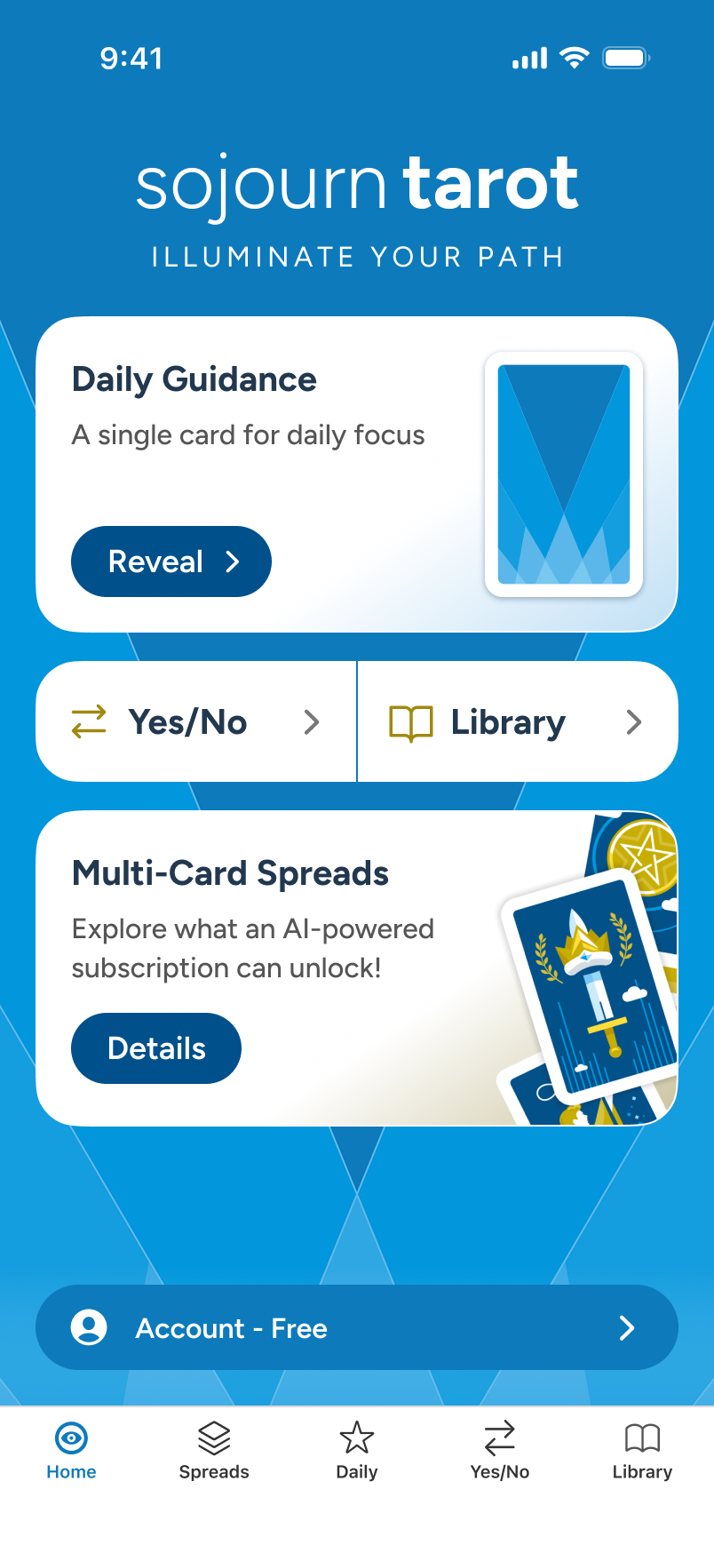
On first run, the app walks new users through 4 core sections: Daily Guidance, Yes/No, Tarot Library, all free, and then Multi-Card Spreads closing the sequence out as the subscriber teaser. Then, once the user has agreed to the policy statement at the end, they land cleanly on Home.

Note: For subtleties beyond the happy path, a full demo can be provided during a review call.

Loading screen is splashed for a few seconds as the application loads and the carousel appears...

After showing off the freemium features, we finish on Multi-Card Spreads, the primary subscriber upsell, before the user taps "Start Free."

Appearing over Home, we provide the policies document. If the user clicks "I Agree," they proceed to Home.

Once agreed, the user has full access to the core features of Sojourn Tarot, landing on Home.

Daily Guidance:

Single Card Auto-Draw

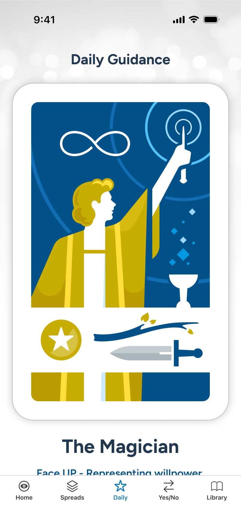
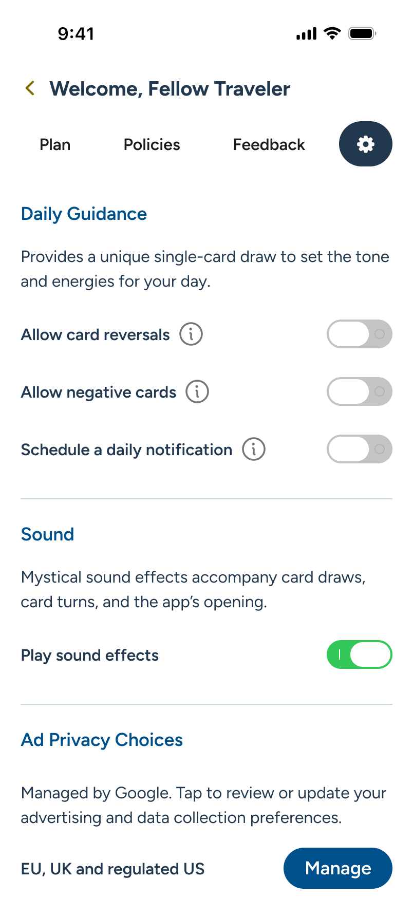
Each day, users can visit Daily Guidance for a quick, personal vibe check. As they scroll, the drawn card reveals its position, keywords, and full details. By default, negative cards and card reversals are disabled, to promote an always-positive take, but can be changed in settings, along with notification scheduling.

Note: When a notification is set, it will reflect back at the bottom of Daily Guidance, with an edit feature, in place of the current CTA (not shown here).

The user explores Daily Guidance, either from Home or from the Daily tab, at bottom.

At first view (not shown), the card back animates a flip to the front, revealing the card and full details below.

As the user scrolls, we see inline ads with the content, supporting the free features. At bottom, an offer to “Set a Daily Notification.” The user taps...

Account/Settings slides over, and the user can enable a time picker (not shown) to schedule daily reminders.

Yes/No:

Single Card Draw

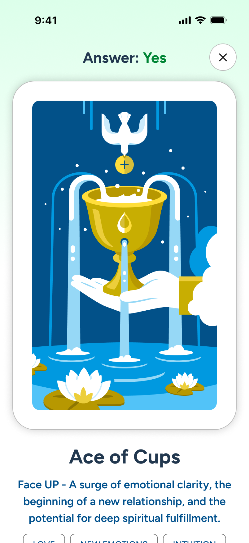
For a quick answer to a pressing question, users can turn to Yes/No for an instant card draw yielding a Yes, No, or Maybe. Spin and draw from the carousel, or tap the Your Card area for an auto-draw. The outcome is immediate, with details accessible via a quick tap. The reset is easy to access when done.

Note: Like Daily, Yes/No details view makes use of the foundational details built into the Library section. The card draw mechanics are reused from Spreads.

The user explores Yes/No, either from Home or from the Yes/No tab, at bottom.

The user can either let the system draw for them by tapping the Your Card slot, or manually select from the carousel, at top.

With the card drawn, the user instantly gets a confirmation. They can tap either the card or the confirmation message for further details.

In the details view, we leverage the library database and add the simple answer at top for the user.

Library:

Search & Review

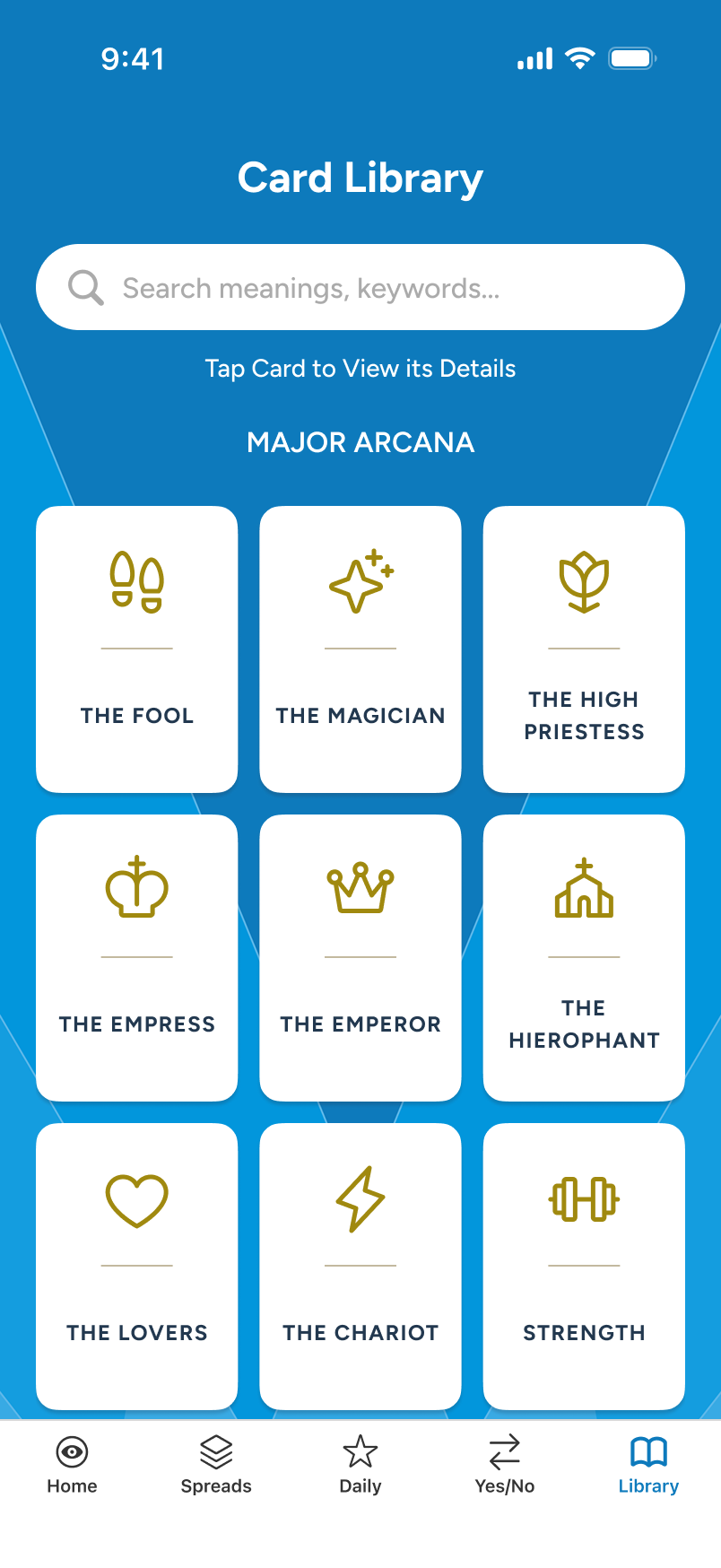
The Library, like Daily Guidance and Yes/No, is always free to use, and leverages similar details view patterns, which greatly simplifies implementation. It's also another avenue of interest for those just learning about tarot. And at 78 cards, each view is an opportunity to generate inline ad revenue.

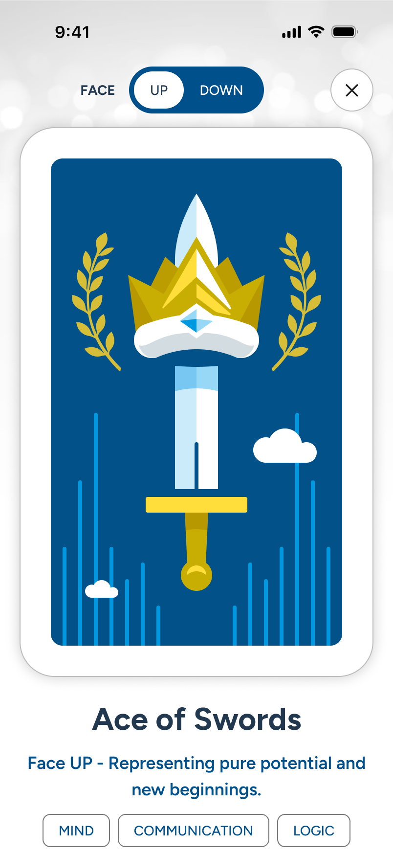
Note: The details view can not only invert the card and copy (not shown), but it also includes side-swipe capability for last-next card switching.

From Home, the user either taps the Library button or the tab at bottom.

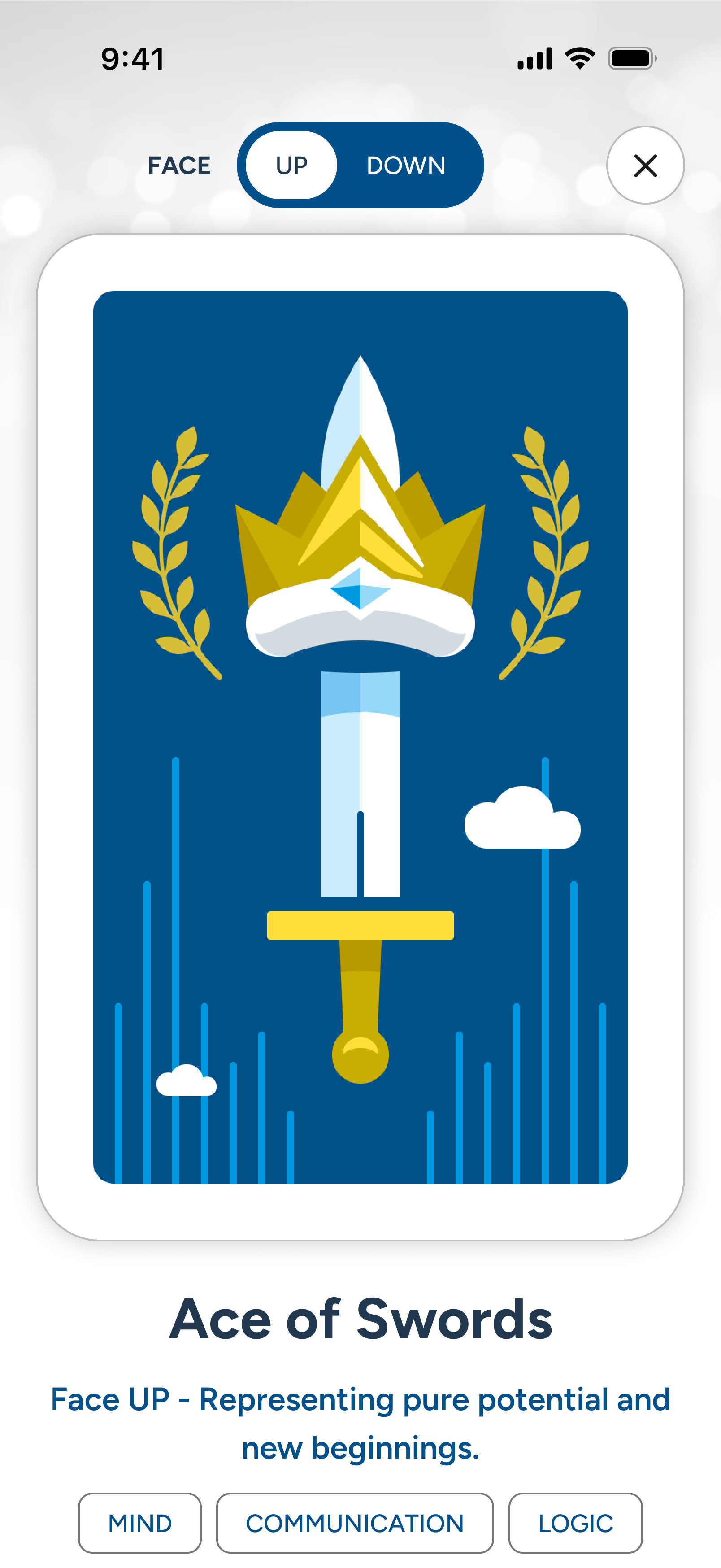
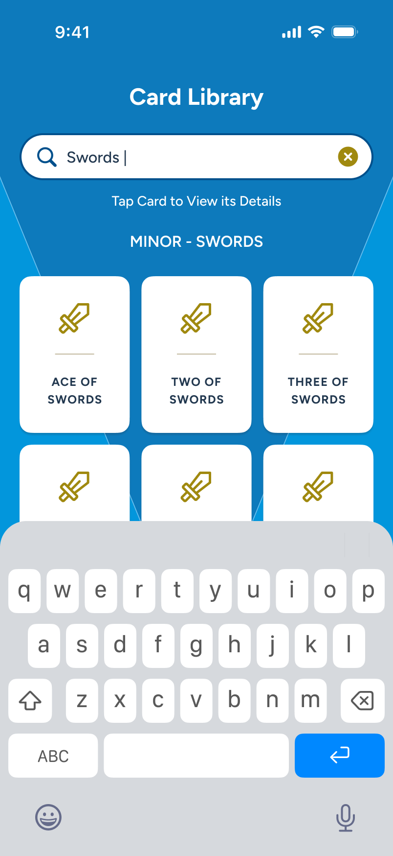
78 icon-based cards appear, grouped by major and minor arcana. The user decides to search for "Swords," so they tap the search bar, at top, to begin.

With the keyboard invoked and "Swords" typed, it instantly filters the options. The user decides to tap on "Ace of Swords."

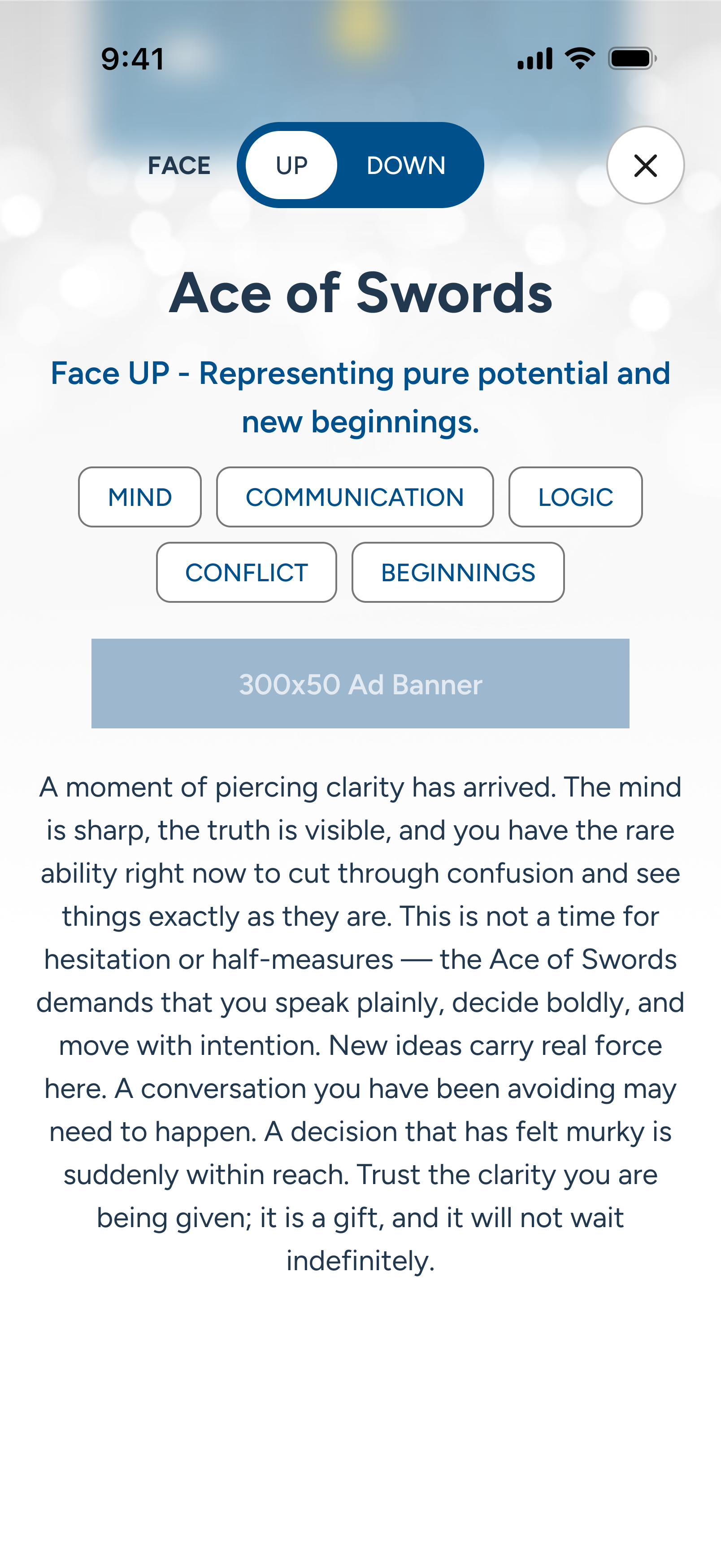
The details overlay is invoked, providing full meaning in both upright and inverted (down) views.

The Multi-Card Spreads Upsell:

Conversion Funnel

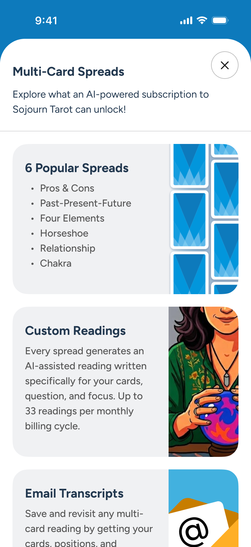
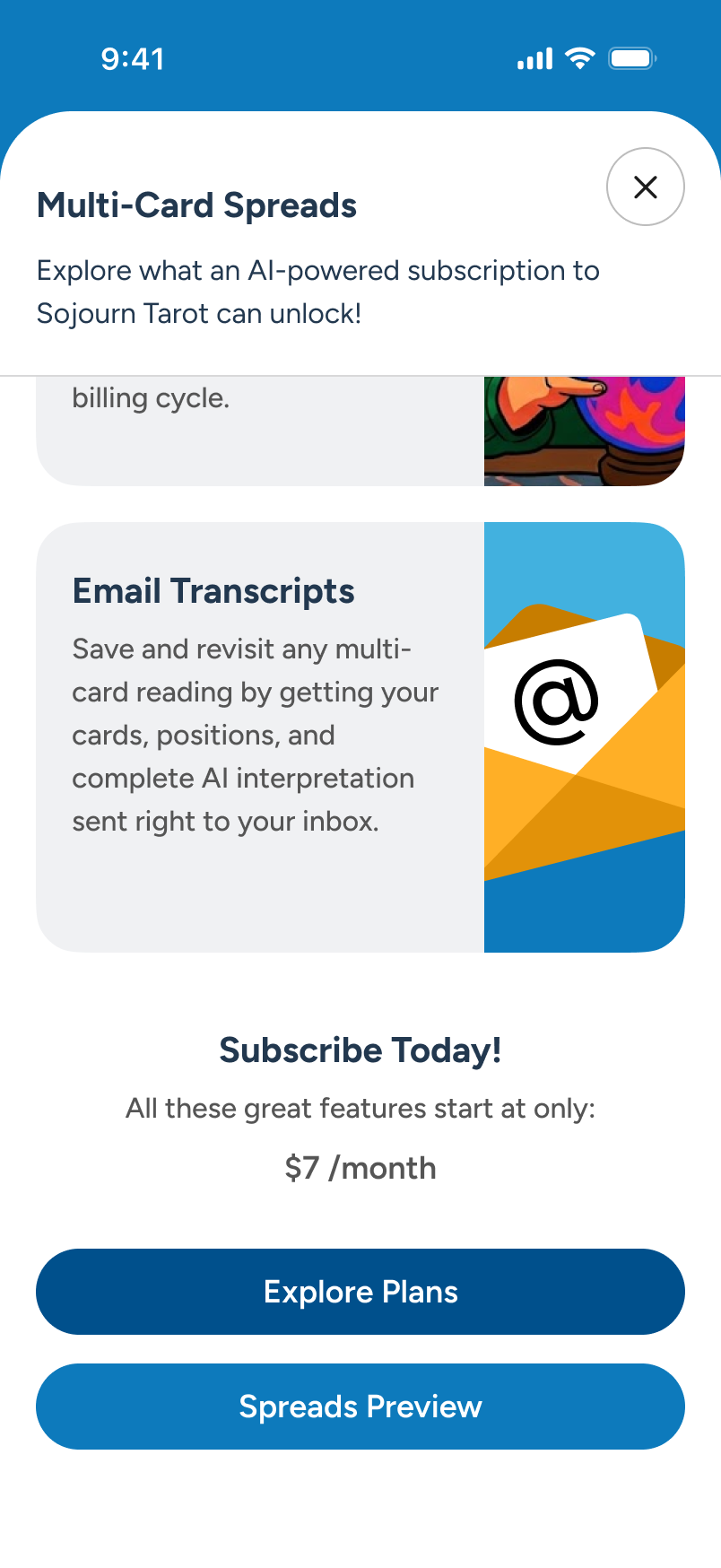
A new user on Home encounters an ad card promoting Multi-Card Spreads. Tapping it launches an overlay touting what a subscription unlocks. The overlay offers two paths: to review and upgrade via "Explore Plans" (shown), or to try Spreads, in demo mode, which will eventually lead back to Plan.

We will forgo a review of Spreads in demo mode, and instead review from a fully subscribed, full-feature perspective, shortly.

From Home, the user taps on the "Multi-Card Spreads" ad card to learn more about the advanced options for subscribers.

An overlay appears, detailing multiple features a subscription would provide.

At the bottom of the overlay, the user sees the base pricing and chooses to proceed via the "Explore Plans" CTA.

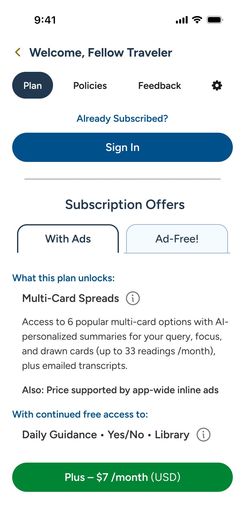
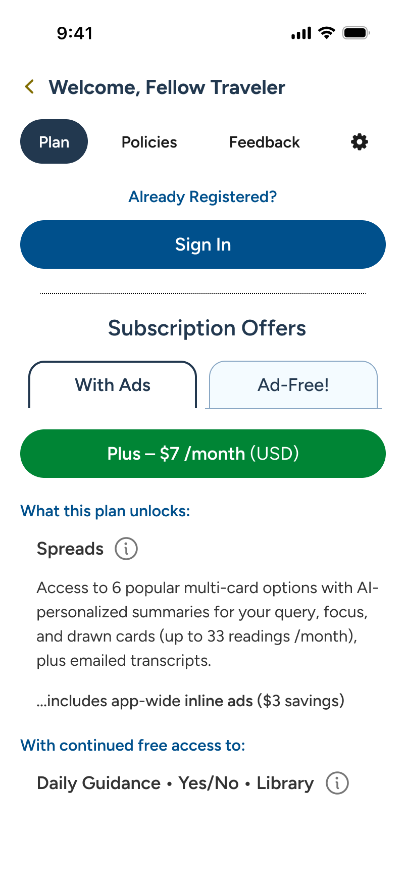
The overlay closes, and the Account/Plan slides into view, detailing subscription offers (next flow).

Multi-Card Spreads Subscription:

Sojourn Plus Onboard

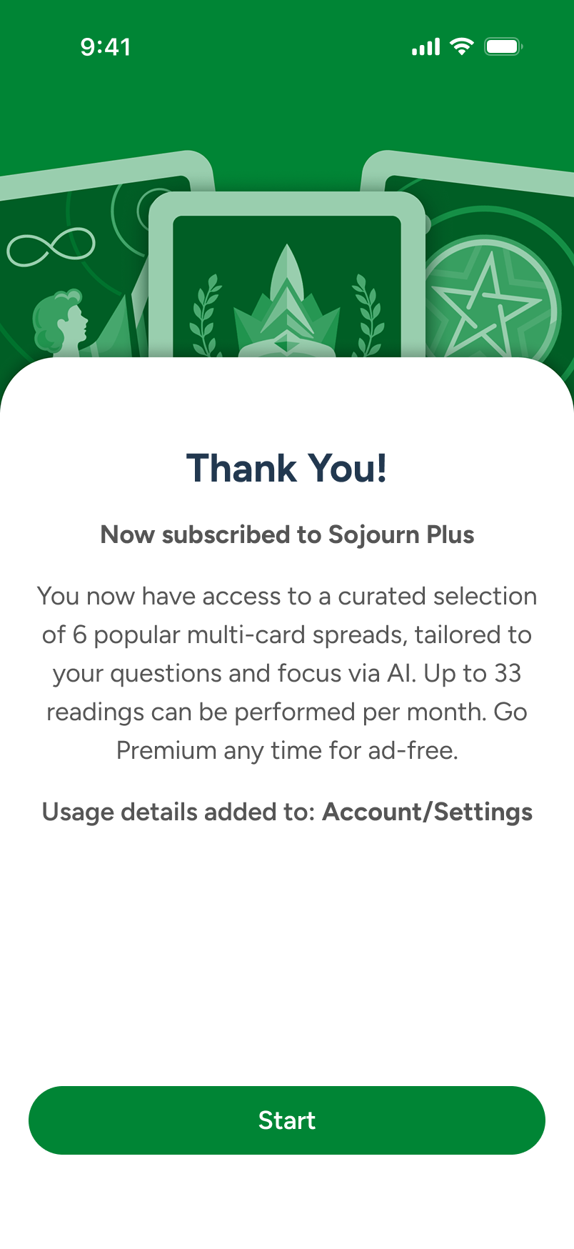
We now skip forward to the user having subscribed to Sojourn Plus, which unlocks Spreads for multi-card AI-assisted readings but maintains inline ads throughout. Once back on Home, the user sees that their account designation has been updated, and proceeds to see the updated Plan card.

Note: Once the user is subscribed (bottom right), we show monthly cost and upgrade/downgrade options in the Change Plan overlay sheet (not shown).

The app restarts...

A single-card onboard screen greets the user, touting the upgrades. The user taps "Start."

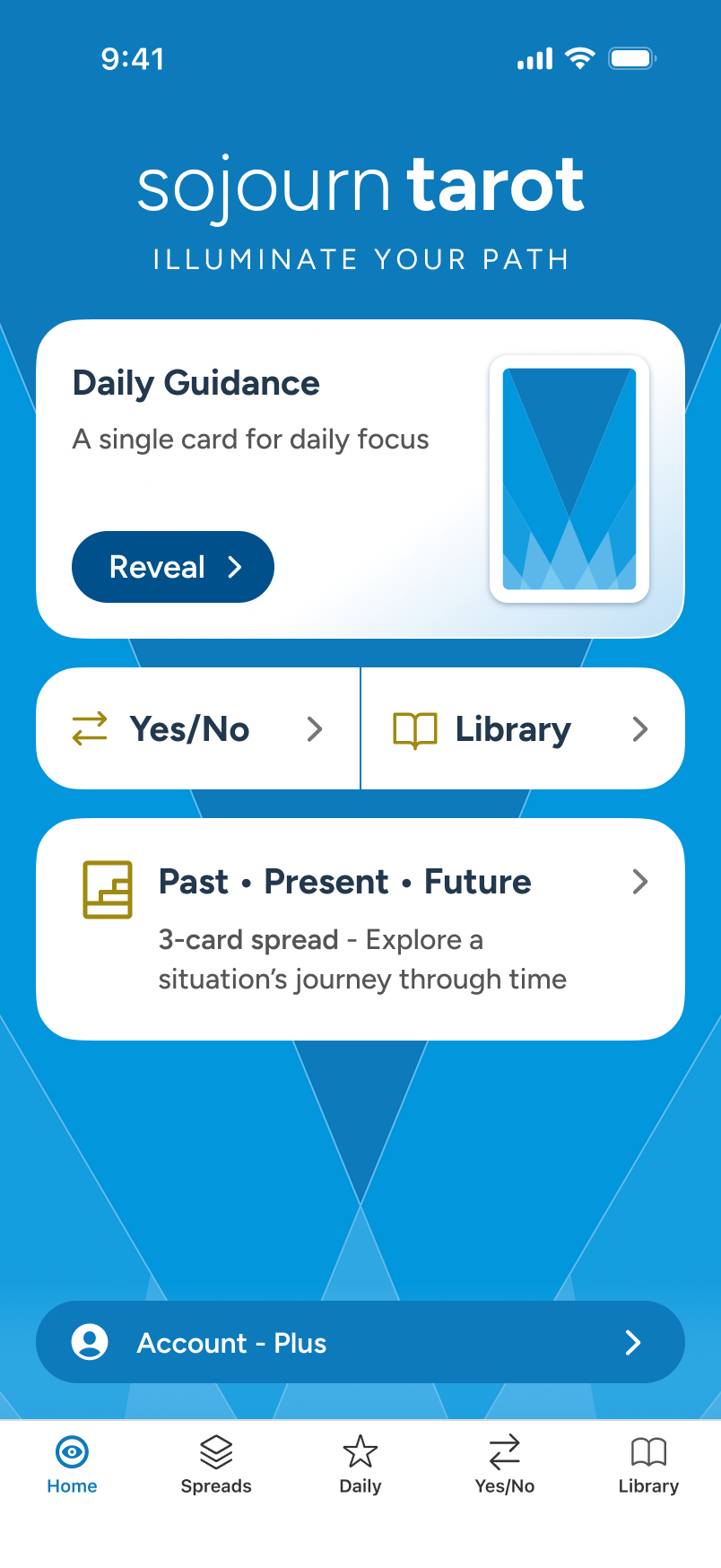
We see Home has been updated with a popular spread (review later) as well as an updated Account. The user taps Account.

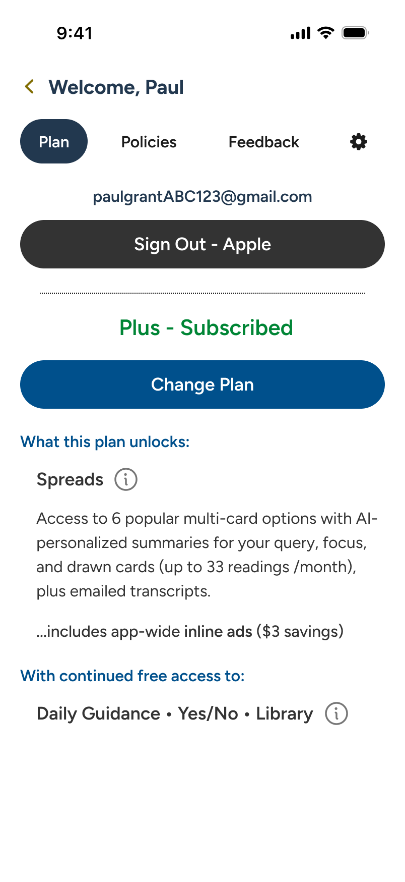
Under Account/Plan, we now see the user's credentials and plan displayed, along with a "Change Plan" CTA.

Account:

Sectional Tabs

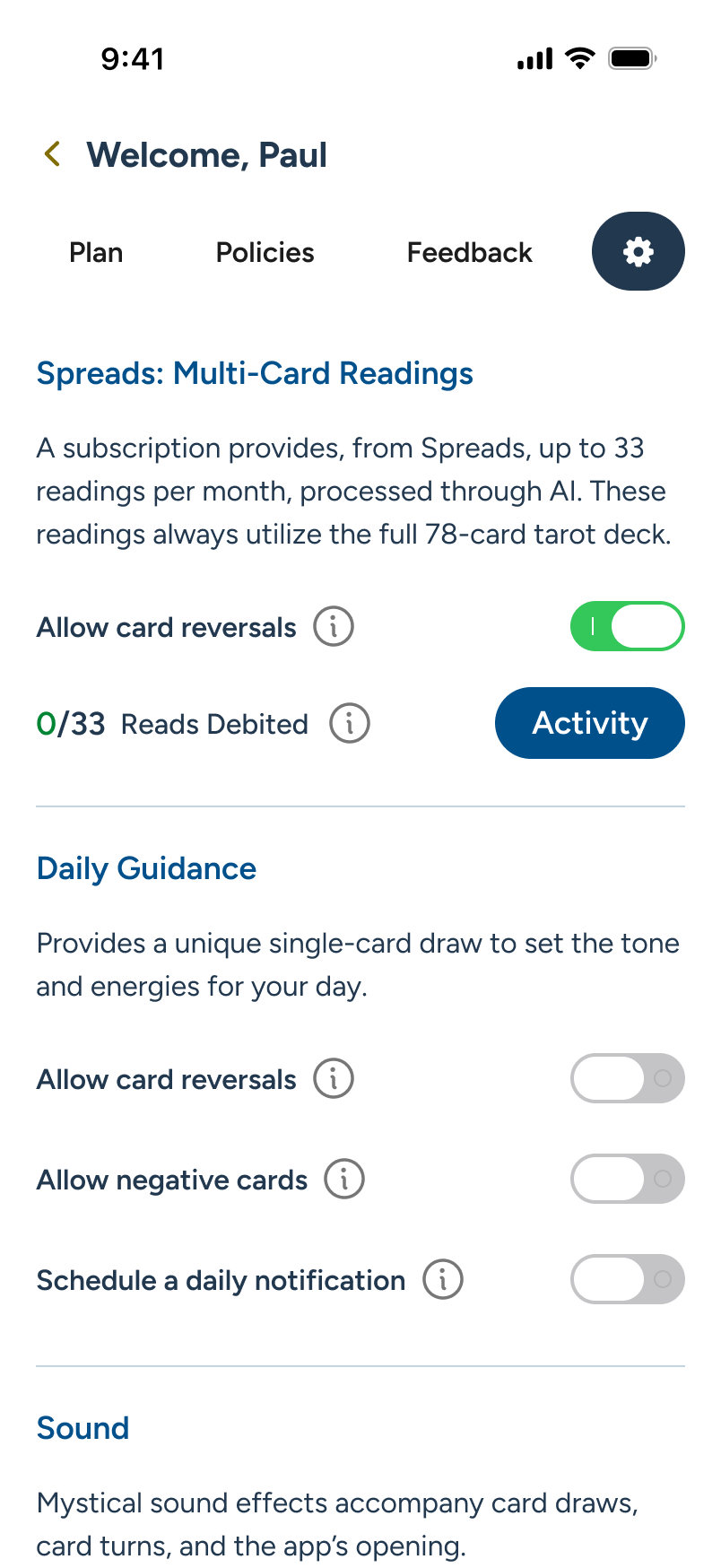
Our newly subscribed user explores the Account section, which houses 3 tabs after Plan: Policies duplicates the initial onboarding agreement; Feedback captures sentiment and future upgrade suggestions; and Settings unlocks a subscriber-only activity area for tracking usage.

Note: Granular changes in these sections, between free and subscribed users, can best be reviewed in a live demo.

Landing on Account/Plan, the user reviews their active subscription, unlocked features, and options to manage. Next - Tab to "Policies."

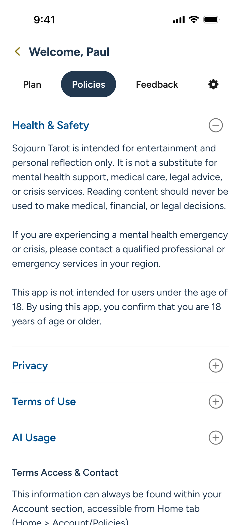
On Policies, the user is provided easy access to the same terms as during Onboard. Next - Tab to "Feedback."

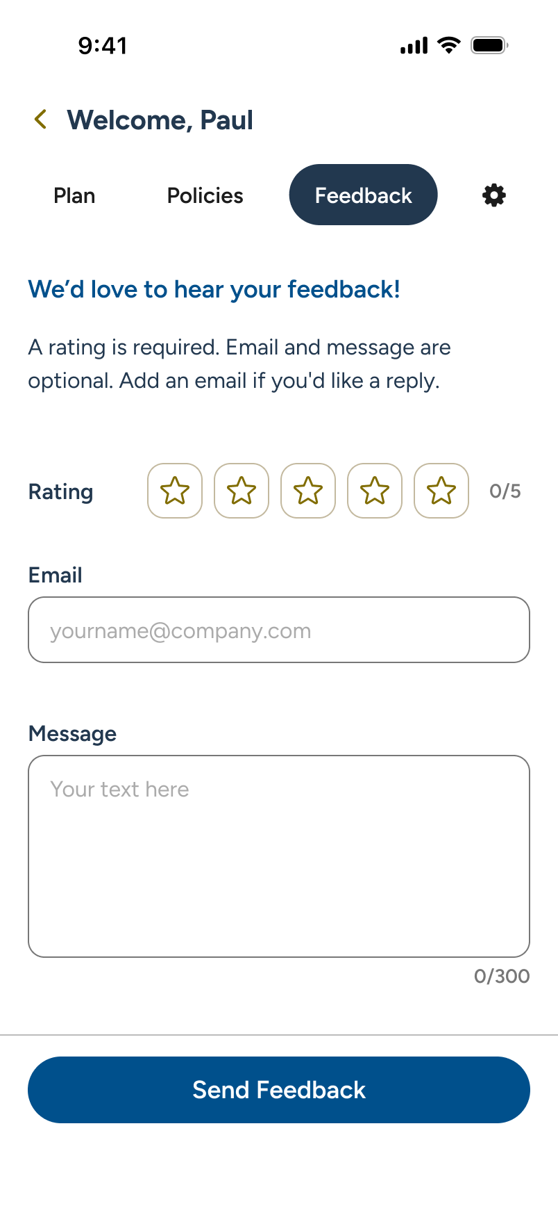
On Feedback, users can submit ratings, email follow-ups, and feature suggestions directly to the product team. Next - Tab to "Settings."

Settings houses controls for card reversals, daily notifications, audio, and multi-card reading usage (when subscribed). Next - Back to Home.

Multi-Card Spreads:

Pin to Home

Subscribers often want their favorite spread available immediately at launch. We pre-pin the popular "Past • Present • Future" 3-card spread to the Home screen by default. As users explore new multi-card options, they can easily swap their pinned selection directly within the Spreads area.

Note: Unsubscribed users see a PREVIEW banner at the bottom of Spreads, allowing partial access, with no Spread pinning to Home (not shown here).

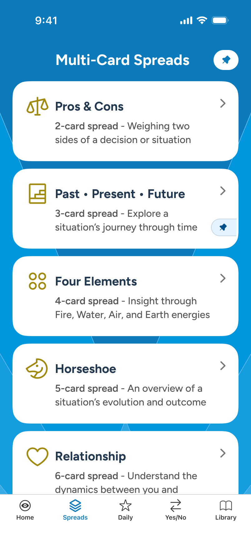
From Home, the user taps on the Spreads section tab to explore their options.

Under subscription, the auto-pinned "Past • Present • Future" can be changed. The user taps "Edit" to explore.

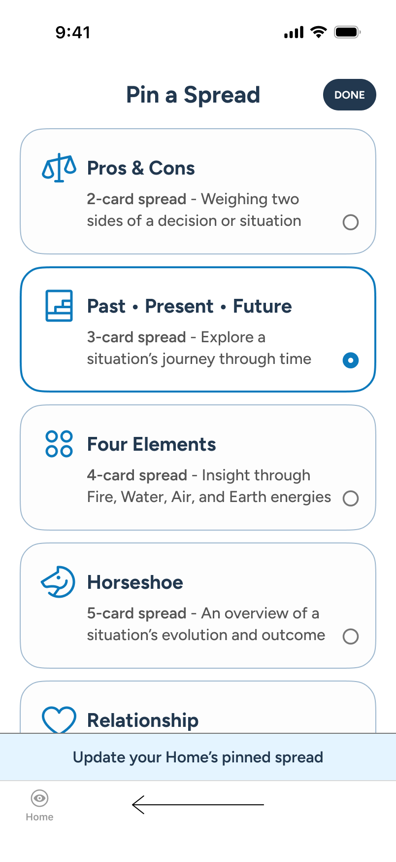
If the user desires, they can select a new spread card to pin in edit mode. When happy, they commit via "Done."

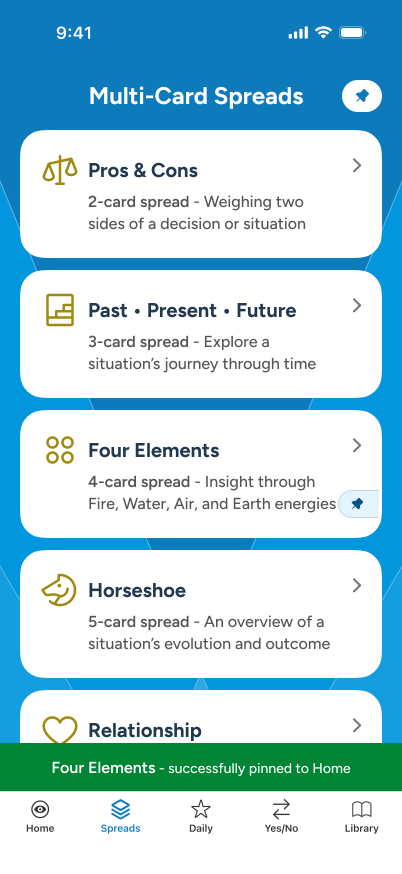
Returning to the normal view, the Spreads section reports that "Four Elements" will now appear on Home.

1 of 3 - Picking a Spread:

Query, Focus, & Card Draw

From the Spreads section, our user selects "Past • Present • Future" for a reading. At the opening stage, the user can supply an optional query and toggle focus to shape the final output. When they move to "Begin Reading," we see the user's intent carried over as they draw their cards.

Note: Weekly/Monthly reading gating, AI processing errors, poorly formatted queries, and other granular aspects can be discussed and reviewed in a call.

From Spreads, the user selects "Past • Present • Future" multi-card spread to begin a reading.

Upon reading spread details, the user fills out the optional query, sets focus, and proceeds to “Begin Reading.”

Leveraging the familiar card draw carousel from Yes/No, the user draws a number of cards for the 3 slots.

Once all cards are drawn, the carousel is disabled and the AI takes over, showing "Building your reading..." at the bottom.

2 of 3 - The Reading:

AI-Personalization

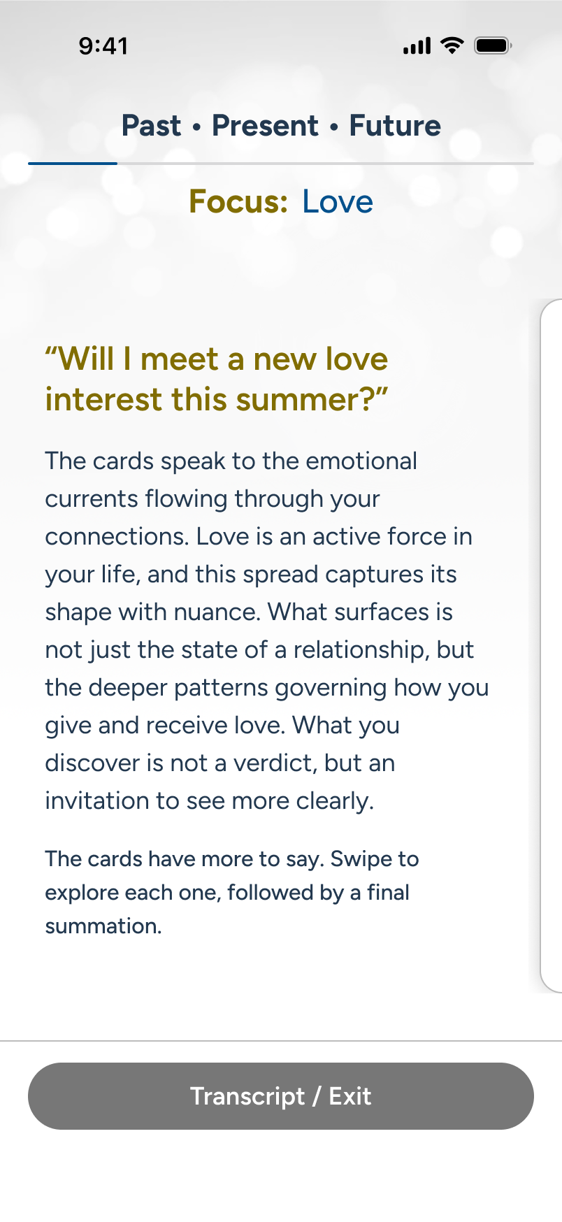
The reading is presented to the user in a left-to-right manner as the cards draw, mimicking a progressive journey. Regardless of card count, the structure is always the same: Overview > Each card/position with a flippable, AI-customized card detail > Closing Thoughts. When done, the user taps "Exit."

Note: Painstaking care was put into this design so that it can work from the largest iPhones down to an SE 2/3, which is still receiving iOS updates in 2026.

The multi-card reading is under review. Story progression is horizontal, like the draw. The user swipes.

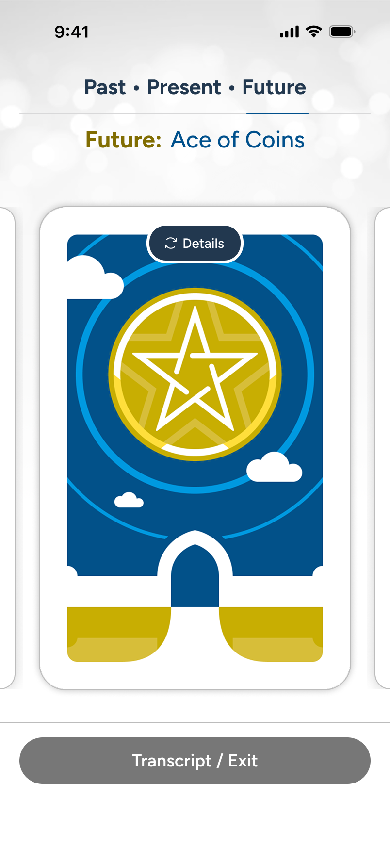
Skipping forward to the 3rd card, we see the custom artwork in the Future position. The user taps it to view details...

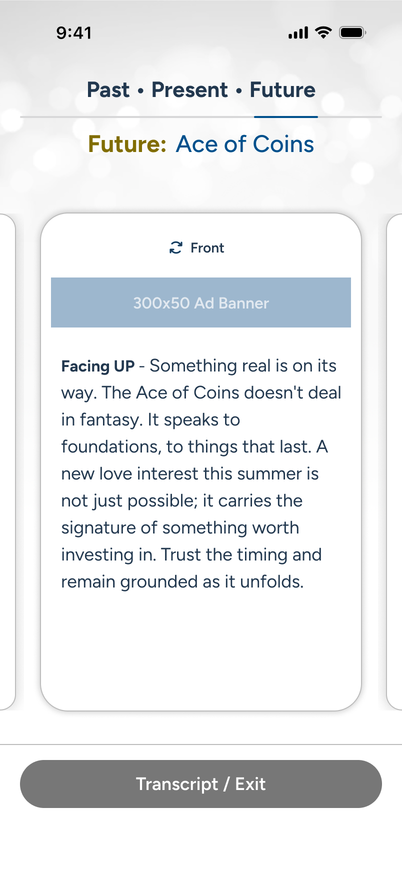
The user reads the customized text based on the card, its position, and other supplied factors. The user swipes...

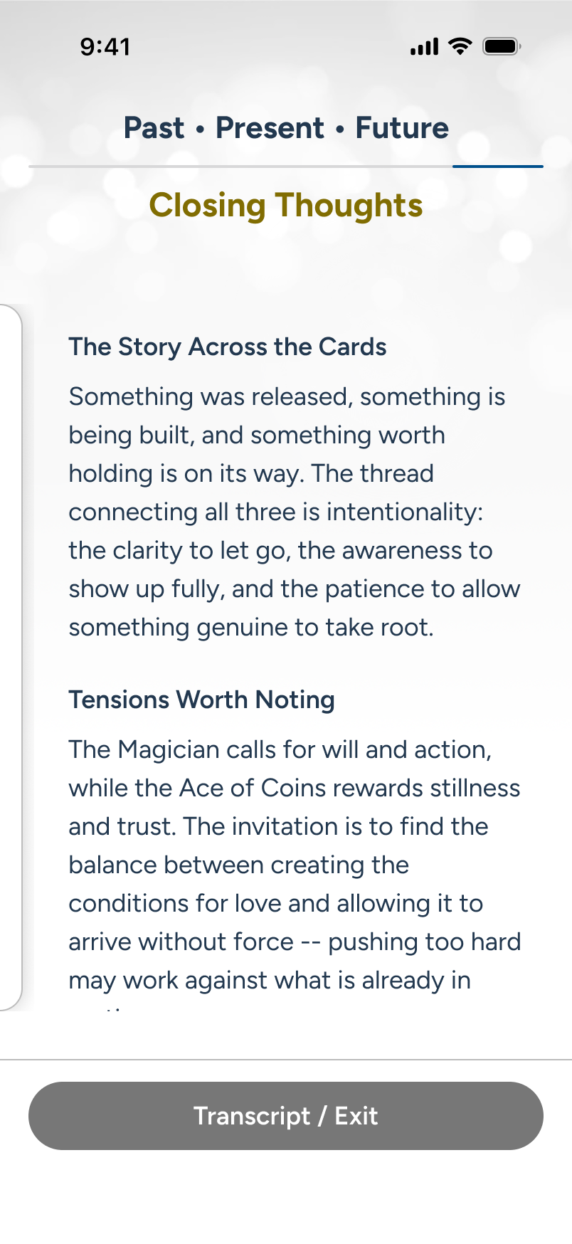
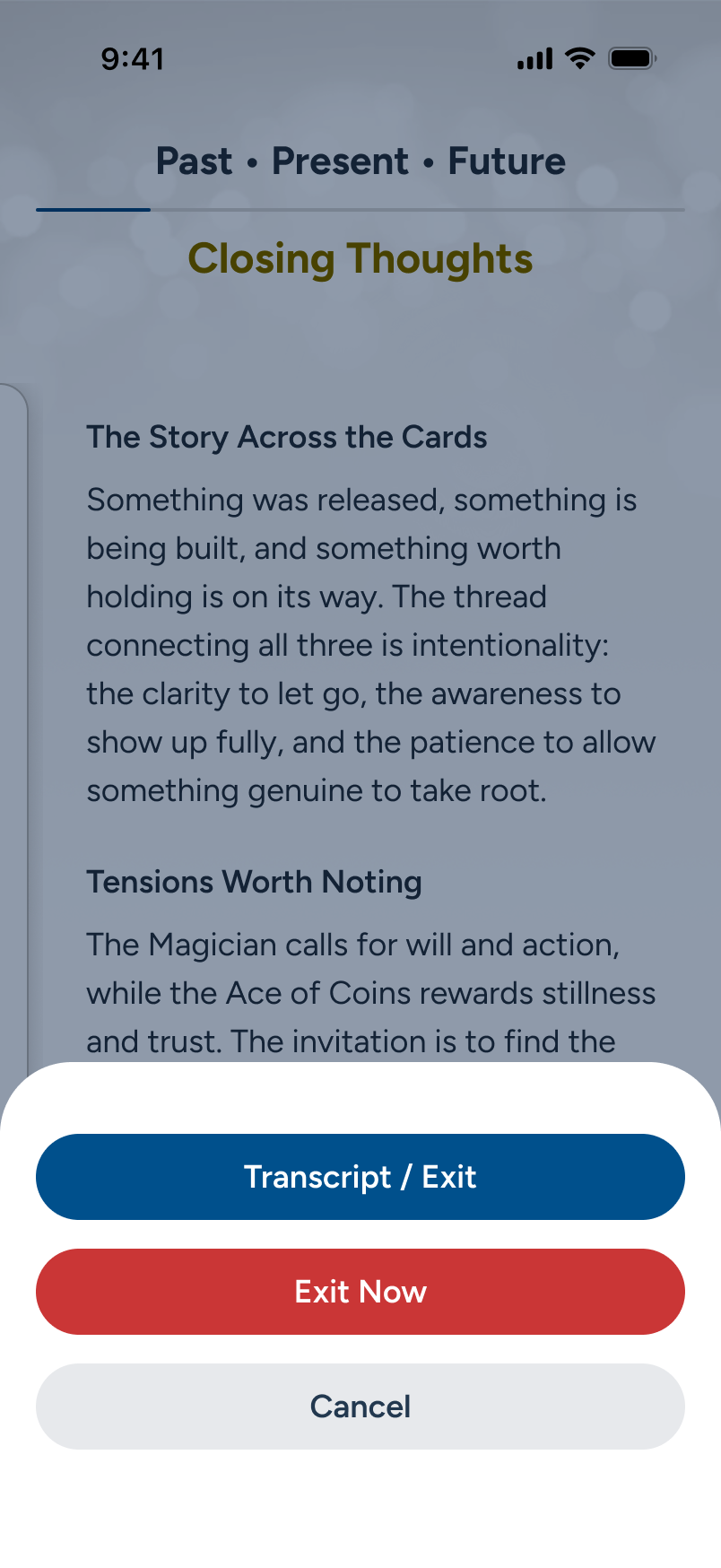
Jumping to the end, the user receives a positive send-off. They now proceed to tap "Transcript/Exit."

3 of 3 - The Reading:

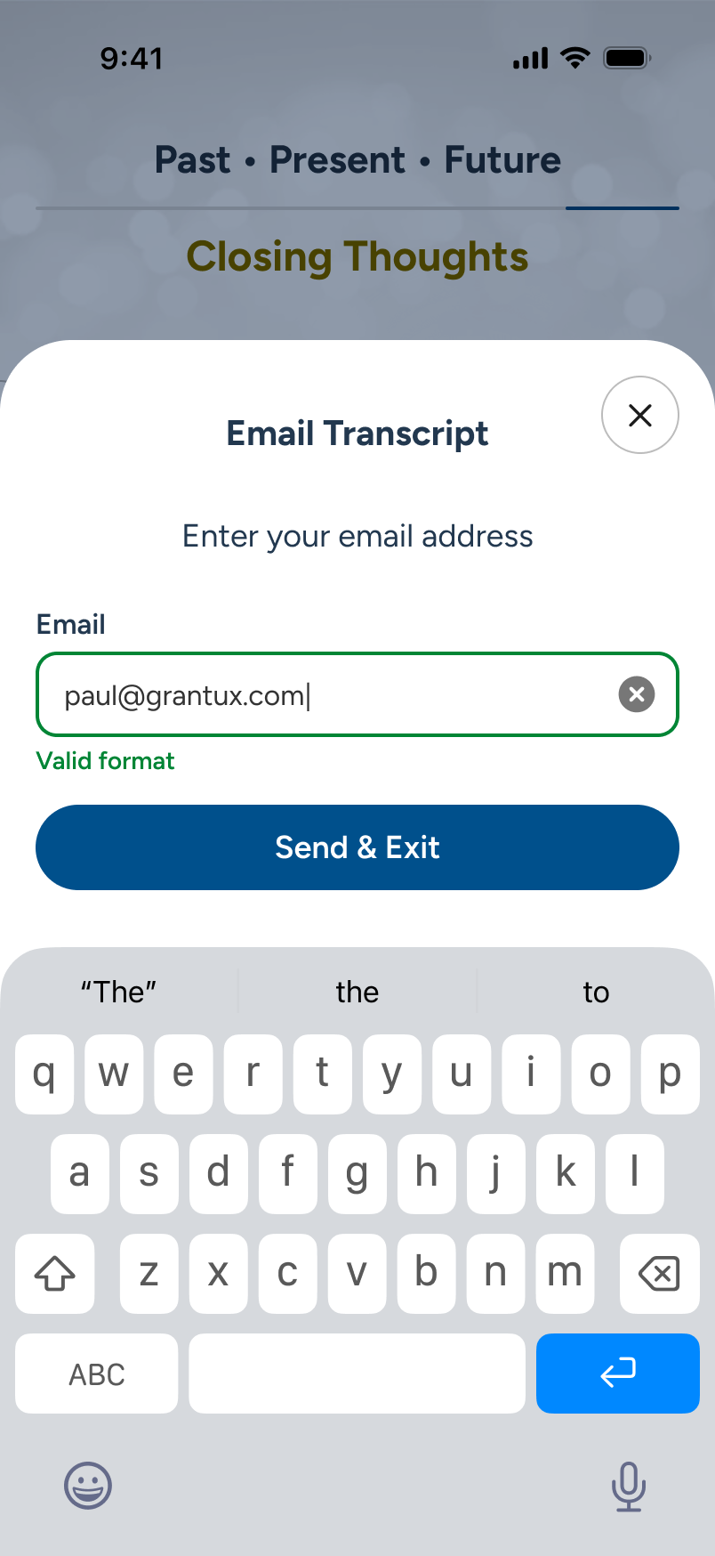
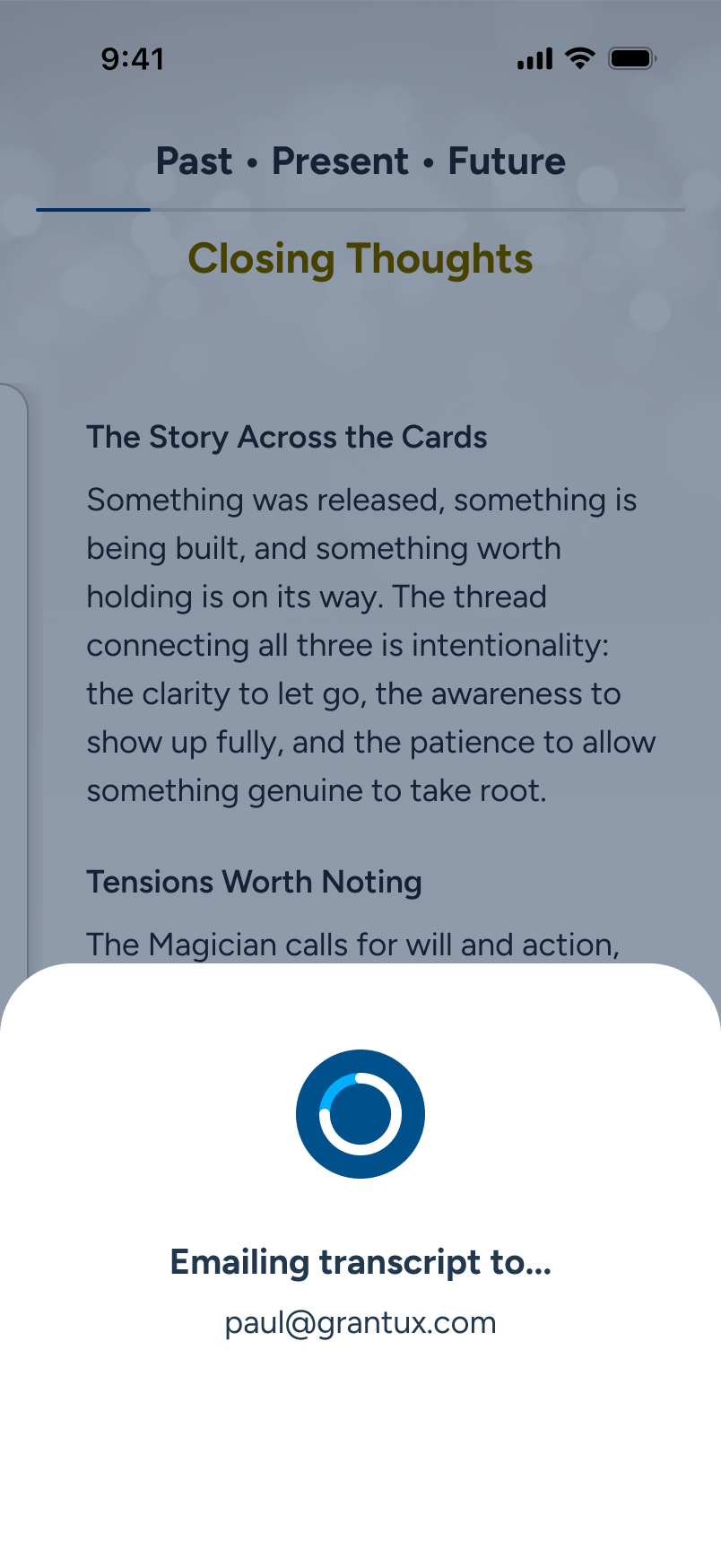
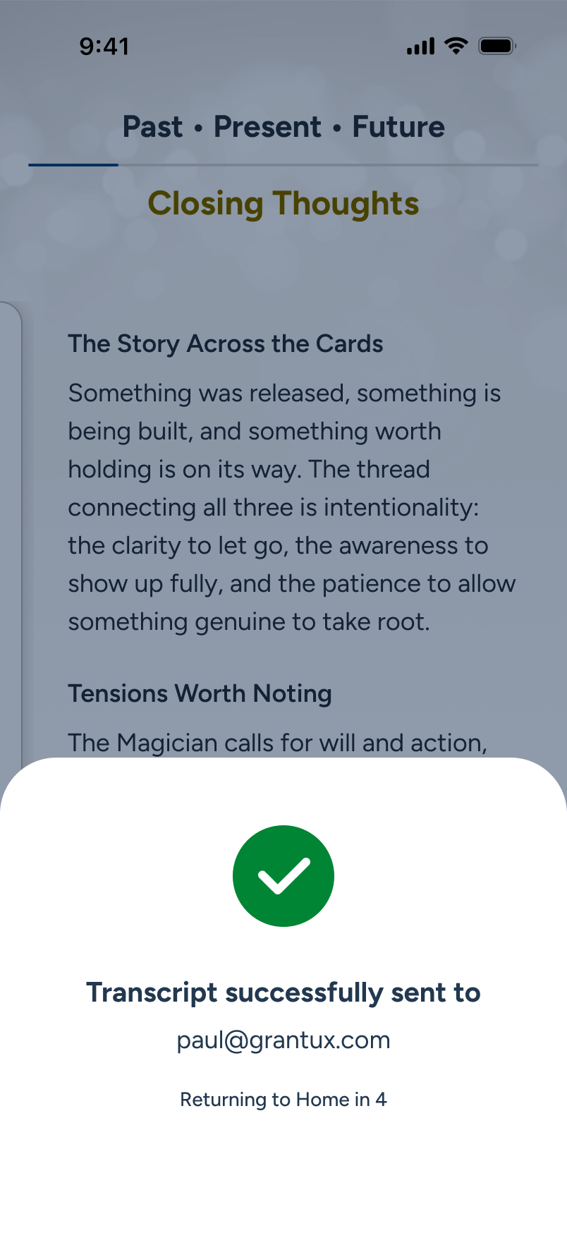
Send Transcript & Exit

Subscribers often want their readings saved for review later. Rather than maintaining a complex database, it is far easier to offer a transcript service on exit, and promote it as a bonus feature. In this example, we make the option as frictionless as possible at the point of reading exit.

Fail states and edge cases, for here and elsewhere, can be reviewed via Figma deck and/or live demo during a call.

With the reading concluded, the user now decides to receive a copy sent to their inbox before exiting to Home.

If the email is on file with sign-in, we can pre-populate the field, making this a one-click "Send & Exit." In this example, a custom address is used.

The send moves forward...

Success! The transcript is now sent to the user's inbox, and the app will automatically return to Home in 4 sec.