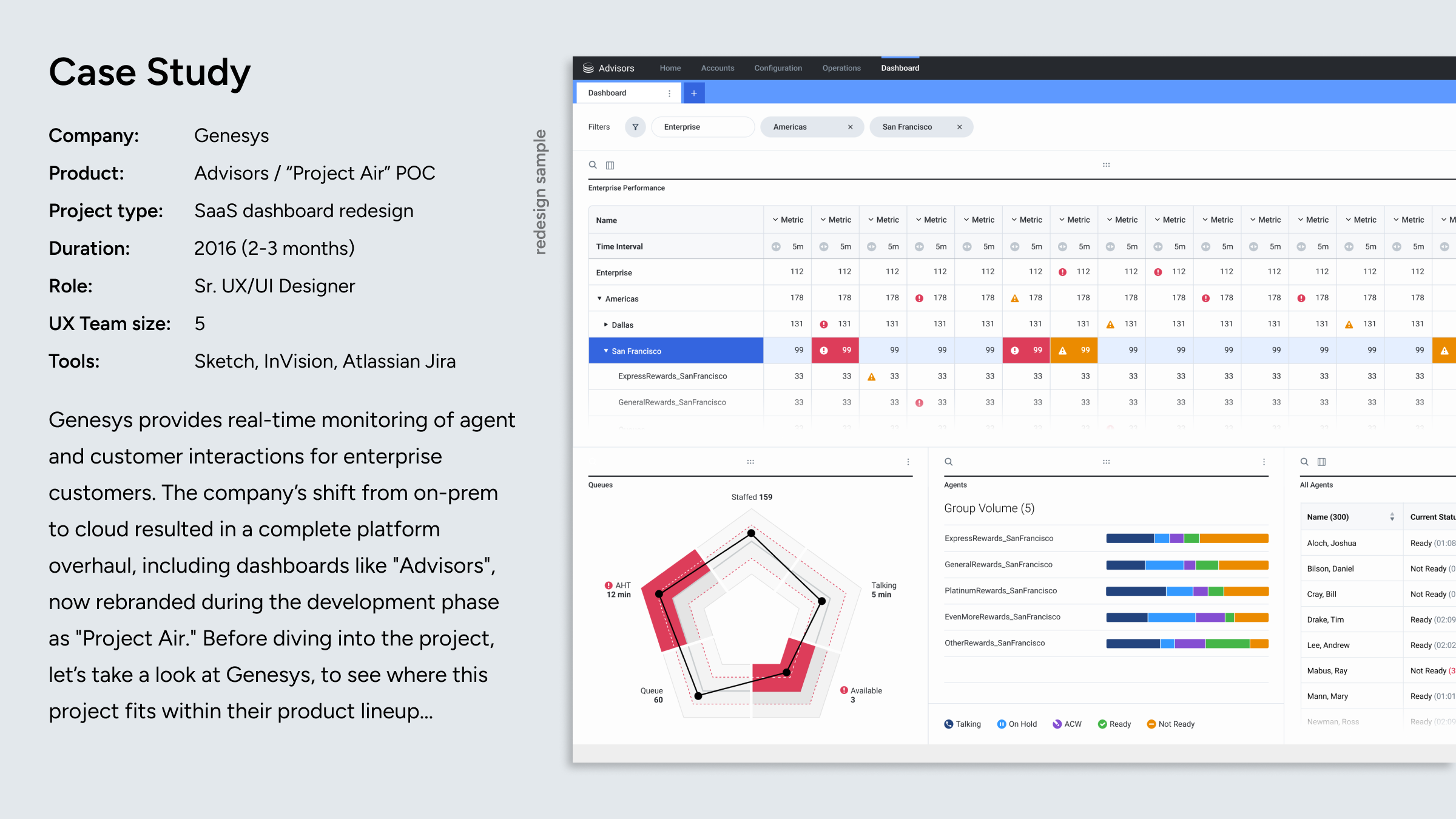


Genesys - “Project Air” Dashboard

16:9 case study format based on source Figma deck
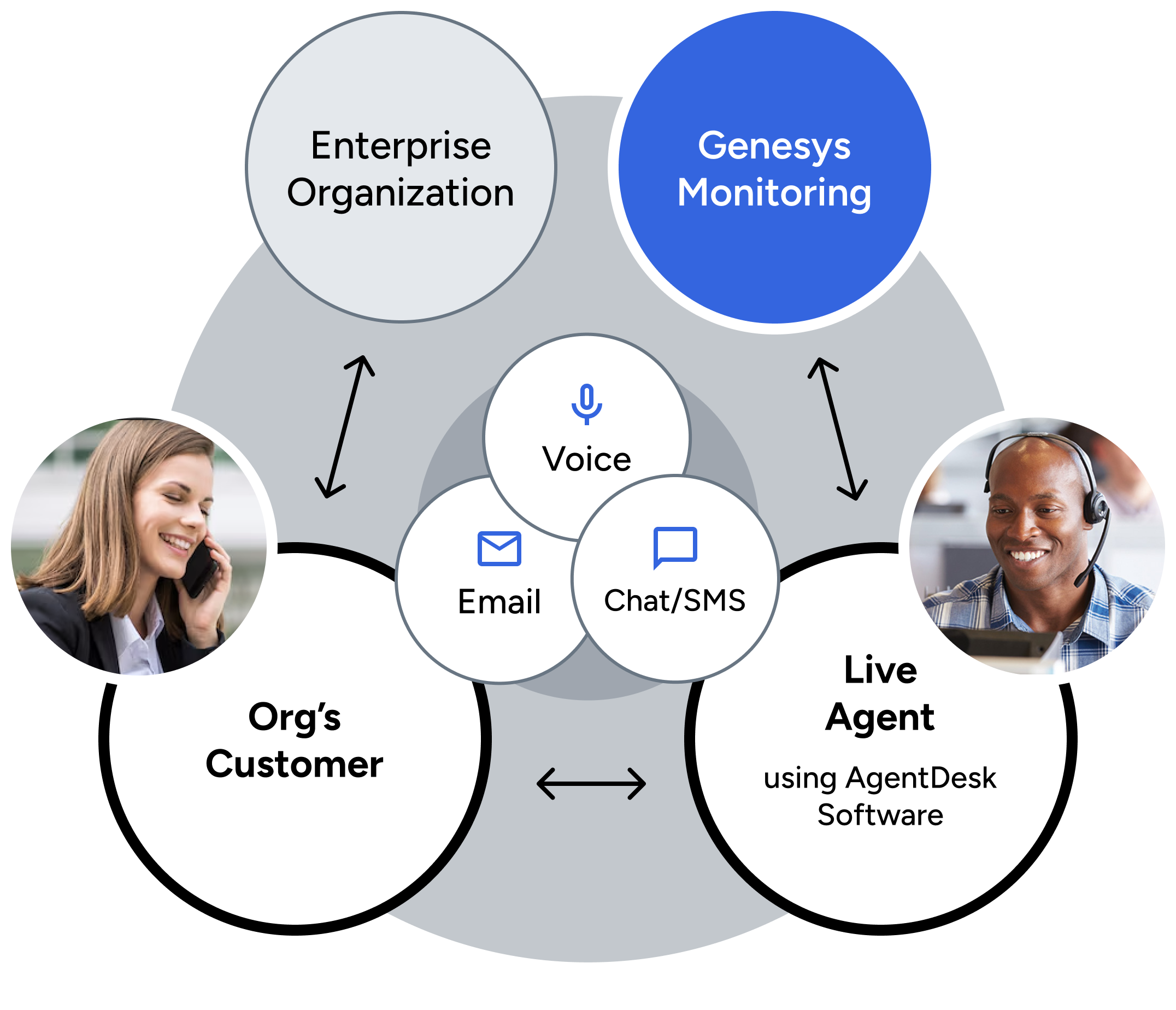
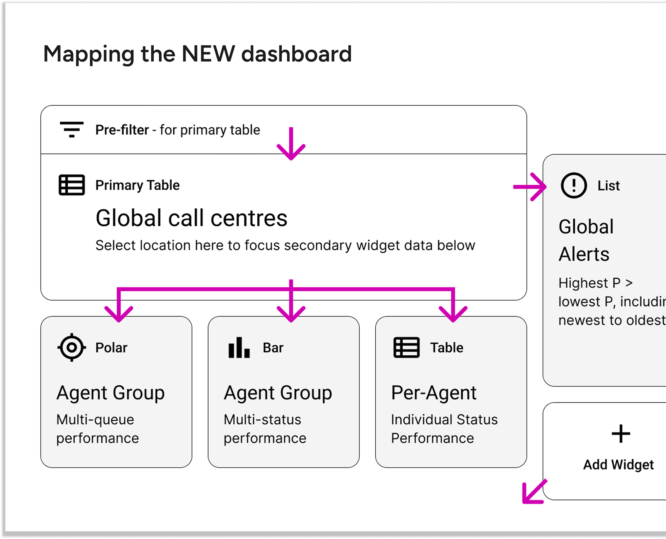
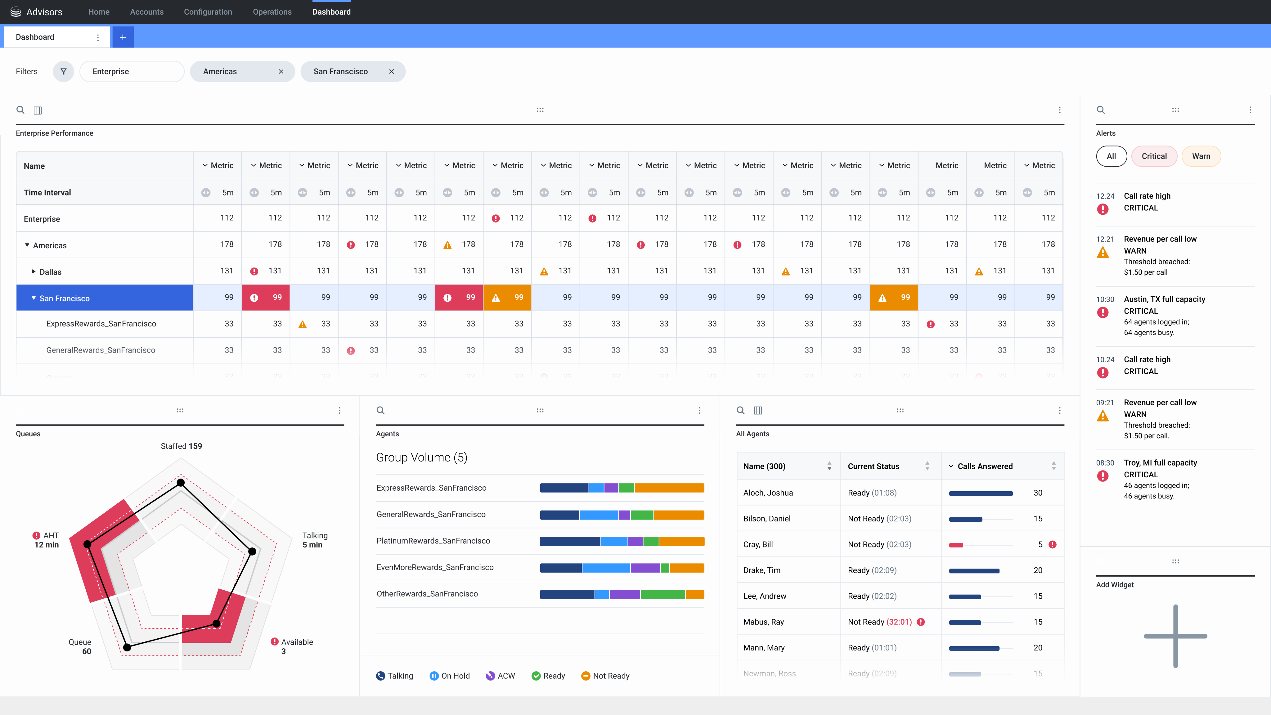
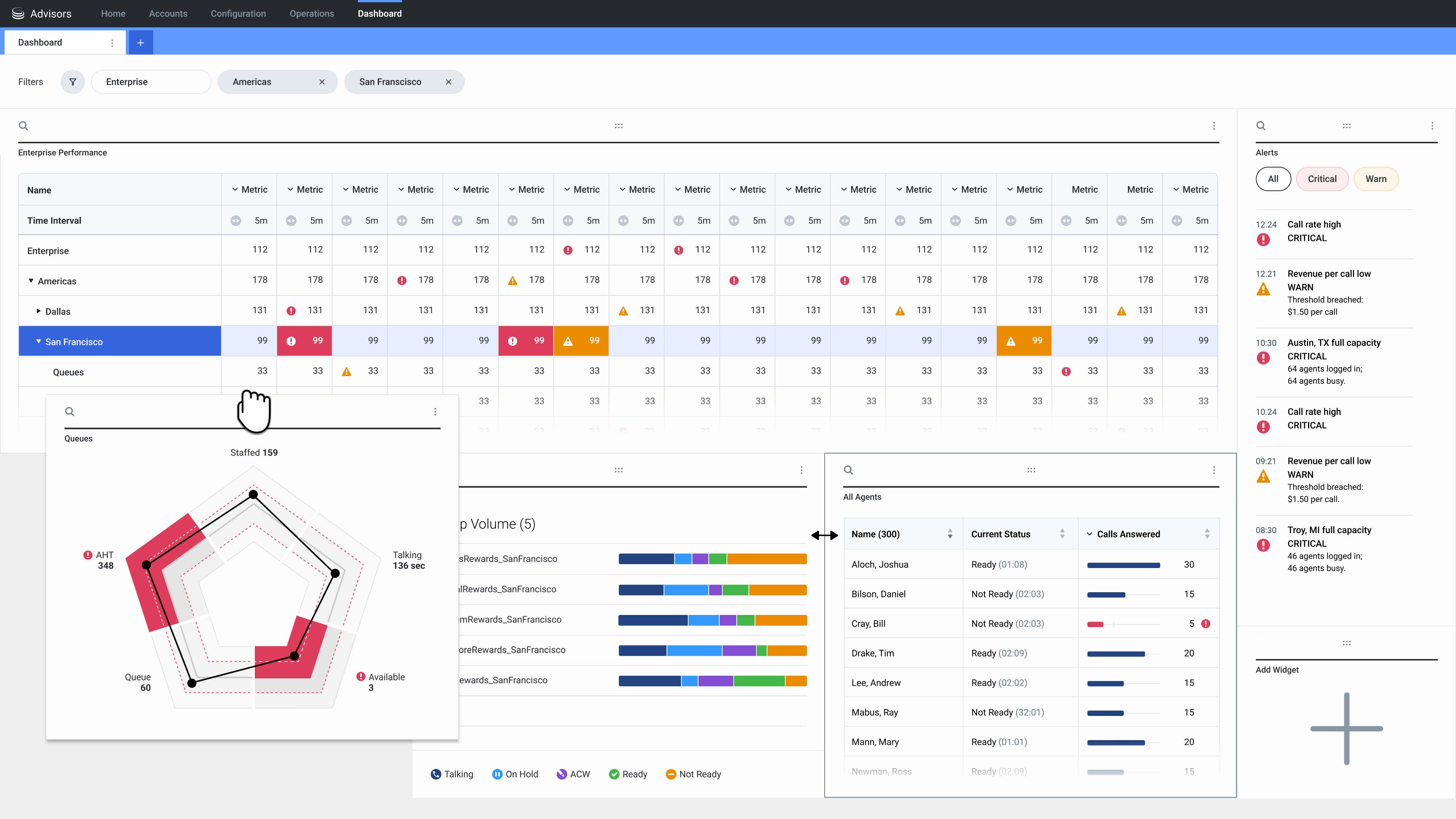
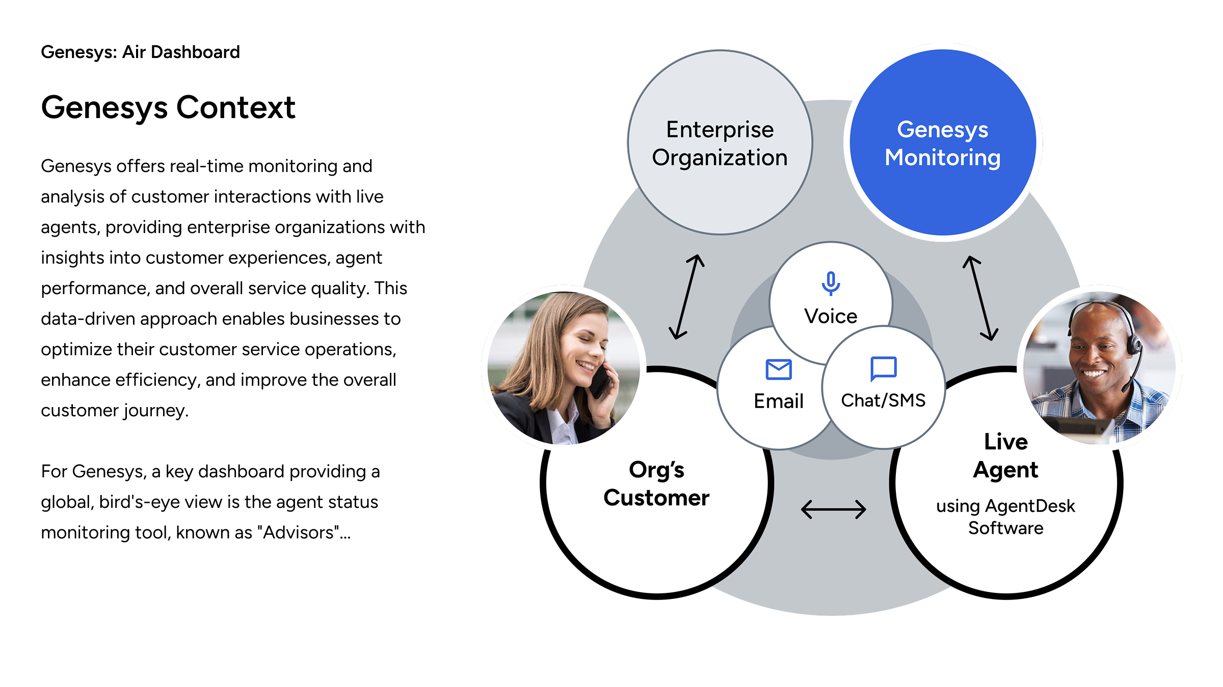
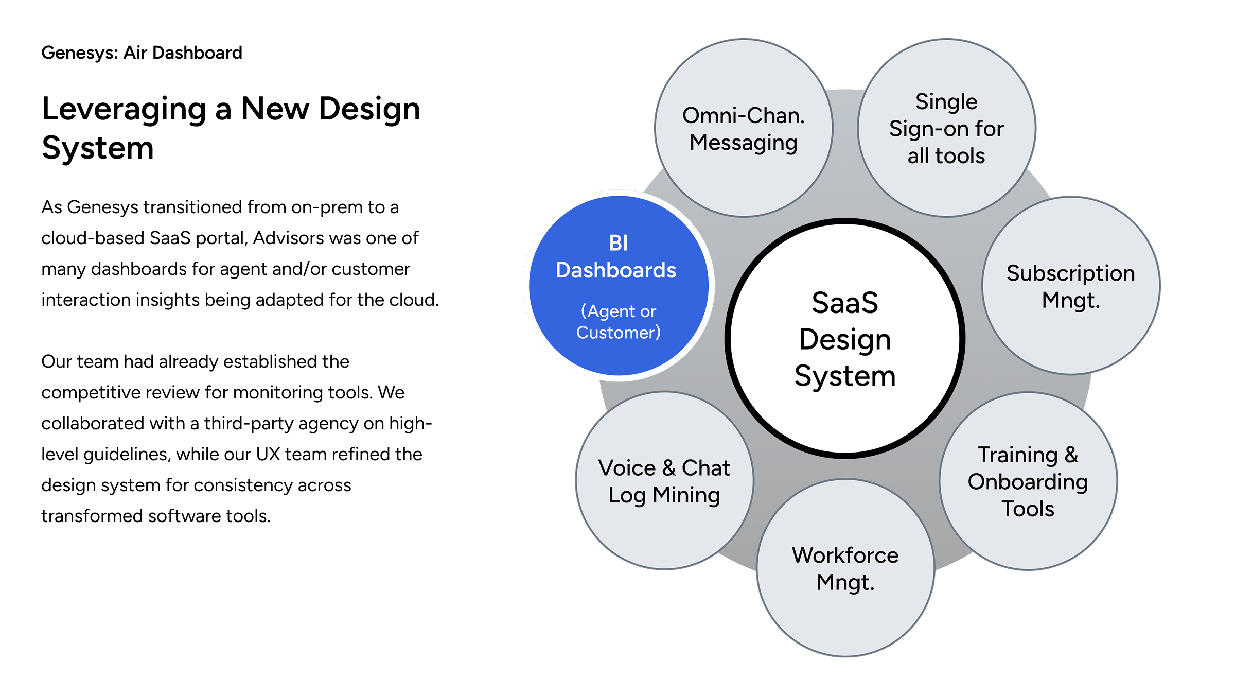
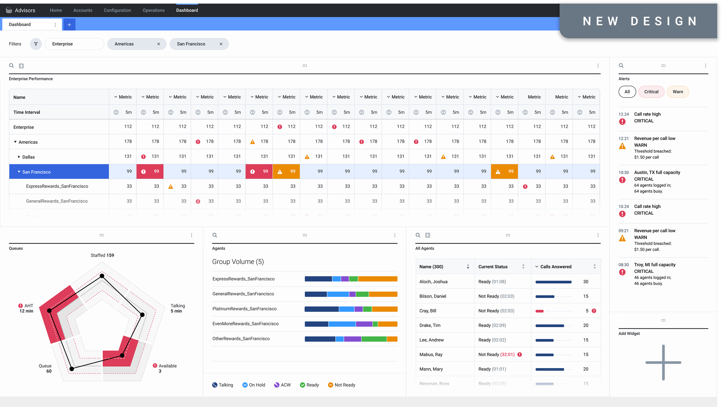
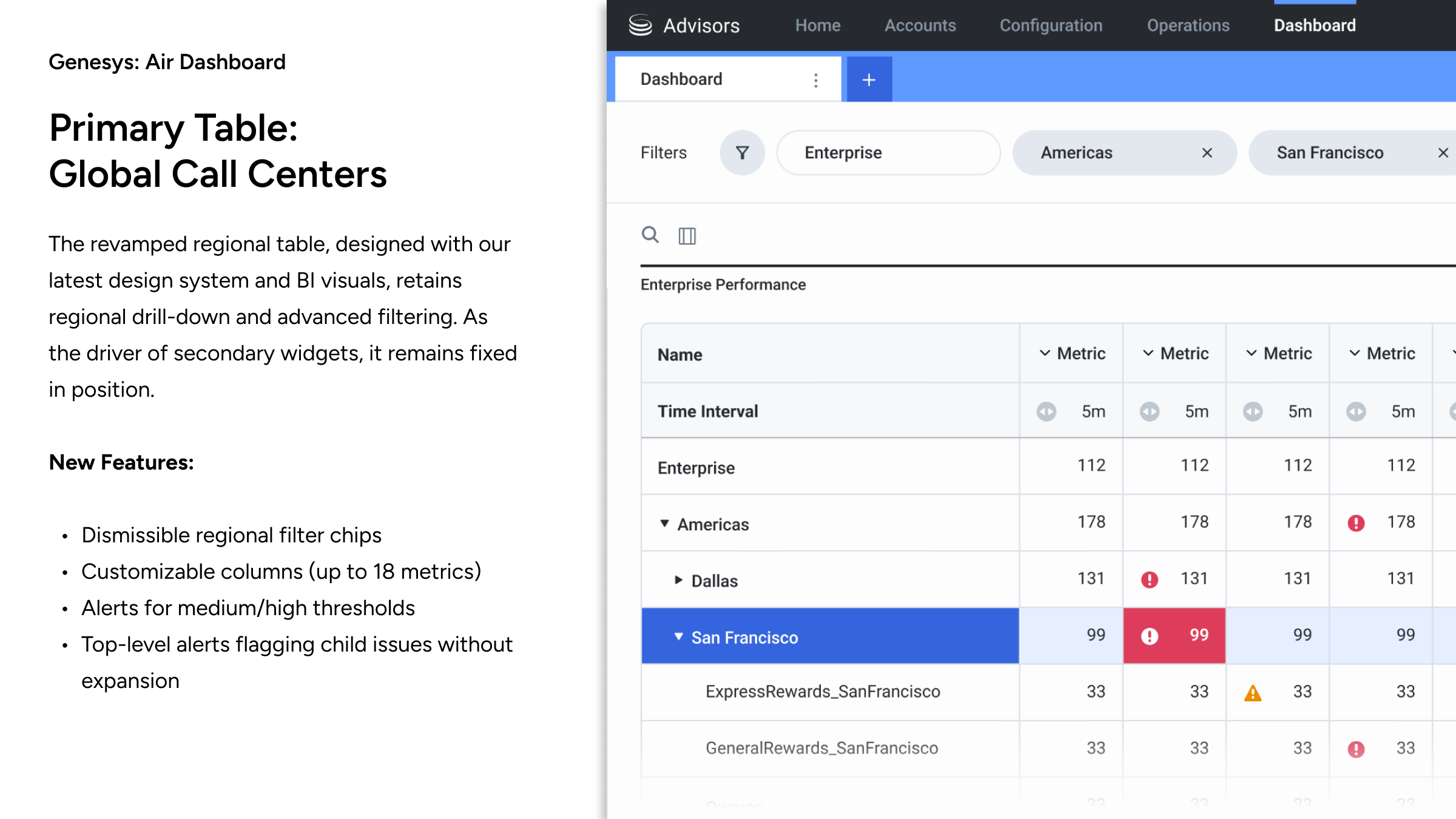
"Project Air" was the code name for a cloud-based dashboard redesign, providing a high-level management overview of global contact centers, with the ability to drill down to geographical region, country, contact center location, and agent teams.
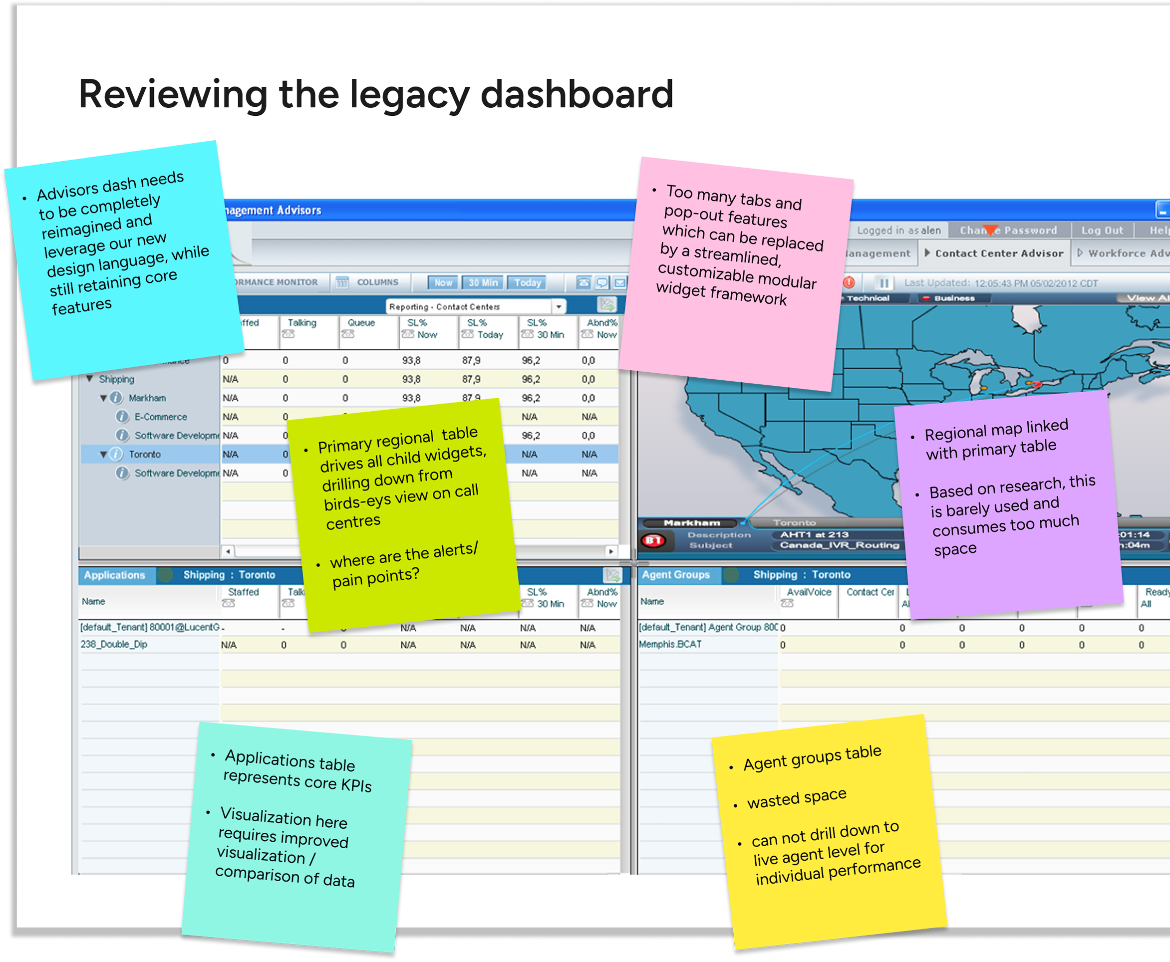
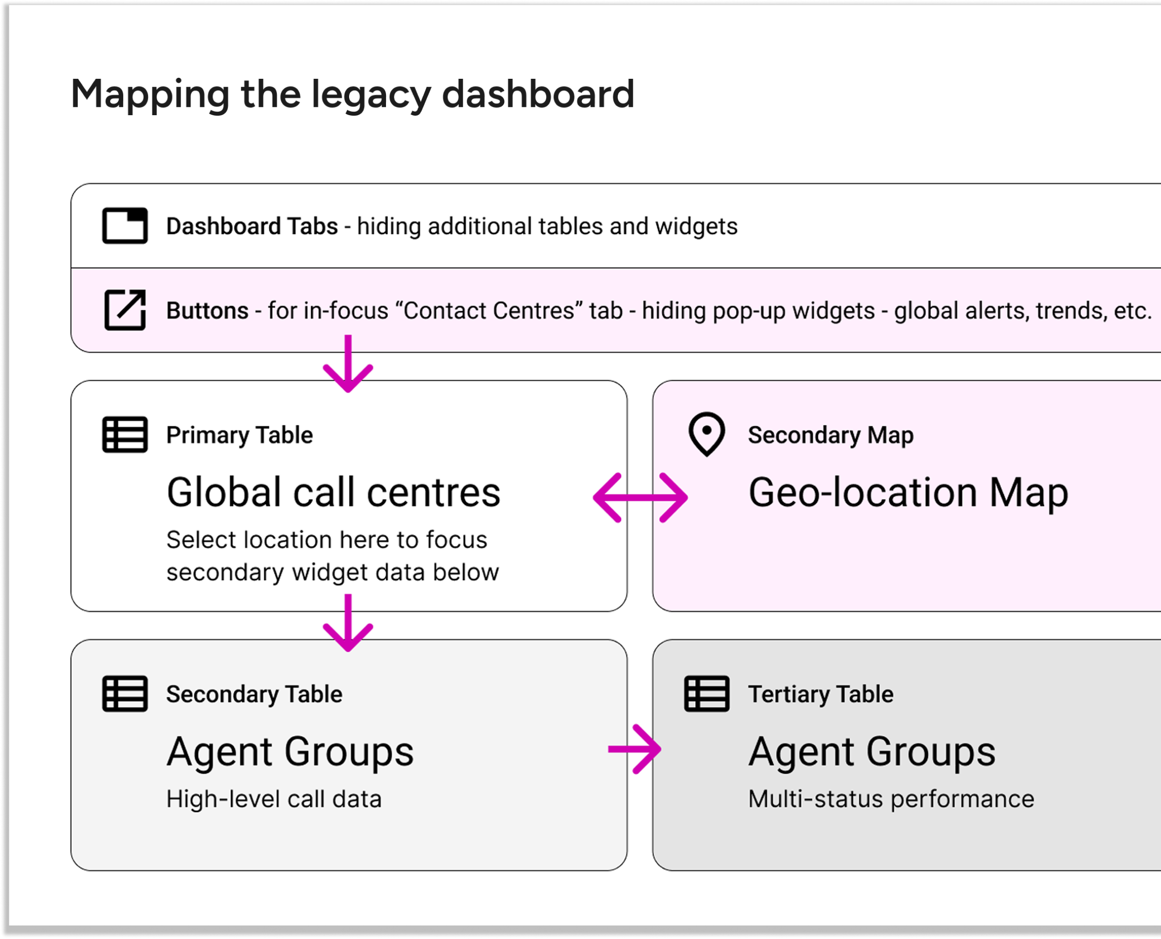
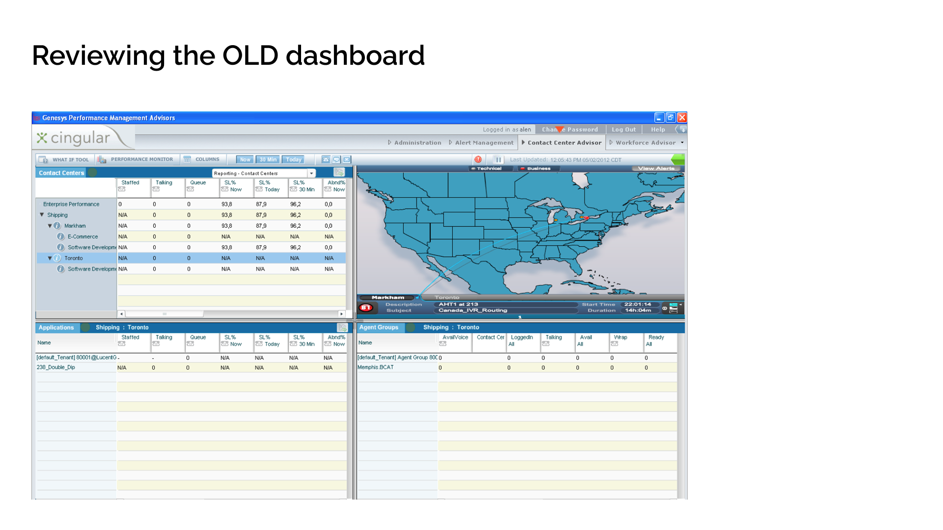
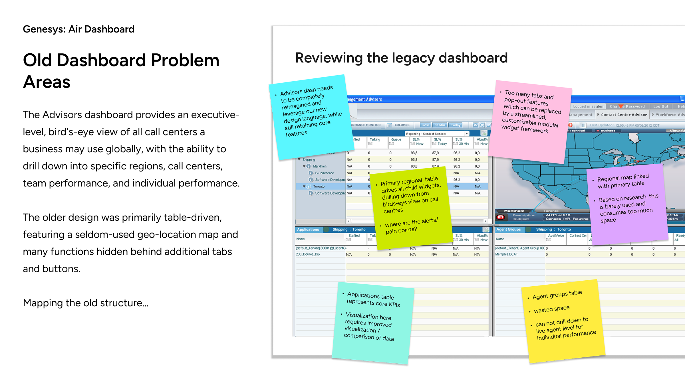
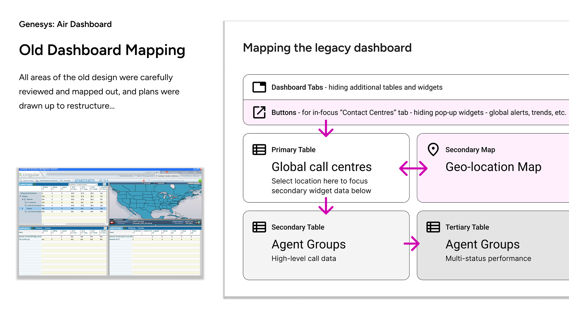
In review, the legacy design consisted of multiple similar-looking drill-down lists which lacked a clear hierarchy of information. The maps tool, rarely used based on user feedback, consumed 25% of available space.
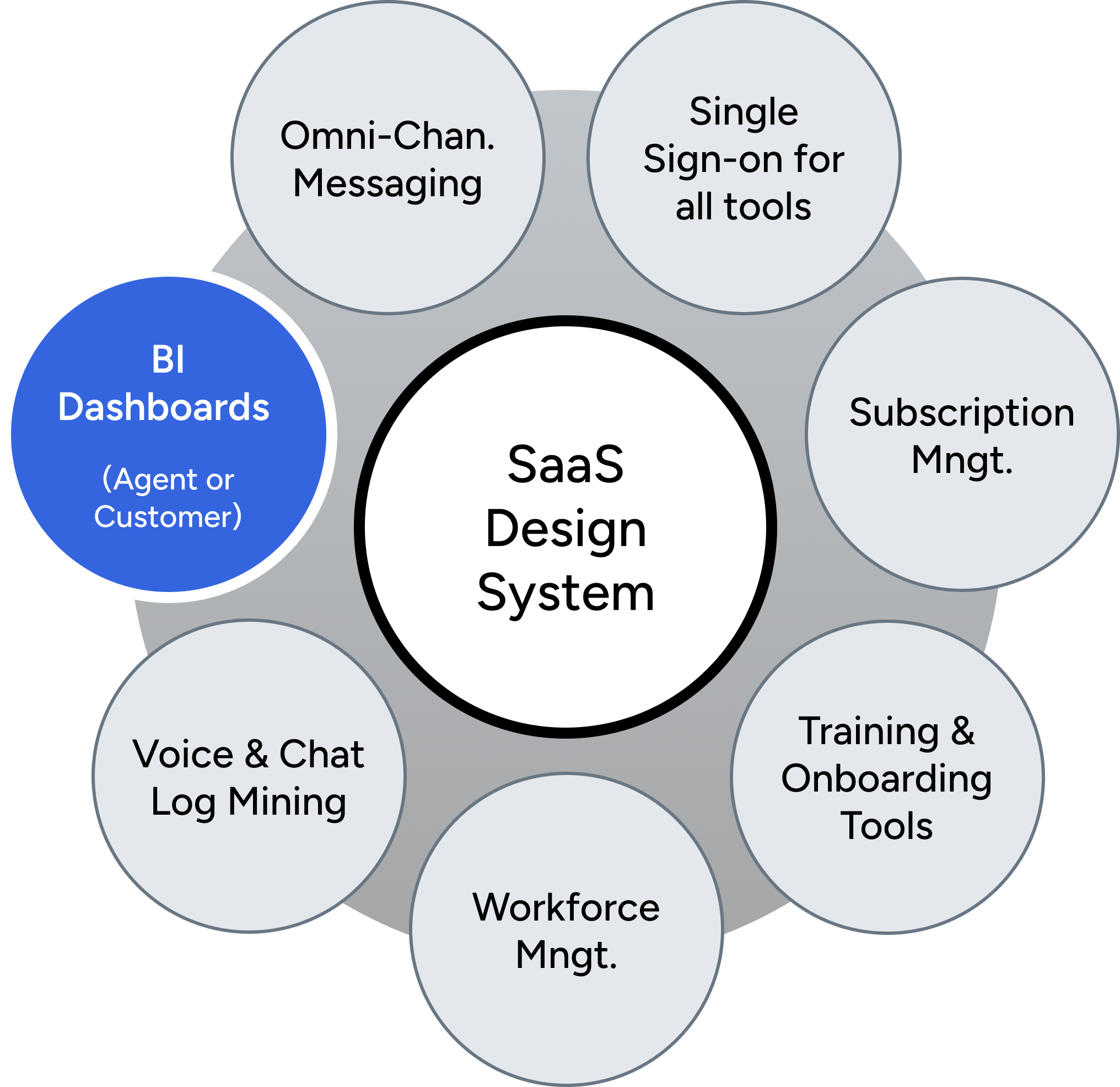
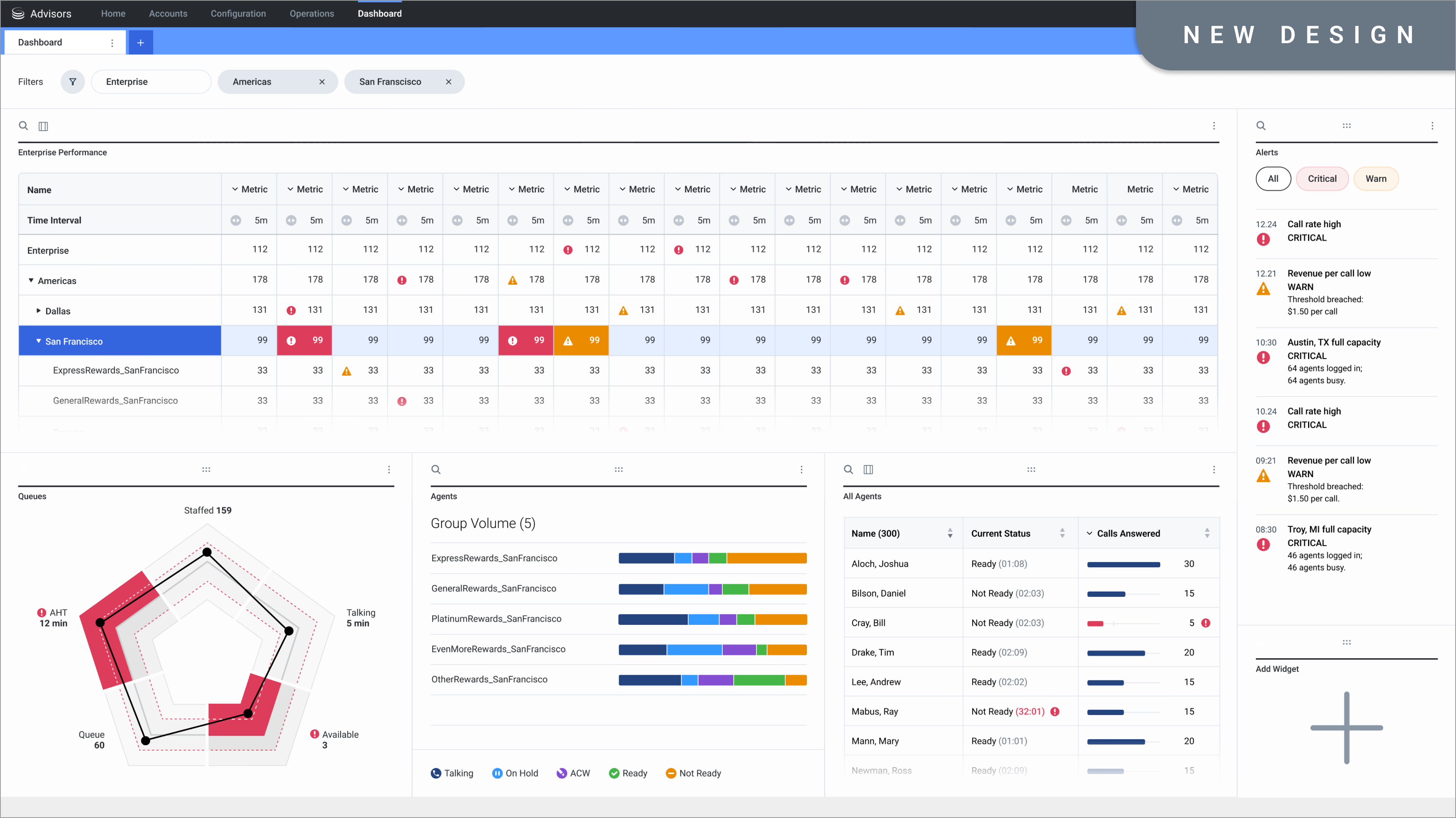
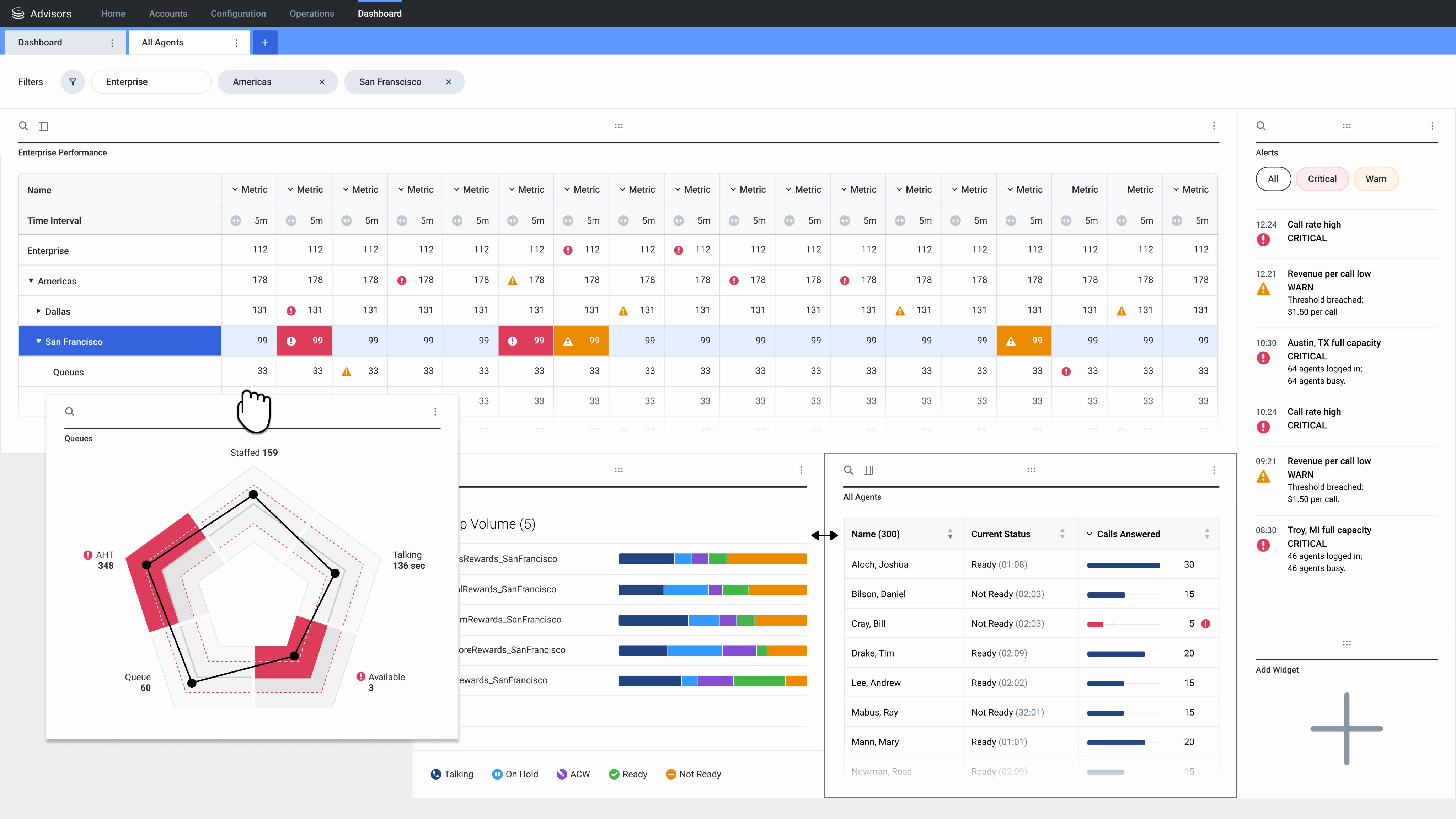
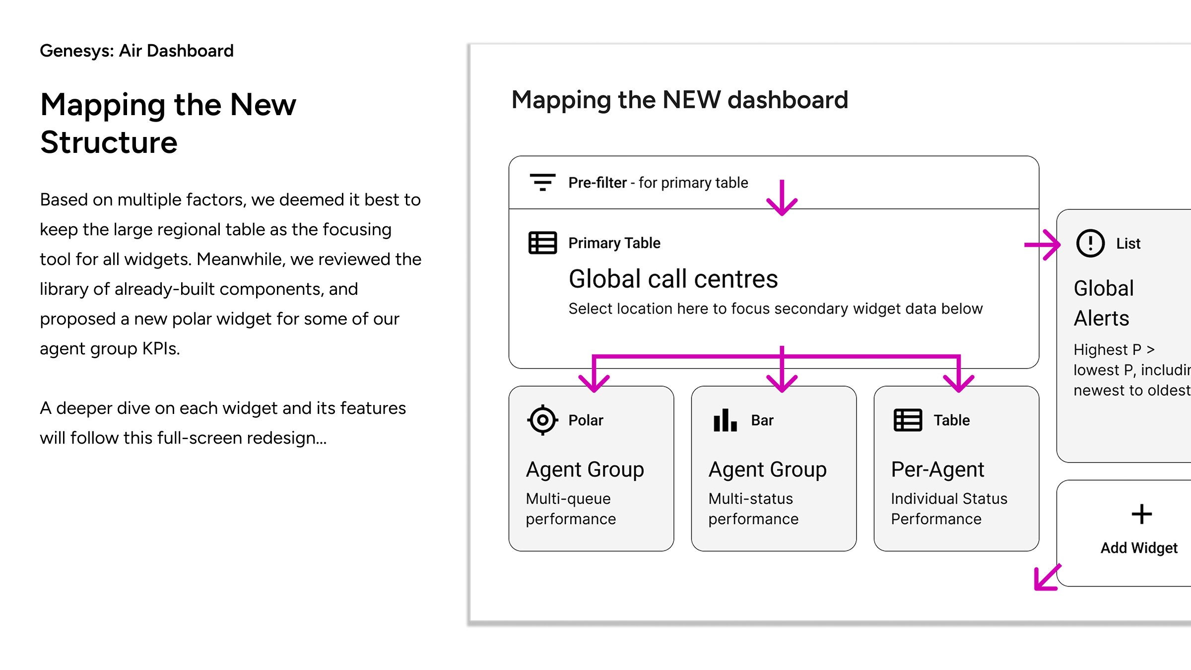
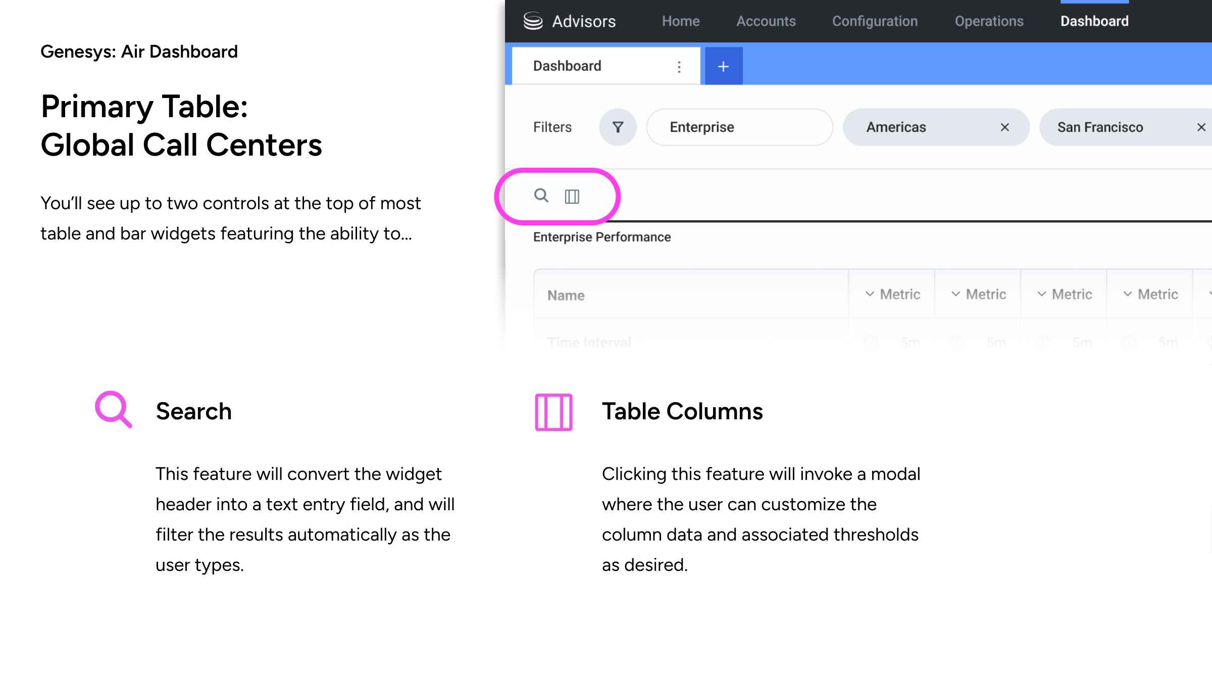
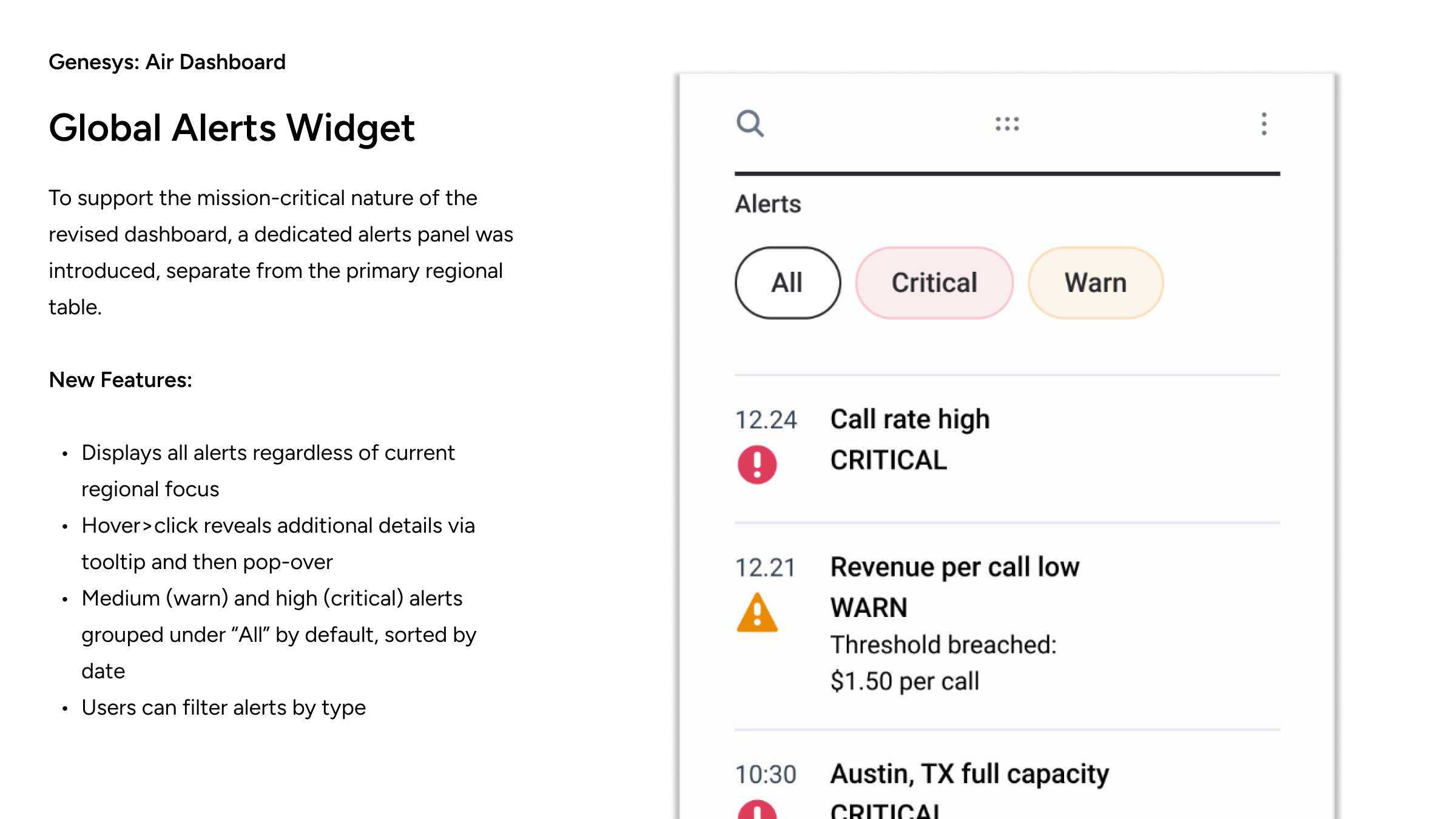
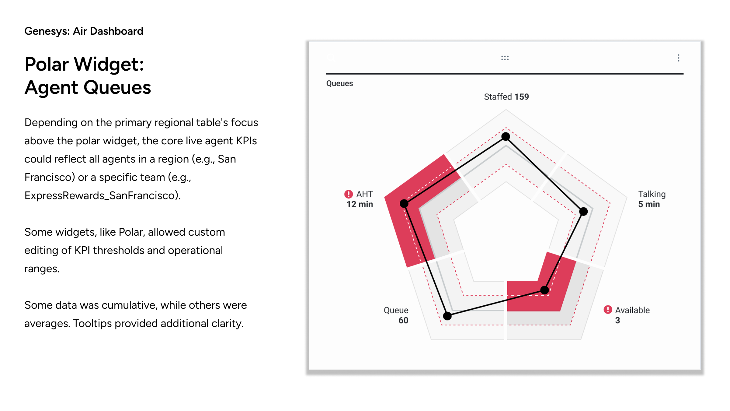
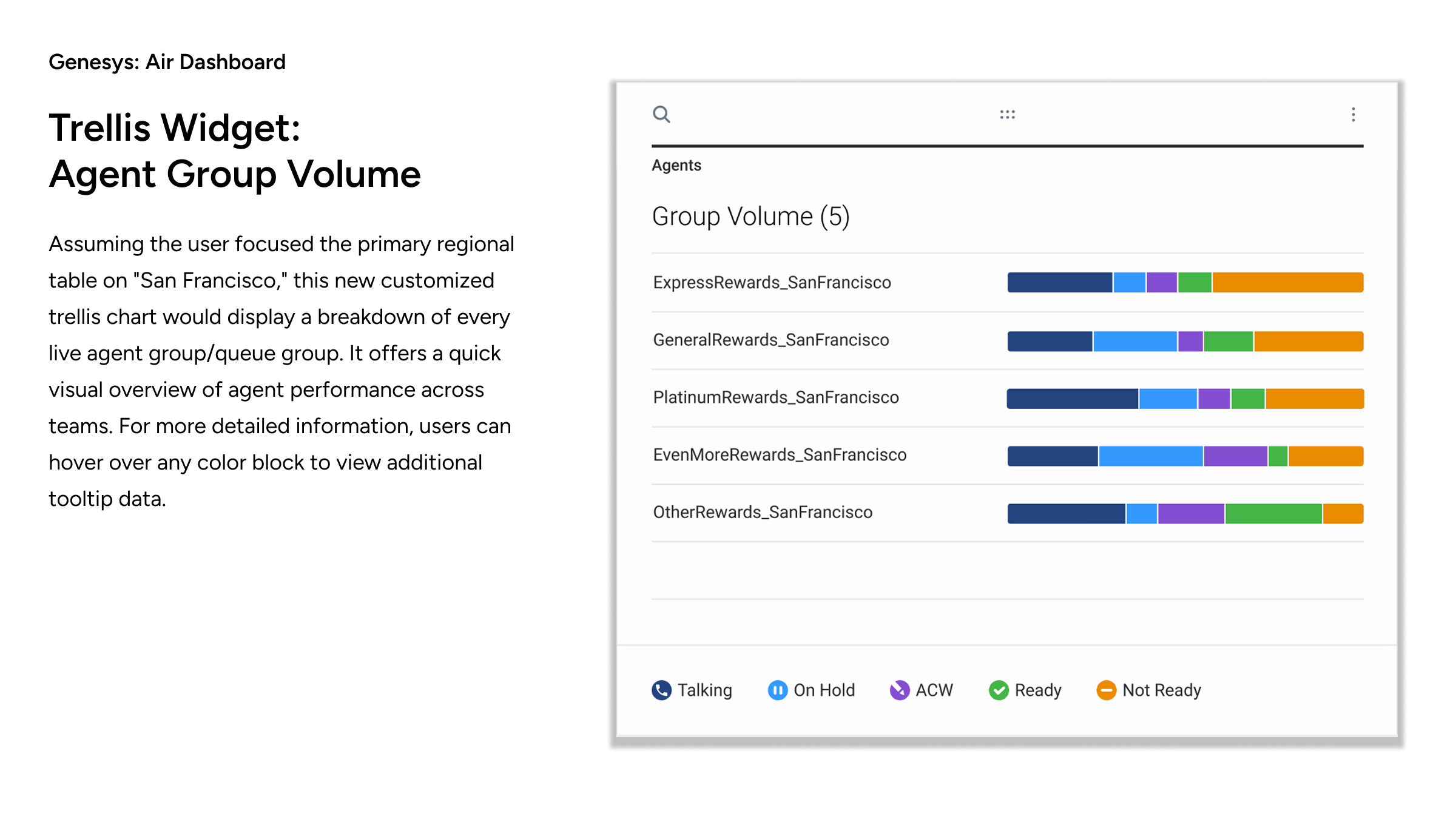
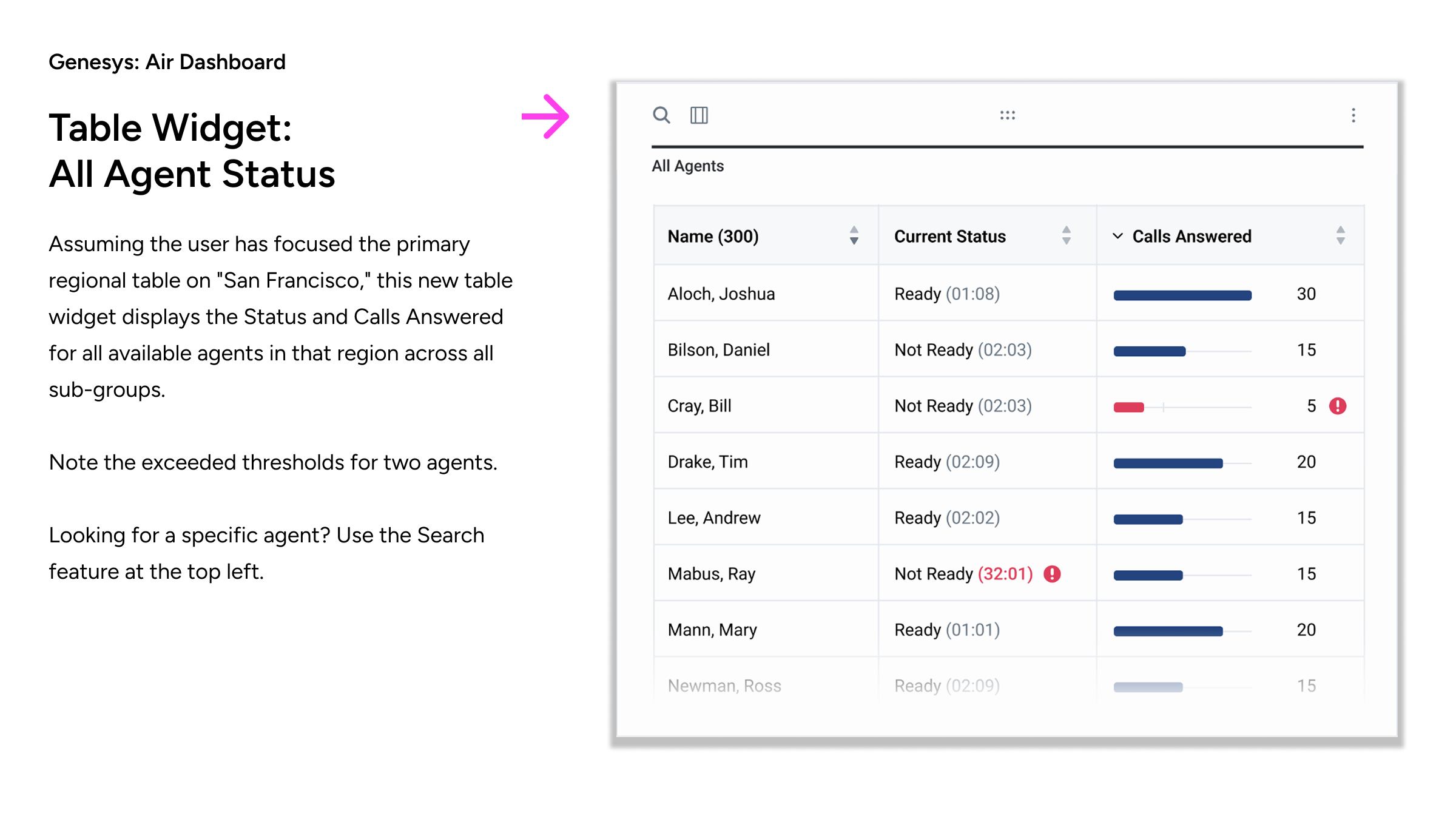
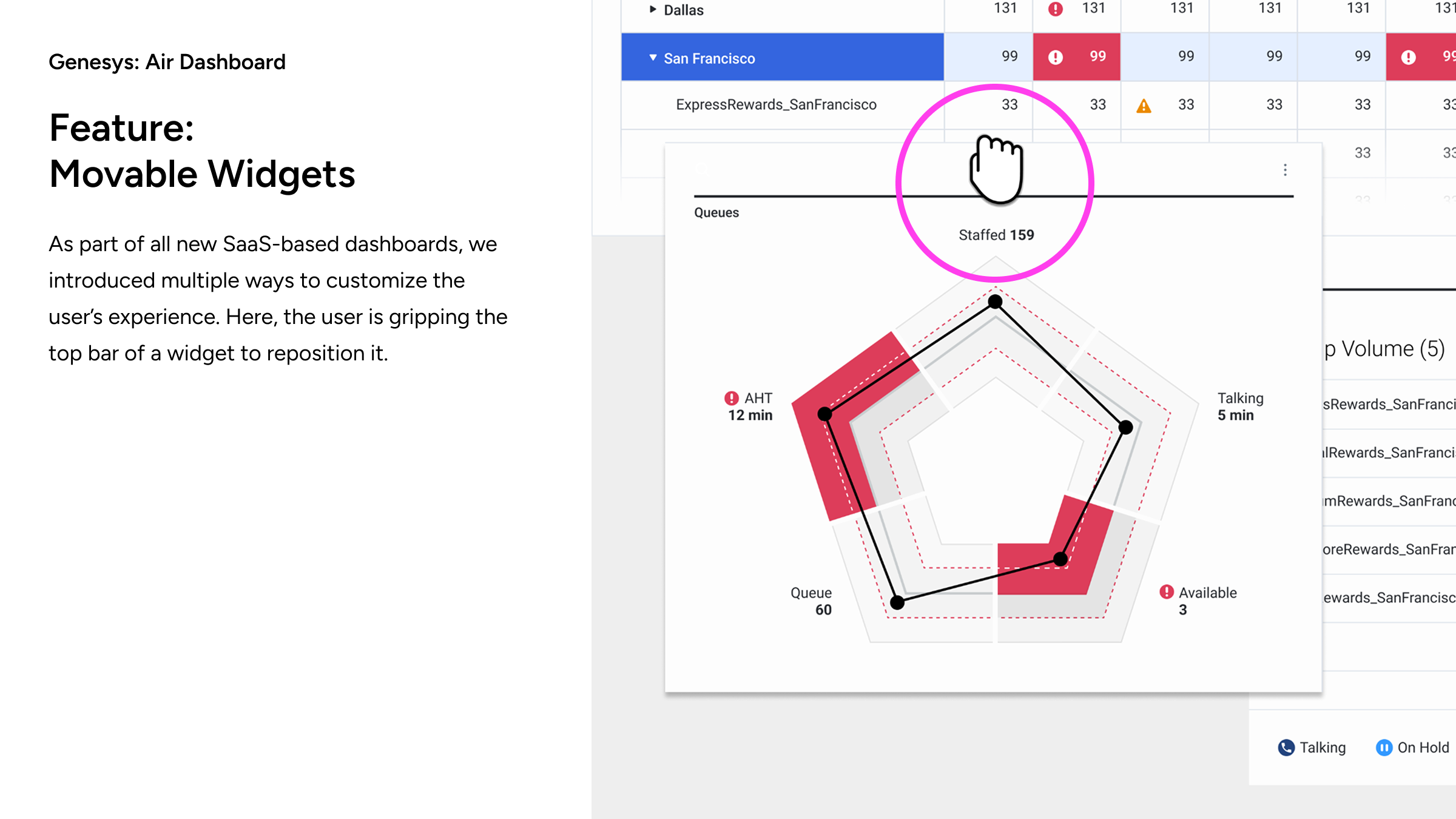
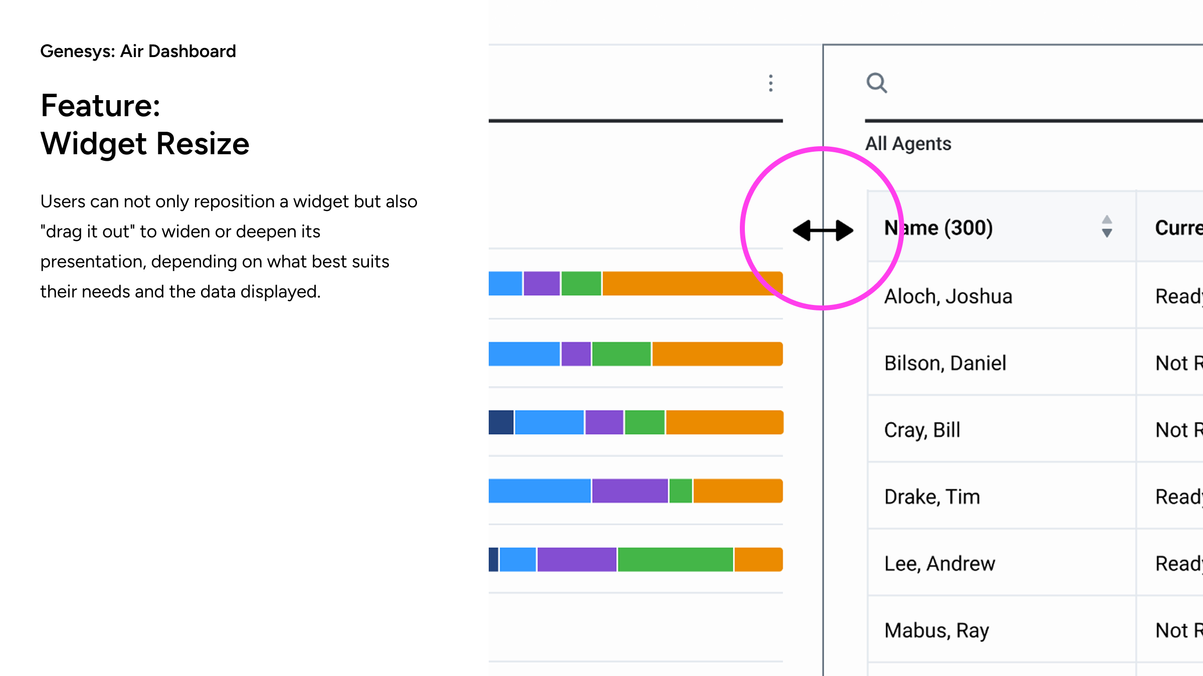
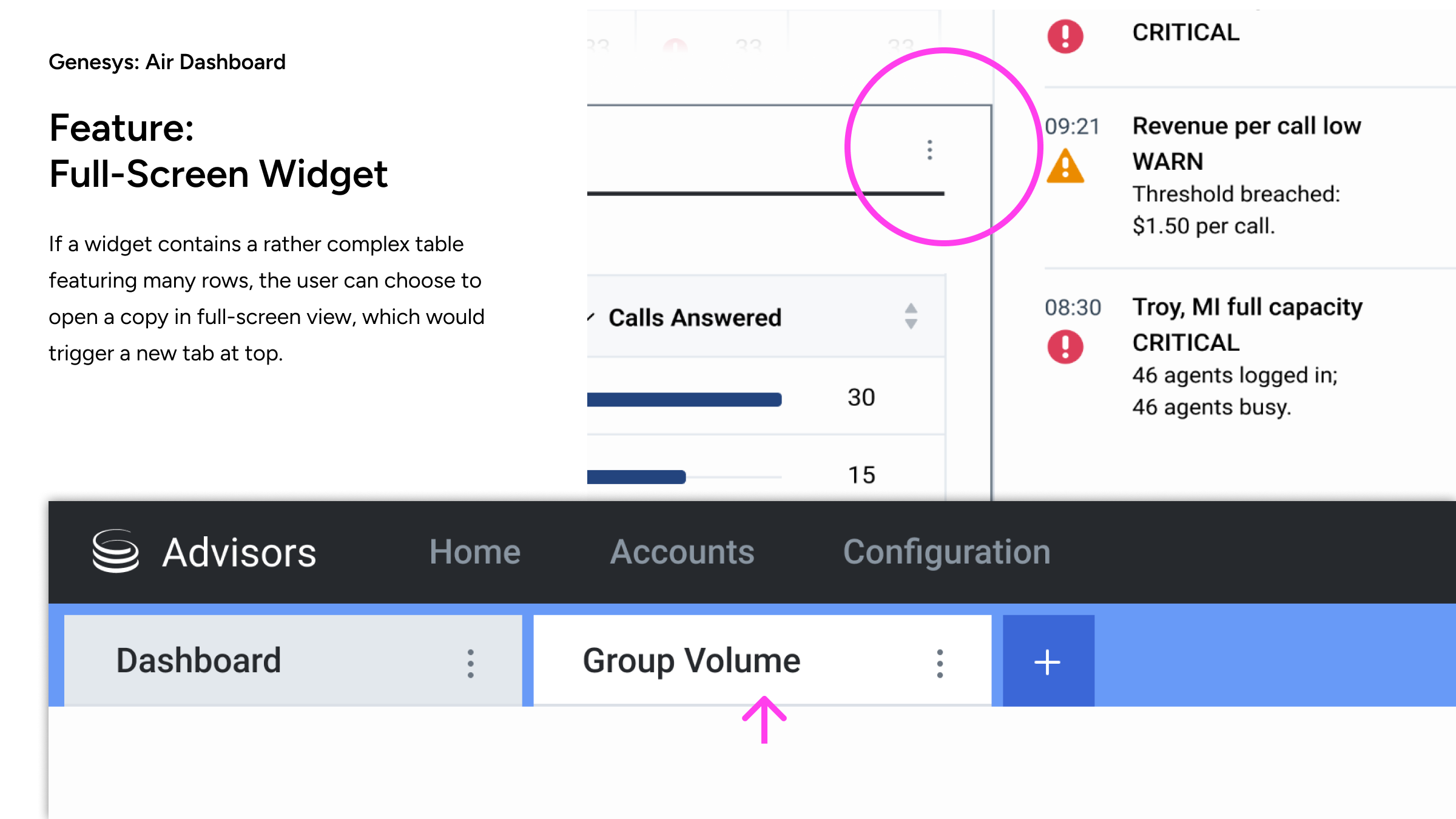
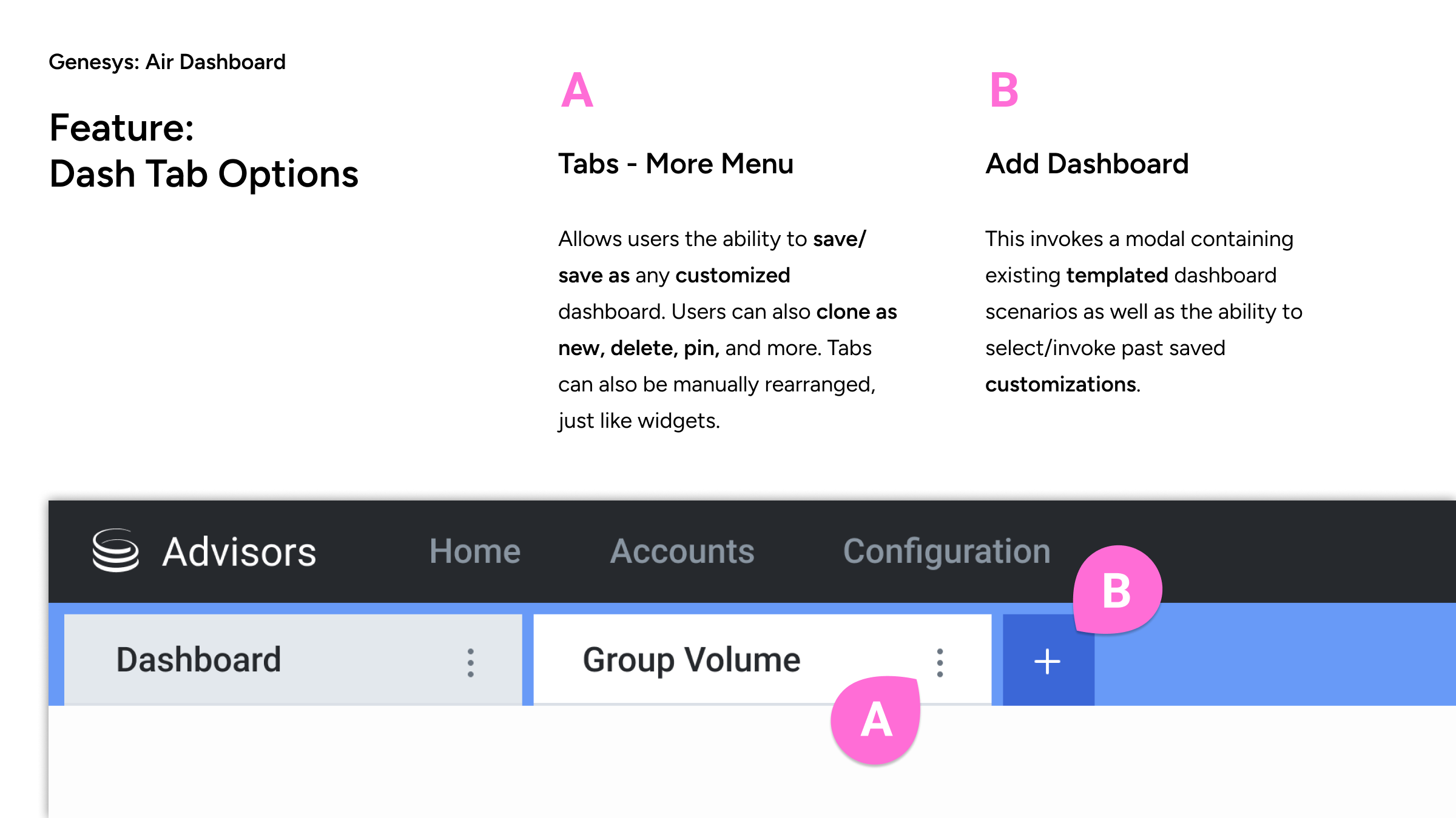
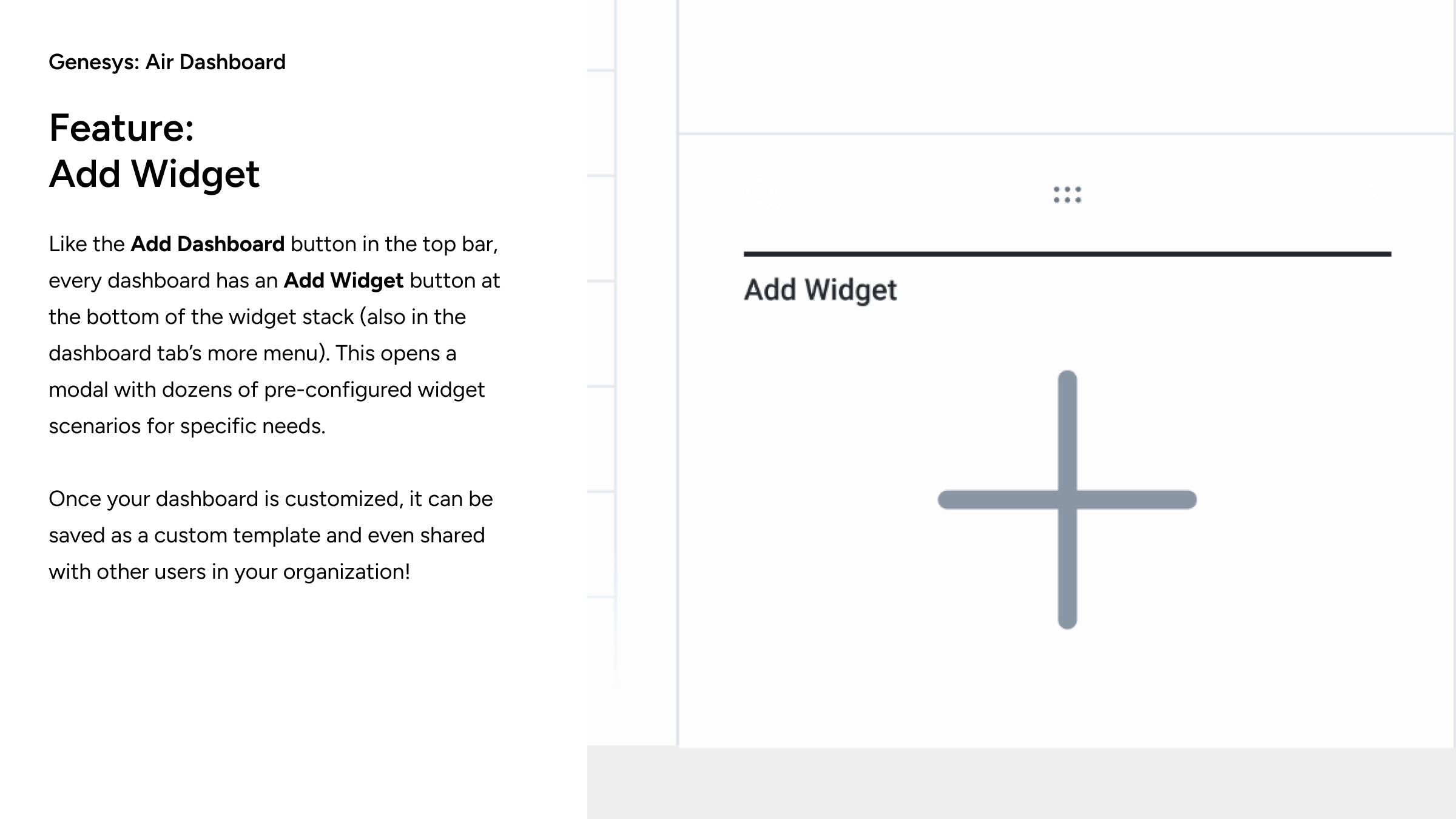
Working closely with stakeholders, table aspects were simplified, and proper alerts and thresholds introduced. The bottom half of the dashboard reflected the focused region/city above, in appropriate and modernized widgets. The dashboard design was highly advanced yet easy to use, and allowed cloning and many customizations, as is documented in the case study below.